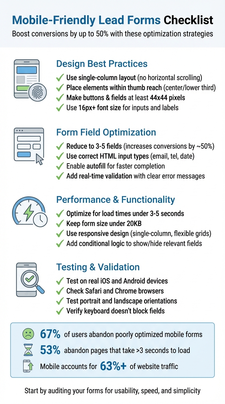
Checklist for Mobile-Friendly Lead Forms

Mobile users dominate web traffic, making it crucial to create forms that are easy to use on small screens. Poorly designed forms – those with too many fields, slow load times, or tiny buttons – frustrate users and hurt conversions. Here’s a quick guide to building forms that work well on mobile:
- Stick to a single-column layout to avoid horizontal scrolling.
- Minimize fields to only ask for essential information.
- Use large buttons and inputs (at least 44×44 pixels) for easy tapping.
- Enable autofill and real-time validation to save users time and reduce errors.
- Optimize load times by compressing images and cleaning up scripts.
- Test forms on real devices to ensure seamless functionality across browsers and screen sizes.
Mobile-friendly forms can increase conversion rates by up to 50%. Start by auditing your forms for usability, speed, and simplicity to turn more visitors into leads.
Mobile-Friendly Lead Form Optimization Checklist
Design Best Practices for Mobile Lead Forms
Use a Single-Column Layout
Stick with a single-column layout to make your forms easier to navigate on mobile devices. This eliminates the need for horizontal scrolling or zooming, aligning perfectly with how mobile users naturally read and interact with content. Place labels directly above input fields so they stay visible when the on-screen keyboard pops up. To keep things intuitive, left-align both labels and fields to follow the natural flow of the eye. Organize fields in a logical order – start with personal details, move to contact information, and end with any specific requests.
As HubSpot puts it:
"A single-column layout allows the eye to flow naturally while preventing clutter on the compact mobile screen."
Why is this important? Mobile-friendly forms can boost conversion rates by nearly 50% compared to forms that aren’t optimized for mobile. On the flip side, about 67% of users are likely to abandon forms that don’t work well on their devices.
Place Elements Within Thumb Reach
Most people use their phones with one hand, so it’s crucial to position interactive elements – like "Submit" or "Next" buttons – within the natural thumb zone. This area typically falls in the center or lower third of the screen. Place your main call-to-action button toward the bottom of the form for easy access, and ensure there’s plenty of padding between clickable elements to reduce the chance of accidental taps.
Marketing strategist Lilach Bullock underscores this:
"Everything works differently on mobile, so marketers need to make sure any elements of their websites are always optimized for mobile. And that, of course, includes forms – especially since it feels like you constantly have to complete forms while on mobile."
Additionally, adjusting the size and spacing of elements can further improve usability and reduce errors.
Make Buttons and Fields Large Enough to Tap
When it comes to buttons and input fields, size matters. Make sure they’re at least 44×44 pixels, and use a minimum font size of 16px for input text and labels. This prevents auto-zooming and ensures everything is easy to read and interact with. Smaller elements not only frustrate users but also increase the likelihood of mis-taps.
For shorter lists, swap out dropdown menus for large, tappable radio buttons. They’re easier to select and require less precision.
| Element | Recommended Size |
|---|---|
| Touch Targets | 44×44 pixels |
| Font Size | 16px or larger |
| Spacing | Ample margins |
Optimizing Forms for Mobile Devices
Form Field Optimization
Once you’ve perfected your form design, the next step is to fine-tune the input fields to make mobile interactions smoother and more user-friendly.
Reduce the Number of Fields
Only ask for what you truly need. For example, if you’re setting up a newsletter signup form, just ask for an email address – nothing more.
Where possible, combine related fields. Instead of having separate fields for "First Name" and "Last Name", opt for a single "Full Name" field. This approach reduces the number of taps and makes the form feel less daunting. For longer forms, consider using conditional logic. For instance, if someone answers "No" to "Do you currently use marketing automation?", you can skip any follow-up questions about their platform.
Here’s why this matters: forms with just 3 to 5 fields can increase conversion rates by nearly 50%. On the other hand, forms with more than six fields often see completion rates drop below 50%. To further lighten the load, use hidden fields to automatically capture data like referral sources or campaign IDs without requiring user input.
Use the Right Input Types
After trimming down the number of fields, focus on making each one mobile-friendly.
Using the correct HTML input types can significantly enhance usability. For instance, setting type="email" for email fields adds the "@" symbol and ".com" shortcut to the mobile keyboard, making typing quicker. Similarly, type="tel" for phone numbers brings up the numeric keypad instead of the full keyboard, which is much faster for entering digits. Date fields (type="date") activate the device’s built-in calendar picker, sparing users from typing dates manually and risking format errors.
| Data Field | HTML Input Type | Benefit |
|---|---|---|
| Email Address | type="email" |
Adds "@" and ".com" to the keyboard |
| Phone Number | type="tel" |
Opens a numeric keypad |
| Date | type="date" |
Activates the native calendar picker |
| Password | type="password" |
Hides text for security |
| Long Message | <textarea> |
Allows multi-line input with scrolling |
Steer clear of dropdown menus on mobile. They often require too many taps and can be tricky to navigate on smaller screens. Instead, use radio buttons for short lists (fewer than five options) or searchable text inputs for longer lists, such as country selection.
Enable Autofill and Real-Time Validation
Take user convenience up a notch by automating data entry and offering immediate feedback.
Autofill eliminates the need for users to repeatedly type information like names, addresses, or payment details. This not only speeds up the process but also reduces the likelihood of errors. Ensure your form fields include standard HTML attributes so browsers can recognize and autofill them.
Real-time validation is another game-changer. It alerts users to errors as they fill out the form. For example, if someone enters an incorrectly formatted email, they’ll see a red border around the field and a message like "Email format looks wrong" right away. Place error messages next to the relevant field instead of at the top of the form, where they might go unnoticed.
For simple "Yes/No" questions, enable auto-advance to move users to the next question immediately after they select an answer. This eliminates unnecessary taps on "Next" buttons and creates a smoother flow. Features like smart defaults – such as auto-detecting a user’s location or offering email autocomplete – also reduce the effort required on small screens. These small adjustments can make a big difference in boosting mobile conversion rates.
sbb-itb-b3a7196
Performance and Functionality Improvements
After refining the design and usability, it’s time to zero in on the technical details – making sure your form is fast, efficient, and works seamlessly on any device.
Optimize for Fast Load Times
Speed matters, especially on mobile. Many users rely on slower cellular networks, so a lagging form can be a dealbreaker.
Start by compressing images and switching to modern formats like WebP to cut down on file sizes. Use lazy loading to ensure images only load when they’re about to appear on the screen. Also, clean up your scripts – remove any unnecessary JavaScript or CSS that might be slowing things down. As the MakeForms team emphasizes:
"Slow-loading forms kill conversions. … A form that takes even a few seconds too long to load or respond can cause users to abandon the process entirely".
To stay on top of performance, use tools like Lighthouse or Think with Google to monitor Core Web Vitals, including metrics like Largest Contentful Paint (LCP) and Cumulative Layout Shift (CLS). Keep your form lightweight – ideally under 20 kilobytes – so it loads in under five seconds, even on mobile connections.
Once speed is under control, the next step is ensuring your form looks and works perfectly on any device.
Use Responsive Design
Responsive design isn’t just a nice-to-have – it’s a must. With mobile devices accounting for over 63% of all website traffic, your form needs to adapt to different screen sizes effortlessly.
Use CSS media queries and flexible grid layouts to make your form fit any screen. Stick to a single-column layout to avoid horizontal scrolling. Make sure the form works smoothly in both portrait and landscape modes. Position labels above input fields so they remain visible when the mobile keyboard pops up.
Also, set the font size for input text to at least 16 pixels. This prevents iOS devices from zooming in unnecessarily when users tap a field. Finally, test your forms on actual mobile devices – both iOS and Android – rather than relying solely on desktop emulators.
With performance and responsiveness in place, you can enhance the user experience by adding smarter functionality.
Add Conditional Logic to Forms
Conditional logic helps simplify your form by showing fields only when they’re relevant, creating a cleaner and more streamlined experience.
For instance, if a user selects "No" to a question like "Are you interested in enterprise features?", the form can automatically hide all related fields. This keeps the process straightforward and reduces the mental effort required from users.
On mobile devices, where screen space is tight and typing can be tedious, conditional logic can make a huge difference. Multi-step forms that adapt based on user input keep the focus on one task at a time, making the experience both efficient and user-friendly.
Testing and Validation
Once you’ve fine-tuned your form’s design and performance, it’s time to ensure it works flawlessly in the real world. And that means testing on actual devices. As Mike Hakob, Co-Founder of FormStory, wisely notes:
"Real device testing reveals problems that simulations miss. Different phones load forms differently. Some keyboards hide labels. Some screens compress fields."
Given the diversity of devices used by a global audience, skipping this step isn’t an option.
Test on Multiple Devices and Browsers
After optimizing your form for performance and responsiveness, real-world testing is the next critical step. Simulators can miss subtle, yet important, issues. Testing on actual iOS and Android devices helps you understand how your form behaves across platforms. With Android commanding 70.48% of mobile web traffic and Apple accounting for 28.8%, covering both ecosystems is essential.
Make sure to check your form on popular mobile browsers like Safari and Chrome. Test how it looks and functions in both portrait and landscape orientations. Also, monitor load times – keep them under three seconds, even on slower connections. Why? Because 53% of mobile users will abandon a page that takes longer than three seconds to load.
| Testing Category | What to Check | Recommended Tool/Method |
|---|---|---|
| Display | Portrait vs. landscape scaling; single-column alignment | Real mobile devices (iOS/Android) |
| Interactivity | Verify that all touch targets function without mis-taps | Manual finger-tap testing |
| Speed | Load time under 3-5 seconds | Google Lighthouse / Think with Google |
| Input | Correct keyboard triggers (numeric/email) | Native mobile browsers (Safari/Chrome) |
| Validation | Real-time error messages; required field alerts | Manual entry of invalid data |
Check Usability and Error Handling
Go through the entire form submission process from start to finish. Test for errors by entering invalid data – leave required fields blank, type text into numeric fields, or use incorrect email formats. Confirm that error messages are clear, in plain language (e.g., "Email format looks wrong"), and visually stand out with cues like red borders.
Pay special attention to how the mobile keyboard interacts with your form. Make sure it doesn’t block input fields or action buttons. For example, tapping an email field should trigger a keyboard with relevant shortcuts, while selecting a phone field should bring up the numeric keypad. If your form includes conditional logic, test it thoroughly by entering various inputs to ensure fields appear or disappear as intended.
Finally, verify that the form submission process works without a hitch. Check that it triggers the necessary notifications and review accessibility features using tools like Google Lighthouse or WAVE. Look for issues such as missing labels or poor color contrast. Marketing strategist Lilach Bullock underscores the importance of this step:
"Everything works differently on mobile, so marketers need to make sure any elements of their websites are always optimized for mobile."
Wrap up your testing by ensuring every function works smoothly and delivers a seamless user experience.
Conclusion
Key Takeaways
With mobile traffic dominating website visits, poorly optimized forms can instantly drive potential leads away. To avoid this, focus on three essential principles: keep your layout simple by using a single-column design, limit fields to only what’s absolutely necessary, and make tap targets larger (at least 44×44 pixels) to improve usability and boost conversions. Use appropriate HTML5 input types to ensure mobile keyboards match the required input, enable autofill to simplify data entry, and include real-time validation to let users correct errors immediately. Speed is critical – forms should load in under three seconds, as even small delays can hurt conversion rates. And don’t rely solely on desktop simulators; test your forms on actual iOS and Android devices to uncover issues that only real-world testing can reveal.
Reducing the number of form fields can increase conversion rates by almost 50%. A seamless mobile experience ensures you capture leads during the research phase, even if they finalize their purchase later on a desktop. As Unbounce aptly states:
"Nobody wants to fill out your stupid form. Especially on mobile. Make it as quick and painless as possible."
Apply these strategies to optimize your mobile forms and start seeing improvements right away.
Next Steps
Now’s the time to audit your forms for both real friction (like tiny buttons or slow load times) and perceived friction (such as too many fields or confusing layouts). Make updates and test them on real devices to ensure everything runs smoothly.
If you’re looking for a tool to create mobile-optimized lead magnets quickly, check out Subpage.co (https://subpage.co). It’s designed to help you build whitepapers, checklists, and gated content pages that are mobile-friendly by default. Plus, it includes built-in lead collection, analytics, and integrations to make your workflow more efficient.
FAQs
What steps can I take to make sure my lead form loads quickly on mobile devices?
When it comes to making your lead form mobile-friendly, simplicity is key. Stick to a single-column, responsive layout and focus on including only the most essential fields – aim for 3 to 5 inputs at most. To speed things up, compress your scripts and assets, and deliver them through a fast content delivery network (CDN). This ensures your form loads in just a few seconds, giving mobile users a smooth and hassle-free experience.
What are the best ways to simplify lead forms without losing important details?
When designing lead forms, aim to keep things simple while still gathering the information you need. Stick to just 3–5 essential fields to avoid overwhelming users. Remove any extra inputs that aren’t absolutely necessary, and take advantage of features like dropdown menus or auto-fill to make filling out the form quicker and easier. You can also try multi-step forms or progressive disclosure, where additional fields only appear when they’re relevant. This keeps the process smooth and mobile-friendly while still ensuring you get the data that matters most.
Why is real-time validation essential for mobile lead forms?
Real-time validation provides users with instant feedback as they fill out forms, allowing them to fix mistakes right away. This not only minimizes frustration but also eliminates the hassle of resubmitting forms, keeping users focused and engaged.
By simplifying the process, real-time validation can greatly boost form completion rates – especially on mobile devices, where users demand fast and smooth interactions.
Related Blog Posts