How Visual Hierarchy Impacts CTA Performance

Want your CTAs to perform better? The key is visual hierarchy – a design strategy that guides users’ attention to the most important elements on a page. It uses size, color, contrast, placement, and spacing to make CTAs stand out and drive action.
Key Takeaways:
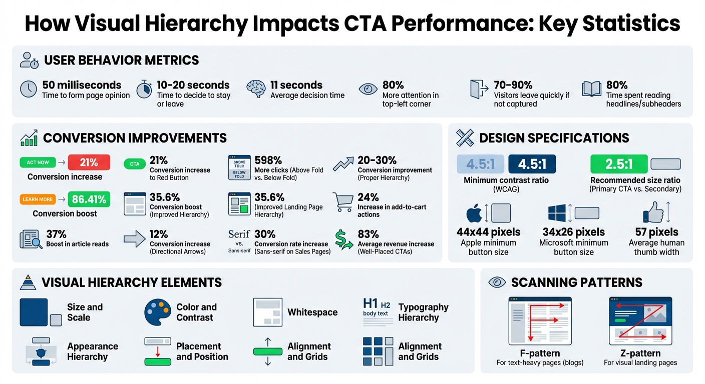
- Users decide quickly: Visitors form opinions about a page in 50 milliseconds and decide to stay or leave within 10–20 seconds. Your CTA must grab attention fast.
- Design elements matter: Larger buttons, contrasting colors, and whitespace around CTAs help them stand out. For example, changing a button color from green to red can increase conversions by 21%.
- Placement is critical: CTAs above the fold or aligned with natural eye patterns (like Z-patterns or F-patterns) perform significantly better – up to 598% more clicks.
- Simple fixes work: Use the "squint test" to check if your CTA stands out. If it doesn’t, adjust its size, color, or position.
By refining your visual hierarchy, you can improve conversion rates by 20–30% or more. Let’s break down how to make your CTAs impossible to miss.
Visual Hierarchy Impact on CTA Performance: Key Statistics and Conversion Data
How Visual Hierarchy Directs Attention to CTAs
Key Visual Hierarchy Elements
Designing an effective call-to-action (CTA) hinges on six essential elements: size and scale, color and contrast, whitespace, typography hierarchy, placement, and alignment. Let’s break these down:
- Size and scale: Larger elements naturally draw the eye first, signaling their importance.
- Color and contrast: A bright yellow button on a dark background? Hard to miss. This contrast creates a clear focal point.
- Whitespace: By isolating your CTA from surrounding distractions, whitespace reduces mental effort for users.
- Typography hierarchy: Variations in size, weight, and style guide users’ attention toward the action you want them to take.
- Placement and position: Did you know elements in the top-left corner of a page receive 80% more attention? This makes positioning critical.
- Alignment and grids: A well-structured layout helps users navigate effortlessly to your CTA.
"Visual hierarchy is the way design elements interact with each other to signal dominance or importance." – Josh Gallant, SEO Lead, Foundation Marketing
When done right, these elements can significantly boost performance. Studies reveal that using proper visual hierarchy for CTAs can improve conversion rates by 20–30%. Plus, adhering to the Web Content Accessibility Guidelines (WCAG), which recommend a contrast ratio of at least 4.5:1 for text, ensures readability for all users.
These principles aren’t just about individual elements – they determine how users process your entire page.
Common User Scanning Patterns
Understanding how people visually navigate your site is just as important as the design itself. Research shows that most users scan, rather than read, web pages. Two common patterns emerge:
- F-pattern: Seen on text-heavy pages like blogs, where the eye moves across the top, partially across the middle, and then down the left side.
- Z-pattern: Found on visually-driven landing pages, where the eye travels from the top-left to top-right, diagonally down to the bottom-left, and then across to the bottom-right.
A Nielsen Norman Group study tracking 232 users across thousands of web pages confirmed these behaviors. Here’s the kicker: users typically decide within 11 seconds whether to stay or leave. This means your CTA placement needs to align with these natural eye movements. For Z-pattern layouts, the bottom-right corner is the perfect "final stop" for your CTA. On F-pattern pages, place CTAs along the left side or within horizontal scanning zones.
"Visual hierarchy controls the delivery of the experience. If you have a hard time figuring out where to look on a page, it’s more than likely that its layout is missing a clear visual hierarchy." – Kelley Gordon, Nielsen Norman Group
Want to disrupt these patterns? Try centering your CTA with plenty of whitespace around it. This forces attention exactly where you want it.
The Cost of Poor Hierarchy
Ignoring natural scanning patterns can lead to a chaotic design that confuses users. Poor visual structure often results in "CTA blindness", where users overlook the action you want them to take. This confusion erodes trust and increases bounce rates. When too many elements compete for attention, the most important one – your CTA – gets lost.
Consider this: visitors spend only 10–20 seconds on a webpage before deciding whether to stay or leave. Without a clear hierarchy, you’re wasting those precious seconds.
"When everything screams for attention, nothing gets it." – Stuart L. Crawford, Creative Director & Brand Strategist, Inkbot Design
Inkbot Design shared a case study from December 2025 that highlights the impact of better hierarchy. An e-commerce product page with a cluttered layout was redesigned to feature a large image, bold product name, clear price, and a high-contrast button. The result? A 24% increase in add-to-cart actions. Another redesign doubled the size of a featured blog post, added a larger headline, and saw a 37% boost in article reads and triple the engagement.
Poor hierarchy doesn’t just confuse – it wastes users’ energy and damages trust. A simple trick to test your page? Perform the "squint test": blur your vision and see if your CTA still stands out. If it doesn’t, your hierarchy needs work.
How to Audit CTA Performance Using Visual Hierarchy
Review Your Page’s Attention Flow
A strong visual hierarchy ensures users focus on the right elements, but how do you know if your page achieves this? Start by evaluating your page’s attention flow. A quick and easy way to do this is by using the squint test. Squint your eyes or apply a slight blur (around 5–10 pixels) to your design. The elements that remain visible are your page’s true focal points. If your call-to-action (CTA) doesn’t stand out in this test, it’s time to rethink your hierarchy.
Positioning also plays a key role. CTAs that align with natural reading patterns – like F- or Z-patterns – are easier for users to notice and engage with. Research shows that elements in the top-left corner of a page get 80% more attention than those placed elsewhere.
Evaluate CTA Design Elements
Your CTA’s design can make or break its effectiveness. To ensure it grabs attention, focus on three key aspects: size, contrast, and spacing. Aim for a 2.5:1 size ratio between your primary CTA and secondary elements. If your CTA button is only slightly larger than nearby text, it risks blending in. Color contrast is just as important – it’s not about the specific color you choose but how much it stands out against its surroundings. Testing your design in grayscale can help confirm whether your CTA truly pops.
Typography and whitespace also play a huge role. Bold, clear fonts and generous spacing can make your CTA more noticeable. Studies show that users spend 80% of their time reading headlines and subheaders before diving into body content, so make sure your CTA benefits from this natural focus. For accessibility, stick to a minimum contrast ratio of 4.5:1 between text and background. By refining these design elements, you can eliminate distractions and amplify your CTA’s impact.
Find and Remove Competing Elements
Your CTA should be the star of the show, but competing elements can steal the spotlight. A simple 5-second test can reveal whether your primary CTA is immediately identifiable. If users can’t find it within five seconds, it’s likely being overshadowed by other elements. Oversized hero images, flashy secondary graphics, or multiple buttons with similar visual weight can confuse users, creating a "nothing stands out" effect.
To avoid this, simplify your design. Stick to no more than three font sizes and contrast variations to maintain visual order. Identify any elements in high-focus areas that aren’t your CTA – these should be minimized, muted, or repositioned to ensure your CTA remains the primary focal point.
"If everything is contrasted, then nothing stands out".
How to Optimize CTA Performance
Clarify CTA Priority
When designing your page, it’s essential to establish a clear priority for your calls-to-action (CTAs). Think of your primary CTA as the star of the show – it should grab the most attention and guide users toward the desired action. If multiple CTAs compete for attention, users can become overwhelmed and unsure of what to do next. To prevent this, make your primary CTA stand out by using bold colors, larger sizes, and high contrast. Secondary CTAs, if needed, should take a backseat visually, with softer tones like white or cream.
A practical way to prioritize CTAs is by ranking them on a simple 0–5 scale. Consider factors like past click-through rates, revenue potential, and ease of implementation. The CTA with the highest score should take center stage as your primary focus.
Once you’ve established priorities, the next step is to fine-tune the design to maximize visual impact.
Improve Size, Color, and Contrast
A successful CTA demands attention, and size, color, and contrast are your best tools for achieving that. Start by increasing the size of your CTA relative to nearby elements – this naturally draws the eye. Then, use colors that stand out. Research shows that hues like turquoise, red, and red-violet are particularly attention-grabbing. For instance, one team saw an 86.41% boost in conversions by switching their CTA button color from orange to green. Another test found that changing from green to red increased conversions by 21%.
Contrast is equally important. Make sure your CTA stands out sharply against its background. On mobile, where space is limited, ensure buttons are thumb-friendly – Apple recommends a minimum size of 44×44 pixels, while Microsoft suggests 34×26 pixels. Rounded corners on buttons can also subtly guide the eye toward the CTA text.
Optimize Placement and Layout
Even the best-designed CTA won’t perform well if it’s not placed strategically. Placement matters – a split test revealed a 598% difference in clicks when a button was positioned above the fold versus below it.
Think about how users naturally scan your page. On pages with minimal text, users often follow a Z-pattern, moving from the top-left to the top-right, then diagonally to the bottom-right. Placing your primary CTA at the end of this path can be highly effective. On text-heavy pages, users typically scan in an F-pattern, focusing on the top and left side of the screen. Positioning your CTAs along these "hot zones" can capture more attention.
Adding visual cues can also make a difference. For example, DigitalMarketer‘s Justin Rondeau reported a 12% increase in conversions after using arrows to point toward an opt-in form. Additionally, surrounding your CTA with plenty of whitespace helps it stand out, and removing distractions like site navigation on dedicated landing pages keeps users focused on the action you want them to take.
How to Measure and Improve Visual Hierarchy for CTAs
Set Baseline Metrics
Before making any design tweaks, it’s crucial to understand where you’re starting from. Track key performance indicators like CTR (click-through rate), form completions, and bounce rate. These metrics will serve as your baseline, helping you gauge how well your current visual hierarchy performs in those critical first moments when users decide to stay or leave.
One simple way to audit your visual hierarchy is the squint test. Just squint at your page until everything blurs – the elements that still stand out are the most prominent. If your CTA doesn’t pop out, it’s a sign it needs more visual emphasis. Quick user tests can also confirm whether your CTA is grabbing attention as it should.
Another method is to perform a hierarchy audit. List all the elements on your page and assign each one a priority level (e.g., from 1 to 5). Then, compare your intended hierarchy to what actually stands out visually. Tools like heatmaps and scroll maps can validate if user attention aligns with your intended design flow, whether it follows an F-pattern for text-heavy pages or a Z-pattern for more visually focused layouts.
Test Hierarchy Changes
Once you’ve set your baseline, it’s time to test adjustments. Use A/B testing to measure the effect of changes, but focus on one variable at a time – such as size, color, or placement – to isolate what works.
Prioritize testing on high-impact pages, like landing pages linked to ad campaigns or those with high bounce rates. Even small changes can have a big impact. For instance:
- Changing a CTA button color from green to red boosted conversions by 21%.
- Moving a "Download Now" button above the fold resulted in 598% more clicks.
- Adding visual cues like arrows near a CTA or switching to sans-serif fonts on sales pages increased conversion rates by up to 30%.
When testing, ensure your CTA meets accessibility standards with at least a 4.5:1 contrast ratio against its background. Additionally, try increasing the whitespace around your CTA. This reduces cognitive load and draws more attention to the button.
Analyze User Behavior Data
After making adjustments, dive into user behavior data to see how visitors are interacting with your page. Heatmaps can reveal where users are focusing their attention and clicking, helping you verify if your intended focal points match actual behavior. Scroll depth data shows how far users navigate down your page, which can guide you in positioning CTAs along natural scanning patterns.
For deeper insights, use session replays to identify where users lose interest or encounter friction. High drop-off rates in specific sections could indicate that your visual hierarchy is causing confusion rather than clarity. Studies have shown that improving the visual hierarchy of a landing page can boost conversions by as much as 35.6%.
"Visual hierarchy isn’t just about aesthetics. It’s also about intention." – Nicolas Lekkas, Writer, GrowthRocks
Ultimately, track your conversion rate to measure whether your adjustments are meeting your business goals. Keep in mind that 70–90% of visitors leave a landing page quickly if the content fails to immediately capture their attention. Getting your visual hierarchy right can make all the difference.
sbb-itb-b3a7196
How to Apply Visual Hierarchy to Lead Magnets with Subpage

Structure Lead Magnet Pages
Subpage’s editor makes it simple to create a clear typographic structure, even if you don’t have design experience. Use a three-level structure: H1 for your value proposition, H2/H3 for section headings, and the body text for details. This layout ensures visitors can easily follow the path from your main message to the call-to-action (CTA).
When designing your lead magnet page, align the layout with natural scanning patterns to keep visitors engaged. Subpage’s pre-designed templates are already optimized for these patterns, providing a great starting point that you can tweak to suit your needs.
Configure Gated Content Elements
Once your page structure is ready, it’s time to set up the gated content elements for maximum impact. Subpage offers various gating options like forms, pop-ups, top bars, and widgets. To make them stand out, position your primary CTA above the fold and use high-contrast colors – think bright yellow or red against muted backgrounds. This approach leverages the von Restorff Effect, making key elements pop.
Make sure your buttons are user-friendly. A height of 44 to 60 pixels works best, as it aligns with the average size of a human thumb (about 57 pixels wide). Surround forms with plenty of whitespace to reduce visual clutter. Instead of generic button labels like "Submit", use phrases that highlight the benefit, such as "Get My Free Audit" or "Claim My Guide." Adding a short note below the button – like "No credit card required" or "Sent instantly to your inbox" – can further reassure visitors.
Track and Improve with Subpage Analytics
After setting up your lead magnet elements, use Subpage analytics to monitor their performance and refine your approach. Analytics can help confirm whether your visual hierarchy is effective or needs adjustments. For example, a high bounce rate might indicate that visitors are struggling to navigate the page. A quick way to test this is the squint test: if your CTA doesn’t stand out when you squint, increase its size or adjust its contrast.
Track conversion rates across different page versions to pinpoint the most effective CTA placement, color, and size. Subpage’s Premium Plan ($19/organization/month) includes unlimited analytics and integrations with tools like Zapier, making it easy to export lead data and track results across your marketing tools. Since 90% of visitors who read a headline also engage with the associated CTA, ensure your headline and CTA work seamlessly together. Small tweaks based on these insights can make a big difference – well-placed CTAs have been shown to boost revenue by an average of 83%.
Conclusion
Key Principles to Remember
Visual hierarchy isn’t just about aesthetics – it’s about leading users to take action. The idea is simple: use size to establish importance, contrast to make calls-to-action (CTAs) stand out against muted backgrounds, and whitespace to create breathing room and reduce mental effort. Placement plays a big role too – position CTAs along natural scanning patterns, like the Z-pattern for visual layouts or the F-pattern for text-heavy designs.
Keep your font hierarchy clear and organize related elements thoughtfully. For instance, place testimonials close to your CTA to reinforce trust. As Nicolas Lekkas from GrowthRocks wisely said:
"Visual hierarchy isn’t just about aesthetics. It’s also about intention."
These principles provide a clear roadmap for creating more effective, action-driven designs.
Next Steps for Marketers
Start by applying these hierarchy principles to evaluate and improve your CTAs. Use quick tests like the squint or 5-second test – if the main action doesn’t jump out immediately, adjust its size, contrast, or placement until it does.
Focus on fixing weak spots right away. Stick to one primary focal point per page to avoid overwhelming users, and ensure your most important CTA is positioned above the fold for maximum visibility.
Want an easier way to implement these strategies? Subpage’s optimized templates make it simple to apply hierarchy principles. You can configure high-contrast gated content elements and monitor results with built-in analytics. Even small adjustments can lead to big wins – well-placed CTAs have been shown to increase revenue by an average of 83%.
How to design an effective website call to action
FAQs
How does visual hierarchy improve website conversions?
Visual hierarchy is all about arranging elements on a page in a way that naturally draws a visitor’s attention to the most important actions – like clicking a call-to-action (CTA) button or filling out a form. By playing with size, color, contrast, spacing, and alignment, you can highlight key elements while keeping the page clean and easy to follow. These design choices reduce mental effort, helping users focus on what’s important and act faster.
To make the most of visual hierarchy, start with a bold headline that grabs attention. Use a larger font size and a contrasting color to make it pop. Position your CTA button right under the headline, using a bright color that stands out against the background. Make it slightly larger than other links to ensure it’s the star of the show. Surround it with plenty of white space to eliminate distractions and keep the focus clear. If you’re working on gated content pages with tools like Subpage.co, these same principles apply – customize your titles, button styles, and spacing to guide visitors seamlessly from the headline to the lead-capture form.
How can I make my CTA stand out and grab attention?
To make your call-to-action (CTA) stand out, think about how you can guide the user’s attention effectively. Start with size and color contrast – a bigger button paired with a bold, contrasting color instantly grabs the eye. Pair this with clean, legible typography to ensure the button text is easy to understand at first glance.
Placement matters too. Position your CTA where users are most likely to notice it, such as near the conclusion of a key section or just below an engaging headline. Surround it with ample white space to separate it from other elements on the page, making it more prominent. You can also use directional cues, like arrows or subtle animations, to subtly draw attention toward the button.
Remember, the CTA should be the star of the page. Use unique shapes or add a shadow effect to make it stand out even more. Minimize distractions by toning down other buttons or links nearby. Tools like Subpage.co simplify the process, offering intuitive features to adjust size, color, and layout – perfect for those without a design background.
How do natural eye-scanning patterns like the F-pattern and Z-pattern influence where CTAs should be placed?
Natural eye-scanning patterns, such as the F-pattern and Z-pattern, are essential for deciding where to place CTAs effectively. These patterns align with the natural way users focus their attention on a page.
The F-pattern, which is typical on text-heavy pages, involves users scanning the page in a specific sequence: first horizontally across the top, then vertically down the left side, and finally with a shorter horizontal glance. To make your CTAs stand out, position them near the top headline or along the left margin – areas where the eye naturally lingers.
On the other hand, the Z-pattern is more common in simpler, visually-driven designs. Here, the eye moves from the top-left corner to the top-right, then diagonally down to the bottom-left, and finally across to the bottom-right. This makes the bottom-right corner a prime spot for a CTA, as it grabs attention at the end of the scanning flow.
If you’re designing lead-magnet pages on Subpage.co, use these patterns to your advantage. Place buttons like "Download Now" or "Get the Checklist" in these high-visibility areas to guide users effortlessly from noticing the content to taking action.
Related Blog Posts