How to Write CTAs That Boost Lead Magnet Conversions

Want to turn website visitors into leads? It all comes down to your CTA. A great Call to Action (CTA) is clear, specific, and persuasive, guiding users toward the next step – whether that’s downloading effective lead magnets, signing up, or making a purchase.
Here’s what you need to know upfront:
- Actionable language matters: Use verbs like "Get" or "Discover" to focus on the user’s benefit.
- Be specific about value: Clearly state what users gain, like "Download Your Free Guide to Double Sales."
- Design for visibility: Use contrasting colors, whitespace, and strategic placement (like above the fold).
- Leverage urgency and scarcity: Phrases like "Offer ends at midnight" or "Only 10 spots left" drive faster decisions.
- Test and refine: Small tweaks – like wording or button color – can significantly boost lead magnet conversion rates.
Stats that prove it works:
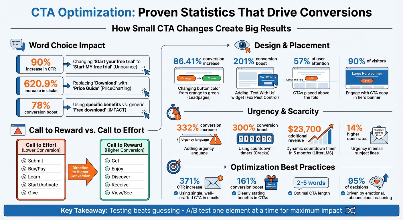
- A single word change in a CTA can increase click-through rates by up to 90%.
- Adding urgency can drive conversions up by 332%.
- Proper CTA placement above the fold grabs 57% of user attention.
Even minor improvements can lead to big results. Let’s dive into the details.
CTA Optimization Statistics: Impact of Word Choice, Design, and Urgency on Conversion Rates
Core Components of Effective CTAs
What Makes a CTA Work
The most effective CTAs stick to the 4Cs Framework: they are Clear (provide specific instructions), Concise (short but impactful), Compelling (evoke emotion or urgency), and Credible (instill trust). By mastering these four principles, you create a smooth, actionable path for your audience.
Another helpful guide is the AIDA Model – Attention, Interest, Desire, and Action. While the CTA is the final step in this process, it only works if the earlier stages – building interest and desire – have been effectively addressed. The design, copy, and emotional triggers surrounding your CTA are just as crucial as the button itself. Together, these elements create what’s called the Context for Action (CFA), making the decision to click feel natural and effortless.
Now, let’s dive into how action verbs can supercharge your CTAs.
Why Action Verbs Matter
Action verbs are the driving force behind effective CTAs. They guide users on what to do while encouraging immediate action. However, not all verbs have the same impact. The secret lies in using verbs that focus on "receiving" over "giving" – for example, "Get" or "Discover" tends to feel more inviting than "Submit" or "Order".
"The copy you use in your buttons has a major impact on your prospects’ decisions. Button color and design are important visual cues… But in the last critical moment, the copy itself is what impacts the prospect’s final decision." – Michael Aagaard, Senior Conversion Optimizer
The data proves it. In one A/B test, Unbounce changed its CTA from "Start your free 30 day trial" to "Start my free 30 day trial", and that single tweak boosted click-through rates by 90% over three weeks. Similarly, PriceCharting, a video game price tracker, replaced "Download" with "Price Guide" and saw a staggering 620.9% increase in clicks.
| Call to Effort (Lower Conversion) | Call to Reward (Higher Conversion) |
|---|---|
| Submit | Get |
| Buy / Pay | Enjoy |
| Learn | Discover |
| Start / Activate | Receive |
| Give | View / See |
To maximize impact, keep CTAs short – ideally 2 to 5 words. Research also shows that placing a single, well-crafted CTA in an email can increase click-through rates by 371%.
Being Specific About Benefits
Beyond structure and word choice, the specificity of benefits can make or break a CTA. Generic phrases like "Click Here" or "Submit" leave users guessing. But when you clearly outline the value they’ll gain, you remove hesitation and build trust.
For example, iMPACT swapped a generic "Free download" CTA for the more specific "Show me how to attract more customers!" and saw a 78% increase in conversions. The difference? The updated version emphasized the outcome, not just the action.
Your CTA should directly highlight your Unique Selling Proposition (USP). Instead of saying, "Download Our Sales Guide", try something like, "Download Your Free Guide to Double Sales." Emotional factors play a huge role – studies indicate that 95% of purchase decisions are driven by subconscious, emotional reasoning. CTAs that tap into these emotions – saving time, achieving goals, or solving problems – create a stronger connection.
"Users pay for your lead magnets with their contact information." – Nitin Deshdeep, Seasoned Digital Marketer, VWO
When you focus on benefits, you’re not just reducing uncertainty – you’re increasing the perceived value of what you’re offering. This makes users far more likely to exchange their information for your lead magnet. To scale this process, consider using content-focused lead magnets to streamline your lead generation efforts.
sbb-itb-b3a7196
Designing CTAs for Maximum Visibility
Visual Design Techniques
A great CTA is useless if it goes unnoticed. The way you design your CTA directly impacts how effectively it grabs attention and converts users. To make your CTA stand out, use high-contrast colors, plenty of whitespace, and interactive elements like hover effects. These design choices ensure your CTA isn’t just seen – it demands attention.
"The CTA should stand out and should be visible clearly. The best thing to make it stand out is to use certain colors such as green, red, or orange with contrast from the background." – Danyal Effendi, Marketer at PureVPN
Here’s proof that design tweaks work: In August 2025, Fox Pest Control swapped out their standard phone-based CTA for a "Text With Us" widget created by Leadferno. The widget’s bold design and clear messaging drove a 201% increase in conversion rates and tripled their leads in just over a month – without any additional traffic. Similarly, Leadpages ran a split test, changing their CTA button color from orange to green. That simple adjustment led to an 86.41% boost in conversions.
Whitespace is another key factor. Surround your CTA with enough empty space to make it pop visually. This "breathing room" helps users immediately recognize the button’s importance.
Size also plays a major role. A good rule of thumb is to make your primary CTA button about 20% larger than your company logo – big enough to stand out but not overpower the page. For mobile users, follow sizing standards: 44 × 44 pixels for Apple devices and 48 × 48 pixels for Android. These dimensions prevent frustrating "rage taps" and improve usability. A quick test? Step back and check if your CTA still catches your eye.
Once your CTA design grabs attention, its placement becomes the next critical factor.
Where to Place Your CTAs
Where you position your CTA can make all the difference in conversions. The prime spot? Above the fold. This is where users spend over 57% of their time and 90% of visitors who read a hero banner also engage with the CTA copy. Pairing your CTA with a strong headline in this area ensures maximum visibility.
For longer pages, include multiple CTAs so users can take action whenever they’re ready. Place buttons after each major section, eliminating the need for users to scroll endlessly to find one. At the end of long-form content, consider a CTA tailored to highly engaged readers, like "Download Your Free Guide" or "Get Started Now".
Strategic placement aligns with user intent, as shown below:
| CTA Intent Level | Best Placement | Example Copy |
|---|---|---|
| Low Intent (Soft) | Top of page (Above fold) | "Learn More", "See How It Works" |
| Mid Intent | Middle of page | "Start Free Trial", "Download Guide" |
| High Intent | Bottom of page | "Buy Now", "Join Today", "Book Call" |
Another effective tactic is using two-step opt-ins. Instead of embedding a form directly on the page, the CTA triggers a pop-up form. This method taps into the "commitment" principle: once users click, they’re more likely to complete the action. While the average landing page conversion rate hovers around 18%, well-placed CTAs can push that number higher.
Strategic design and placement aren’t just about aesthetics – they’re about driving action.
Using Urgency and Exclusivity in CTAs
Adding Time-Sensitive Language
Time-sensitive language taps into our natural fear of missing out. People are more motivated by the thought of losing an opportunity than by the prospect of gaining something new. Including phrases like "Offer ends at midnight" or "Download now before it’s gone" in your CTAs gives users a strong reason to act right away.
"Urgency isn’t about pressure – it’s about priority. Buyers don’t need more time to think, they need a compelling reason to act now." – Martin Boyle, Director of Brand and Communications, Lead Forensics
This approach works. Cracku, an online coaching platform, added countdown timers to its homepage and saw a 300% increase in conversion rates. Similarly, LifterLMS introduced a dynamic countdown timer on their pricing page, which led to an additional $23,700 in revenue over five months. Even email campaigns benefit – subject lines with urgency can boost open rates by 14% and transaction rates by 16%.
The trick is to be specific. Instead of vague phrases like "Limited time offer", use clear deadlines such as "Early-bird pricing ends at 11:59 PM EST tonight". Pairing urgency with scarcity can make your message even more compelling.
Creating Scarcity and Exclusivity
Scarcity builds on urgency by emphasizing limited availability. When something is rare – whether in quantity, access, or time – it becomes more desirable. Phrases like "Only 10 spots left" or "Join the VIP list" trigger FOMO (fear of missing out), a powerful motivator for impulsive decisions, especially among 60% of millennials.
Bud Light used scarcity effectively in February 2018, releasing exactly 20,418 limited-edition commemorative packs to celebrate the Philadelphia Eagles’ Super Bowl win. Whole Whale, a digital agency, applied the concept differently by gating premium resources behind a "Content Locker", which required a subscription. This strategy doubled their website conversion rates.
Combining urgency and scarcity can supercharge results. For example, pairing social proof like "Join 20,000+ students" with a time-sensitive prompt such as "Get instant access today" boosts credibility while encouraging immediate action. However, authenticity is crucial. Fake scarcity – like a "limited time" offer that never expires – can erode trust and harm long-term conversions.
7 Call to Action CTA Best Practices for Guaranteed Landing Page Conversions
Implementing CTAs with Subpage.co
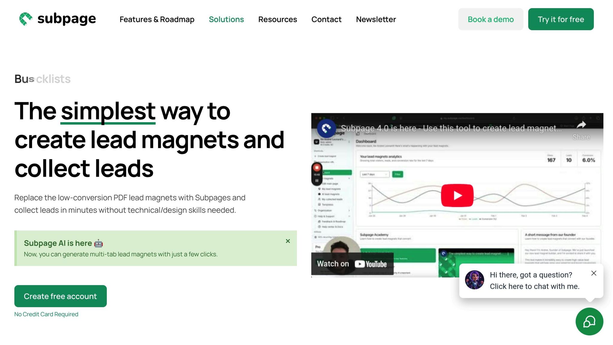
With your design strategies and urgency tactics in place, let’s explore how Subpage.co brings these ideas to life.
Using Pre-Built Templates for CTAs
Subpage.co simplifies the process of creating effective CTAs with its drag-and-drop editor. The platform offers pre-built templates that transform traditional PDF lead magnets into interactive web pages designed to engage and convert visitors. With the Subpage AI generator, you can quickly create multi-tab lead magnets – typically featuring 3–5 tabs – that enhance mobile usability while providing multiple opportunities for CTA placement. These templates are fully mobile-responsive and support embedded videos, forms, and files to keep users engaged.
You can also customize these templates with your brand colors and domain, ensuring the design stays clean and keeps the CTA as the focal point. This approach builds trust and delivers results: users have collectively generated over 1,000 leads in just two weeks using these templates. The templates are specifically structured to maximize CTA visibility and improve conversion rates, making them a powerful tool for boosting lead magnet performance.
Setting Up Lead Collection Features
Subpage.co offers versatile lead capture options to suit different needs. You can use gated blocks to restrict access to premium resources like industry reports or exclusive templates, encouraging visitors to submit their information. The platform also includes pop-ups and top bars that grab attention as users navigate your lead magnet. Combining gated content with video has been shown to increase sign-up rates by up to 400% and boost conversions by over 86%.
To streamline lead management, Subpage.co integrates seamlessly with your existing marketing tools. Use native Zapier integrations or webhooks to automate the flow of lead data into your CRM or email marketing platform. The free plan includes access to 5 templates, supports up to 5 lead magnets, and offers 7-day analytics. For $19 per organization per month, the Premium plan removes these limits and adds whitelabeling options.
Tracking and Improving CTA Results
Subpage.co’s analytics dashboard provides detailed insights into your CTAs, tracking click-through and conversion rates across formats like embedded forms, pop-ups, and gated content. This data helps you test and refine elements – such as button colors or headline phrasing – in real time.
"By tracking CTA performance metrics such as click-through rates and conversion rates, you gain valuable insights into the effectiveness of your blog content and overall marketing efforts." – Subpage.co
For multi-tab lead magnets, the analytics reveal which sections are driving the most engagement. This allows you to strategically place high-intent CTAs alongside softer calls to action. You can export lead data via CSV or sync it automatically through webhooks to monitor long-term CRM performance. While the free plan retains data for 7 days, the Premium plan provides unlimited access to historical analytics. This real-time tracking ensures every adjustment you make aligns with your goals for improving lead conversion.
When testing changes, focus on one variable at a time to identify what truly impacts results. These insights will guide ongoing refinements, helping you continually improve your CTA performance and drive more conversions.
Conclusion
To increase lead magnet conversions, focus on using action-oriented language, highlighting clear benefits, and reducing friction. As Stacey Corrin from SeedProd wisely says, "The best CTAs come from testing, not guessing". Data backs this up: clearly stating the benefit in your CTA can boost conversions by up to 161%, while urgency-driven language can drive a staggering 332% increase.
But it’s not just about the words – visual design plays a big role too. High-contrast colors make your CTAs impossible to ignore, and placing them strategically ensures they grab attention at the right moment. Every visual choice should reinforce your message and guide users toward taking action.
If technical hurdles are holding you back, tools like Subpage.co can make the process easier. With pre-built templates, drag-and-drop functionality, and integrated analytics, you can create conversion-ready lead magnets quickly. If you need inspiration, check out these lead magnet ideas to get started. Plus, the platform’s tracking features let you analyze performance and make data-driven adjustments.
Start testing today. Compare a benefit-driven CTA with your current one, or tweak placement and urgency language to see what resonates. Even small changes can lead to big improvements – just look at how PriceCharting saw a significant boost in click-through rates by refining its CTA.
FAQs
Why do action verbs make CTAs more effective?
Action verbs can make your calls-to-action (CTAs) more compelling by sparking urgency and motivating users to act right away. Words like download, claim, or get are straightforward and engaging, clearly telling users what to do next. This kind of clarity often translates into better engagement and higher conversion rates.
When you use strong, actionable language, you’re essentially guiding users toward interacting with your lead magnet – whether that’s downloading a checklist, accessing a whitepaper, or signing up for exclusive content.
Why should CTAs be placed above the fold?
Placing your CTA (Call-to-Action) above the fold ensures it grabs attention immediately when visitors land on your page. This prime placement makes your offer one of the first things users notice, increasing the likelihood of engagement right from the start.
When your CTA is easy to spot, you minimize the chance of it being overlooked as users scroll through the page. This straightforward strategy can lead to higher conversion rates by encouraging users to take action without hesitation.
How does creating urgency help improve lead magnet conversions?
Urgency is a powerful motivator when it comes to lead magnet conversions. It pushes users to act quickly by creating a sense of immediacy. Tapping into the fear of missing out (FOMO) can be an effective way to encourage faster decision-making.
For instance, phrases like "Download now – offer ends soon!" or "Only 10 spots left!" introduce scarcity, making users feel like they need to act before it’s too late. When applied carefully, this approach can lead to higher engagement and better conversion rates. Urgency isn’t just a tactic – it’s a key part of crafting compelling calls-to-action.