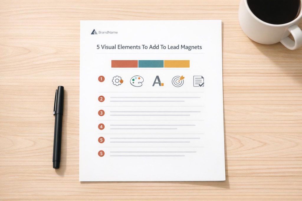
5 Visual Elements To Add To Lead Magnets
Want more leads? Your lead magnet’s design might be the missing link.
Well-designed lead magnets don’t just look good – they build trust and drive conversions. By focusing on five key visual elements, you can turn an average resource into a high-performing lead generator with these lead magnet ideas:
- Logos: Boost brand recognition and credibility with consistent logo usage.
- Brand Colors: Use colors strategically to create emotional connections and improve readability.
- Typography: Select clean, readable fonts that reflect your brand’s personality and guide attention.
- Icons and Graphics: Simplify complex ideas and break up text-heavy sections with visual aids.
- White Space: Avoid clutter and highlight key elements with proper spacing.
Want proof? Companies like Platinum Skin Care and Backlinko have seen conversion rates soar by refining their lead magnet designs. Platforms like Subpage.co make it easy to create polished, professional lead magnets without design expertise.
Keep reading to learn how to apply these elements and boost your lead magnet’s effectiveness.
5 Essential Visual Elements for High-Converting Lead Magnets
1. Logos
Builds Brand Recognition
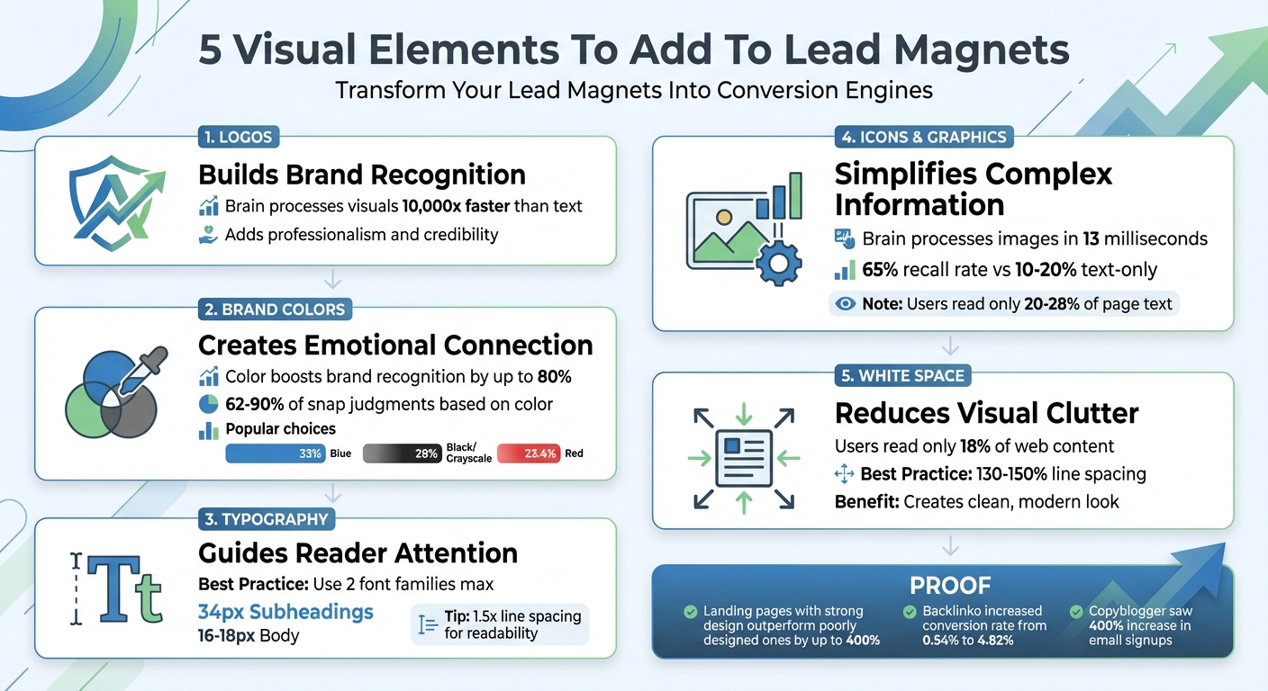
Your logo plays a key role in making your brand instantly recognizable. It’s often the first thing people notice in your lead magnet, serving as a visual shortcut to your brand. Considering that the human brain processes visuals 10,000 times faster than text, your logo provides an immediate connection to your company even before someone starts reading. This quick recognition ties the resource to your brand and reinforces your identity.
Consistently using your logo across platforms – your website, emails, and social media – helps strengthen this recognition. As Beacon.by explains:
"Being consistent across your branding helps to build trust with your target audience".
This consistency not only makes your brand more memorable but also increases the likelihood of conversions by creating a seamless and trustworthy experience.
Adds Professionalism and Credibility
A well-designed logo does more than just look good – it signals professionalism. When placed prominently in your lead magnet, it acts as a stamp of credibility. Pairing your logo with elements like impressive stats, media mentions, or testimonials on your opt-in page further solidifies your authority. For brands with a personal touch, combining your logo with a photo of the brand owner can add a relatable, human element that builds trust.
This layer of credibility reassures potential leads that your resource comes from a reliable and reputable source, setting the tone for a positive brand experience.
Maintains Consistent Branding
Your lead magnet should feel like an extension of your brand, not a one-off document. Using a high-quality logo file is crucial – low-resolution images pulled from social media can appear pixelated and detract from your credibility. To ensure uniformity, follow steps to create effective lead magnets by establishing a style guide that outlines logo placement, color schemes, and tone. Whether your brand is casual, approachable, or highly professional, your logo should reflect that vibe to maintain a cohesive look and feel.
Platforms like Subpage.co make it easy to manage these elements, ensuring your branding remains polished and consistent across all your lead magnets.
sbb-itb-b3a7196
2. Brand Colors
Builds Brand Recognition
Did you know your brain processes color in less than 90 milliseconds? That’s lightning fast. By using consistent brand colors in your lead magnets, you’re leveraging a powerful tool for recognition. Studies reveal that color can boost brand recognition by up to 80%. It’s a simple yet impactful way to make your content memorable.
Look at the world’s most recognizable brands: 33% use blue, while black or grayscale comes in at 28%, and red follows at 23.4%. These choices are intentional. When your lead magnet mirrors the colors on your website, emails, and social media, it creates an instant connection. Even before reading a word, people associate the resource with your brand, setting the stage for a polished and cohesive visual experience.
Improves Visual Appeal and Readability
Color isn’t just about making things pretty – it plays a big role in readability. A balanced brand palette typically includes 1–2 primary colors, 2–3 secondary colors, and neutral tones like grays, blacks, and whites. For headers and backgrounds, stick to 2–3 core colors, and use a high-contrast accent color for call-to-action buttons or links. This keeps your design clean and attention-grabbing.
Adding colored callout boxes with a 2px–5px border can break up long sections of text, making your content easier to digest. These small design tweaks not only enhance readability but also reinforce your brand identity throughout your materials.
Creates Emotional Connection with Readers
Colors have a powerful impact on emotions, shaping how people perceive your content. In fact, between 62% and 90% of snap judgments about a product are based on color, and 85% of consumers say color is the main reason they choose a product .
Different colors evoke different emotions. For example:
- Blue conveys trust and stability, ideal for industries like finance or tech.
- Red signals urgency and energy, making it perfect for time-sensitive promotions.
- Green represents growth and health, commonly used in wellness or eco-friendly brands.
Emily Agan, a Squarespace Website Designer, puts it perfectly:
"Your brand colors are the visual first impression of your business. Before someone even reads your headline or clicks your contact button, they’ve already formed an opinion based on how your site looks."
Choose colors that align with your brand’s values and the emotions you want to evoke. For example, blue works well for IT or finance to inspire confidence, while red can spark excitement for food and beverage brands.
Maintains Consistent Branding
Consistency is key. Document your hex codes and establish clear guidelines for how your colors should be used. This ensures that every piece of content – from your website to creating a checklist lead magnet – feels cohesive, which builds trust with your audience. When they see the same colors across all your materials, they know they’re dealing with a reliable and professional brand.
To make sure your color choices are accessible, especially for text-heavy designs, use tools like the WebAIM Contrast Checker. Platforms like Subpage.co can also simplify the process by helping you apply your brand colors consistently across all your materials, no design skills required.
3. Typography
Reinforces Brand Identity
Typography is more than just a design choice – it’s a key player in shaping how people perceive your brand. Just like your logo or color palette, the fonts you choose tell a story about your business. Are you aiming to appear polished and trustworthy? Or perhaps modern and approachable? As Vik Chadha, Founder & CEO of Magnt, puts it:
"Typography communicates personality before anyone reads a word. Your font choices say a lot about your brand."
Each font category carries its own vibe. Serif fonts, for example, evoke tradition and reliability – perfect for professional or high-end brands. Sans-serif fonts are clean and modern, while script fonts add a touch of elegance. Display fonts? They’re all about grabbing attention. The right font choices not only reflect your brand’s personality but also enhance the way your audience engages with your content.
Improves Visual Appeal and Readability
Typography isn’t just about making things look good – it’s about making your content easy to read and enjoy. A great example of this comes from a B2B legal consultancy in late 2025. They managed to slash their bounce rate from 85% by tweaking their article designs. By increasing the body font size to 18px and adding clear subheadings, they boosted engagement by a whopping 140% in just two weeks.
To keep things simple, stick to no more than two font families – one for headings and one for body text. For digital content, consider these standard sizes: 34px for headings, 24px for subheadings, and at least 16px for body text (18px is even better). Also, aim for line spacing that’s 1.5 times your font size. This gives your text room to breathe and makes it easier on the eyes.
Guides Reader Attention and Hierarchy
Typography also acts as a guide, helping readers navigate your content effortlessly. You’ve got about 10 seconds to convince someone they’re in the right place, so a clear visual hierarchy is essential.
Use three levels of text to structure your content: large, bold headings for main ideas, medium-sized subheadings for supporting points, and standard text for the body. If your main message isn’t standing out, revisit your hierarchy. A simple spacing tip: use twice as much space above a heading as below it. This visually links the heading to the content that follows.
Maintains Consistent Branding
Consistency is key to building trust. When your typography looks the same across all your materials – whether it’s a lead magnet, a website, or an email – your audience instantly recognizes your brand. To achieve this, document your font choices and spacing in a style guide. This ensures a cohesive look and feel across all platforms.
For accessibility, make sure your text has a contrast ratio of at least 4.5:1 against its background (3:1 for larger text). Tools like Subpage.co make it easy to apply these typography standards across your materials, even if you’re not a design pro. By aligning your typography with your other visual elements, you create a lead magnet that’s not just functional but also visually compelling.
Designing A Lead Magnet In Canva – 2024 Process + Tutorial
4. Icons and Graphics
Alongside logos, colors, and typography, thoughtfully designed icons and graphics can make your lead magnets stand out by clarifying ideas visually and keeping your audience engaged.
Simplifies Complex Information
Did you know your brain can process an image in just 13 milliseconds? That’s way faster than it takes to read even a single word. This makes icons and graphics ideal for breaking down complicated concepts. For example, a shield icon can instantly convey "security" without requiring a sentence to explain encryption protocols.
Infographics and process diagrams take this a step further. Instead of relying on lengthy text to explain workflows, a flowchart or series of icons can illustrate multi-step processes at a glance. Similarly, bar charts and comparison tables transform raw data into easy-to-understand visuals, helping readers grasp performance metrics and statistics without wading through dense paragraphs. These visuals not only simplify information but also set the stage for content that’s easier to absorb.
Breaks Up Text-Heavy Sections
Here’s a surprising fact: users typically read only 20–28% of the text on a page. When faced with large blocks of text, many readers tune out, associating it with effort. Icons and graphics can break up these sections, offering visual relief and allowing readers to quickly grasp key points without reading every word.
The impact on memory is striking. Text-only content has a recall rate of just 10–20% after three days. Add a relevant image, and retention jumps to 65%. This is especially important for lead magnets viewed on mobile devices, which now account for over 82% of landing page traffic. On smaller screens, breaking up dense content with graphics is crucial for maintaining engagement. Consistent icon styles further enhance the polished, professional feel of your material.
Maintains Professional Consistency
Inconsistent or poorly chosen graphics can undermine credibility. To keep your lead magnet looking sharp, ensure all icons share the same stroke weight, corner radius, and color scheme. Using SVG files is a smart choice – they stay crisp at any size, have small file sizes, and can adapt to dark mode with CSS styling.
Avoid using raw screenshots. Instead, enhance them with overlays, arrows, or numbered labels to guide readers’ attention to key details. These small adjustments turn simple images into effective teaching tools. When your graphics work together as a unified system, your lead magnet projects professionalism and builds trust – exactly the impression you want to leave.
5. White Space
White space, the blank areas surrounding design elements, plays a key role in making your design clear and easy to navigate. Alongside logos, colors, typography, and icons, it ensures your layout feels balanced and user-friendly. Think of it as the breathing room your design needs to shine.
Reduces Visual Clutter
Overloading your lead magnet with text, images, or graphics can overwhelm readers before they even begin. White space acts as a buffer, keeping design elements from feeling cramped. There are two types of white space: micro white space, which refers to the small gaps between text lines or icons, and macro white space, the larger spaces between major sections like columns or graphics. Together, these types prevent the dreaded "wall of text" effect that can discourage readers.
Here’s a key insight: internet users typically read only about 18% of a web page’s content. White space helps them quickly locate the information they need by separating topics and grouping related ideas. As Josh Gallant, SEO Lead at Foundation Marketing, explains:
"When you give your design elements room to breathe, they’ll serve their intended purpose much more effectively".
Directs Focus to Key Elements
White space can also guide attention. The more space surrounding an element, the more it stands out – making it especially effective for highlighting Call to Action (CTA) buttons or opt-in forms. By surrounding your primary CTA with generous macro white space, you ensure it grabs the user’s attention first. This aligns with earlier tips about maintaining clarity and focus.
Strategically placed white space can also work with natural scanning patterns, like the Z-layout. This pattern moves the eye from the top-left to the top-right, down through the center, and finishes at the bottom-right. Placing your most important elements along this path, while using white space to define these zones, helps guide readers smoothly through your content. And remember, white space doesn’t have to be white – it can be any color, pattern, or image that creates separation between elements.
Creates a Clean, Modern Look
A minimal design approach, with fewer stock images and less clutter, gives your lead magnet a polished and professional feel. Generous white space is a hallmark of modern design, often associated with sophistication and quality. In contrast, older designs that cram every inch with text or shapes can appear chaotic and outdated. Clean, open layouts not only look better but also build trust with your audience.
For better readability, aim for line spacing that’s 130% to 150% of your font size. With mobile devices accounting for over 55% of global web traffic as of May 2021, maintaining consistent white space across all screen sizes is crucial. Proper spacing ensures your content doesn’t overlap or push important elements off-screen. Combined with your brand’s colors and typography, white space enhances the overall professionalism of your lead magnet.
Conclusion
An effective lead magnet doesn’t just capture attention – it builds trust and drives conversions. By using a professional logo, consistent brand colors, clear typography, meaningful icons, and strategic white space, you can create a design that resonates with your audience. Considering that people process visual information 60,000 times faster than text, the way your lead magnet looks could be the deciding factor in whether someone shares their contact details. Every visual element – from logos to white space – works together as part of a unified strategy.
The impact of these design choices can be dramatic. Landing pages with strong UX and design can outperform poorly designed ones by up to 400%. Real-world examples back this up. In 2021, Brian Dean from Backlinko boosted his conversion rate from 0.54% to 4.82% by using highly targeted, professionally designed lead magnets. Similarly, Copyblogger saw nearly a 400% increase in email signups after switching to a bundled package of high-value ebooks, showcased with clean and engaging design elements on their registration page. These examples highlight how thoughtful design can turn lead magnets into powerful conversion tools.
Experts agree on the importance of design in bridging the gap between your audience’s needs and your offer. Aaron Whittaker, Vice President of Demand Generation at Thrive Internet Marketing Agency, states:
"A well-designed landing page bridges your audience’s needs and your offer. It needs to showcase the value of your offer while making the conversion process smooth and intuitive".
The good news? You don’t need to be a design expert to create visually appealing lead magnets. Platforms like Subpage.co make it simple. With a Notion-like editor, you can design professional whitepapers, checklists, and gated content pages in minutes – no design software required. The tool allows you to apply your brand colors, add icons and graphics, and maintain clean layouts with ease. Plus, it includes built-in lead collection tools, analytics, and integrations to help you turn visitors into leads effortlessly.
You can start for free with up to five lead magnets or choose the $19/month plan for unlimited custom designs and integrations. By streamlining the design process, tools like Subpage.co help transform your lead magnets from polished visuals into effective conversion engines.
FAQs
Which visual element should I fix first?
Clear up any pixelated images right away. Blurry visuals can harm the professionalism and trustworthiness of your lead magnet. High-quality, sharp images not only look better but also leave a stronger impression, making your content more appealing overall.
How do I choose brand colors that are readable?
To make sure your brand colors are easy to read, focus on contrast and clarity. Pick colors that not only reflect your brand’s identity but are also visually distinct and effective. High-contrast color combinations are key to improving readability, especially for important elements like lead magnets. Choose shades that keep your content both memorable and accessible for your audience.
What’s the easiest way to add icons and keep them consistent?
To keep your icons looking consistent, stick to a single style – either outline or filled. Make sure the stroke weight, corner style, and size are uniform across all icons. Following these guidelines will create a polished and unified appearance.