Why Gated Forms Fail and How to Fix Them

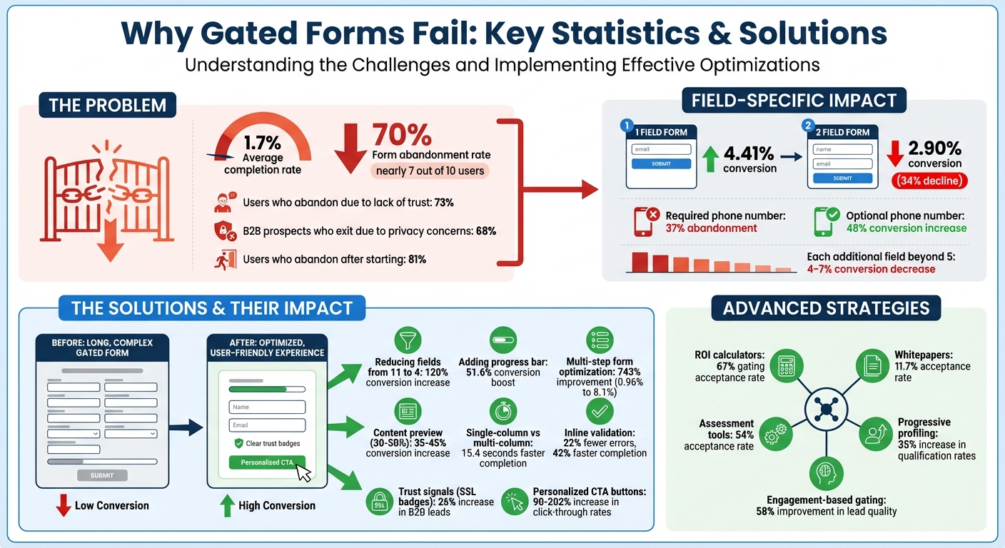
Gated forms often fail because they create too much friction for users, leading to low conversion rates. On average, only 1.7% of users complete these forms, and nearly 70% abandon them midway. Common issues include:
- Too many fields: Asking for excessive details reduces completion rates. For example, requiring a phone number can lead to a 37% drop in conversions.
- Poor content alignment: Users won’t trade their information for content that feels generic or low-value. Offering previews can improve trust and boost conversions by up to 45%.
- Design flaws: Complicated layouts, slow load times, and a lack of trust signals (like privacy policies) further discourage users.
To fix these problems:
- Simplify forms: Limit fields to essentials like name and email. Use multi-step forms with progress indicators for longer requests.
- Highlight the value: Use clear, benefit-driven headlines and visuals to show why the content is worth the trade.
- Improve usability: Optimize for mobile, use single-column layouts, and add trust signals like SSL badges and privacy policies.
- Use advanced strategies: Implement behavior-based gating (e.g., showing forms only to engaged users) or replace static content with interactive tools like calculators or quizzes.
Gated Form Conversion Statistics and Optimization Impact
Common Problems That Cause Gated Forms to Fail
Too Many Form Fields
When forms ask for too much information, users are less likely to complete them. This happens because every extra field increases the mental effort required, leading to what’s known as “form fatigue.” Research shows that most people can only juggle 4–7 items in their working memory at one time. For instance, a simple form with just one field converts at 4.41%, but adding a second field drops the conversion rate to 2.90% – a sharp 34% decline. And the more fields you add beyond five, the worse it gets, with conversion rates decreasing by about 4% to 7% per additional field.
Marcus Espersen, Growth Manager at Sleeknote, shared a striking example of this. By cutting the number of fields in a form from 11 to just 4, his team achieved a 120% boost in conversions. His advice is clear:
Every extra field you add to your form is another reason for visitors to bounce. Keep your forms lean, intentional, and aligned with user expectations.
Certain fields, like phone numbers, can be especially problematic. Making the phone number a required field causes 37% of users to abandon the form altogether. But when it’s optional, conversions can increase by as much as 48%. Beyond just the number of fields, a mismatch between what’s promised and what’s delivered can also discourage users from completing forms.
Content That Doesn’t Match the Ask
Users will abandon a gated form if the content offered doesn’t seem worth the personal information being requested. People make quick decisions about whether the value of the resource – like interactive lead magnets or PDF checklists – outweighs the cost of sharing their details. If the promised content turns out to be generic or outdated, such as an “Industry-Defining Report” that’s really just a recycled PowerPoint, it not only reduces conversions but also damages trust for future campaigns. To avoid this, marketers should follow a structured process to create effective lead magnets that provide genuine value.
One way to address this is by letting users preview part of the content before they hit the gate. Studies suggest that showing 30–50% of the content upfront can increase conversions by 35–45%. However, even the most valuable content can fail to convert if the form itself is poorly designed or difficult to use.
Design and Usability Issues
Effective forms aren’t just about the right number of fields or matching content value; they also require thoughtful design and usability. Trust plays a huge role here – 73% of users have abandoned forms because they didn’t trust the site with their information. Missing elements like a privacy policy or security badges can be a dealbreaker, with 67% of users refusing to complete a form without a clear privacy statement and 29% citing security concerns as their reason for abandoning the process.
Technical issues can make matters worse. A one-second delay in page load time can reduce conversions by 7%, while multi-column forms take an average of 15.4 seconds longer to complete than single-column layouts. Mobile users face even more challenges, as over 60% of visitors now browse on mobile devices. Forms designed primarily for desktop – featuring tiny tap targets, incorrect keyboard setups, or layouts requiring horizontal scrolling – create unnecessary friction. On top of that, overly strict validation rules that penalize incomplete entries can frustrate users further.
Katie Woon, Head of Marketing at PlatoForms, sums it up perfectly:
A lead capture form isn’t just a set of fields. It’s a psychological journey. It’s a value exchange.
sbb-itb-b3a7196
How to Fix Gated Forms
Reduce Form Fields
Simplify your forms by trimming unnecessary fields, which can significantly improve conversion rates. Start by reviewing each field and categorizing them as "Essential", "Useful", or "Nice-to-have." Keep only the essential fields in the initial form – like name and email – and save the "useful" ones for later follow-ups. Using progressive profiling, you can gather additional details over time, which has been shown to increase qualification rates by 35%.
If your form exceeds five or six fields, consider breaking it into multiple steps with a progress indicator. This approach can work wonders. For example, Venture Harbour turned a single-page consulting inquiry form into a multi-step process and saw their conversion rate jump from 0.96% to 8.1% – a 743% improvement. Similarly, Empire Flippers added a progress bar and experienced a 51.6% boost in conversions over 47 days.
Streamlining fields can also mean using features like browser autofill or consolidating inputs. For instance, a single "Full Name" field works well since 99% of visitors provide their full name this way. Optional fields, like phone numbers, can further reduce friction and improve completion rates.
By making your form shorter and easier to complete, you’ll create a smoother user experience. Next, it’s time to emphasize the value of what you’re offering.
Make the Value Clear
Once your form is simplified, shift your focus to showcasing the immediate benefits users will receive. Your headline and copy should clearly communicate what they’ll gain. Instead of vague phrases like "Download Our Ebook", go for something more specific and results-driven, such as "25 Email Templates That Booked 847 Sales Calls". Headlines like this can have a dramatic impact on conversions.
Visual elements and content-focused lead magnets also play a key role in making your offer more appealing. Use high-quality mockups – like ebook covers or report previews – to give your digital asset a more tangible feel. Adding trust-building elements like testimonials, client logos, or download counts near the form can further persuade users; after all, 92% of consumers read testimonials before making a decision. Offering a preview of your content – like 30–50% of the material or a detailed table of contents – can increase conversions by 35–45%.
Don’t overlook the importance of your call-to-action (CTA). Replace generic "Submit" buttons with action-oriented, first-person phrasing like "Get My Free Report" or "Start My Trial." These types of CTAs not only clarify what the user gets but can also increase click-through rates by up to 90%. A reassuring note below the form – such as "We’ll send the guide and occasional tips. No spam, ever" – can further build trust.
Fix Form Design and Usability
Even the most compelling form will fall short if it’s difficult to use. A user-friendly design ensures that the reduced friction and visible value you’ve built into your form translate into higher completion rates. Start with a single-column layout, arranging fields vertically for a natural top-to-bottom flow. Research shows single-column forms are completed up to 15.4 seconds faster than multi-column ones. Place labels above input fields to make the process even smoother.
For mobile users – who now make up a large share of web traffic – optimize the experience by using HTML5 input types (like type="tel" or type="email") to trigger the correct virtual keyboards. This reduces input errors by about 31%. Ensure buttons and input fields are at least 44×44 pixels to accommodate finger sizes, and set font sizes to a minimum of 16px to prevent mobile browsers from zooming in unnecessarily.
Inline validation is another game-changer. Providing real-time feedback as users fill out the form can cut errors by 22% and reduce completion times by 42%. Use "validate on blur" so error messages only appear after users leave a field, avoiding disruptions while they type. Lastly, include trust signals – like SSL badges, privacy policy links, or security icons – near the submit button. These signals can increase B2B lead submissions by 26% and improve mobile checkout completion rates by 17%.
Here’s Why You Need to Use Partially Gated Content
Advanced Gating Methods
Taking basic gating techniques a step further, these advanced strategies focus on tailoring user experiences and leveraging interactive tools to engage visitors while collecting valuable data.
Adaptive Gating Based on User Behavior
Imagine customizing forms based on how visitors interact with your site. That’s the idea behind adaptive gating – it adjusts the gating experience depending on user behavior, traffic source, or previous interactions. For example, you can skip forms for returning visitors who’ve already shared their details or trigger a gate only after someone has viewed three blog posts or spent a significant amount of time on a page. This approach acknowledges that a first-time visitor browsing your homepage has different intentions than someone repeatedly visiting your pricing page.
Timed gating is another effective tactic. Instead of blocking access right away, you allow users to preview 30–50% of your content – like an executive summary – before asking them to register for the full report. This builds trust by showcasing value upfront and can boost conversion rates by 35–45% compared to immediate hard gates. Similarly, engagement-based gating waits for users to hit specific interaction thresholds, such as multiple page views or extended time on site, which can result in a 58% improvement in lead quality.
Bynder, a digital asset management SaaS provider, took a unique approach with 6sense‘s intent data solution. They identified anonymous buyers showing interest – even before those visitors filled out a form. By targeting high-intent accounts, Bynder saw a 250% increase in their outbound pipeline and achieved full ROI on the tool within just four months. This behavior-driven strategy ensures you focus on visitors most likely to convert.
Next, let’s look at how interactive content can replace traditional static downloads for even better results.
Interactive Content Instead of Static Downloads
Static resources like PDFs and whitepapers have long been go-to options for gated content. But interactive tools – such as ROI calculators, quizzes, and assessments – are proving to be much more effective. These tools create a two-way interaction: users receive instant, personalized results (like a cost estimate or benchmark), while you gather richer data for lead qualification. For instance, ROI calculators boast a 67% gating acceptance rate, compared to just 11.7% for whitepapers. Similarly, assessment tools perform strongly, with a 54% acceptance rate.
A great example is VenturePact, which launched a mobile app cost calculator in 2025 using Outgrow. This tool addressed a key buyer concern – pricing – and delivered impressive results. Within two weeks, it increased website traffic by 15%, boosted conversion rates by 28%, and generated over 11,000 leads. Users got immediate value with a price estimate, while VenturePact collected detailed insights about their project needs and budgets.
Interactive content also taps into psychological principles. For example, people are more invested in outcomes they help create (known as the IKEA Effect) and are more likely to complete experiences they’ve started (the Zeigarnik Effect). Platforms like Subpage simplify the creation of these engaging tools, enabling you to build calculators, assessments, and other interactive experiences without requiring design or coding expertise. These tools not only generate leads but also offer real, tangible value to users.
Implementation and Testing
Once you’ve made adjustments, it’s crucial to implement them thoughtfully and evaluate their impact. The trick lies in aligning your gating strategy with the buyer’s journey while keeping a close eye on metrics to ensure your efforts are paying off.
Match Gating to Funnel Position
Not every piece of content should be gated, and the style of gating should vary depending on where visitors are in their buying journey. At the awareness stage (top of funnel), prioritize accessibility. Leave blog posts, infographics, and how-to videos ungated. This approach builds trust, boosts SEO, and positions your brand as a helpful resource.
As visitors move to the consideration stage (middle of funnel), they begin actively researching and comparing options. This is the right time for soft gates or timed gates. Offer lead magnet ideas like ebooks, webinars, templates, or white papers that tackle specific challenges. Timed gating – where users can preview a portion (30–50%) of the content before encountering a form – can improve conversions by 35–45% compared to gating everything upfront. Keep forms concise, asking for just 2–4 fields, to focus on nurturing the relationship rather than immediately qualifying leads.
By the decision stage (bottom of funnel), you’re engaging high-intent buyers who are ready to evaluate vendors. Hard gates are fitting for content like product demos, case studies, ROI calculators, and free trials. Since these users are closer to making a purchase, they’re more willing to provide details such as company size, budget, or implementation timeline. Leads generated through gated content at this stage convert to sales-qualified leads 36% more often than those from other sources.
Always ensure the perceived value of your content outweighs the information you’re asking for. For example, requiring a phone number for a simple checklist might deter users. Instead, use progressive profiling: start with minimal information (like an email address) and gather more details in subsequent interactions as the lead progresses through the funnel.
Once your gating strategy aligns with the buyer’s journey, it’s time to test its impact.
Measure Performance and Run Tests
After tailoring your gating strategy, measure key metrics to identify areas for improvement. Focus on these core metrics for every gated form: form views, form starts, completion rate (completions divided by starts), and abandonment rate (1 minus completion rate). These metrics reveal bottlenecks. For instance, if you’re getting plenty of views but few starts, your headline or value proposition might need tweaking. If users start the form but don’t finish, there may be friction in the process.
Dive deeper into field-level data to pinpoint specific issues. For example, if 37% of visitors abandon the form after being asked for their phone number, consider removing or repositioning that field. Also, track how long it takes users to complete the form – if a 30-second form is taking three minutes, confusion may be the culprit.
Lead quality is just as important as quantity. Keep an eye on the percentage of fake entries, which can plague up to 79% of B2B leads. If you’re seeing placeholders like "[email protected]" or "123-456-7890", it might mean your form feels too invasive or your content isn’t compelling enough. Additionally, track downstream metrics like the percentage of marketing-qualified leads (MQLs) that convert to sales-qualified leads (SQLs) and the revenue generated per visitor from each gated asset. A form generating 100 leads with a 5% SQL conversion rate can be far more impactful than one generating 500 leads with only a 1% conversion rate.
Don’t overlook technical factors. Slow load times – just a 1-second delay – can hurt conversions. With 82.9% of users potentially accessing content on mobile devices, ensure your forms are mobile-friendly to avoid losing out on potential leads.
When running A/B tests, focus on one variable at a time. Test changes like headline text, the number of form fields, CTA button design, landing page layout, or offer positioning. Run tests for at least 1–2 weeks and aim for 100–150 conversions per variant to ensure reliable results. High-impact adjustments can yield impressive results – for instance, reducing form fields from seven to three can boost conversions by 19.6%, while replacing a generic "Submit" button with a personalized "Get My Guide" can increase conversions by 202%.
If you’re using tools like Subpage, built-in analytics can help you track these metrics and export lead data for deeper analysis. Integrating with platforms like Salesforce or HubSpot allows you to monitor the ROI and close rates of your gated content over time.
Conclusion
Gated forms often struggle when friction outweighs the perceived value they offer. Research reveals that 81% of users abandon forms after starting them, with 68% of B2B prospects exiting due to privacy concerns. For instance, requiring a phone number can drastically reduce conversion rates.
The solutions are straightforward but require consistent effort. Start by cutting unnecessary form fields – reducing from 11 to 4 fields can lead to a 120% increase in conversions. Use headlines that clearly highlight benefits, and ensure mobile optimization, as 40% of B2B research now happens on mobile devices. Adjust your gating strategy based on the buyer’s journey: leave awareness-stage content open, introduce soft gates mid-funnel, and reserve hard gates for decision-stage content. These strategies show how even small design tweaks can significantly impact conversions.
But improving your forms isn’t a one-and-done task. Buyer behavior is constantly shifting – 89% of B2B buyers now rely on generative AI for research. Despite this, only 17% of marketers actively A/B test their forms, leaving many opportunities untapped. Companies that embrace testing can achieve an average 49% boost in conversion rates. Regular testing isn’t optional; it’s critical for staying competitive.
Track metrics like field-level abandonment and lead quality, test one variable at a time, and measure downstream outcomes like lead-to-opportunity conversions. Since buyer expectations are always evolving, ongoing testing ensures your forms remain effective and relevant.
FAQs
When should I gate content vs leave it ungated?
Gating content is a smart move when your main goal is lead generation. By offering high-value resources like whitepapers or webinars, you can encourage users to trade their contact details. But if your focus is on brand awareness, SEO, or driving maximum reach, ungated content is the way to go. It opens the door to a wider audience and increases traffic.
To strike a balance, you might want to gate only your most premium content. Another option? Use adaptive strategies like timed gating – letting users access content initially, then prompting for details later. This approach can boost conversions without jeopardizing audience trust.
What form fields should I ask for first?
When designing a form, start with the basics: name and email address. These are straightforward and require minimal effort from users, making it easier for them to get started. By keeping the initial fields simple, you create a low-friction experience that encourages users to complete the form.
How do I tell if my gated form is hurting lead quality?
If you’re wondering whether your gated form is impacting lead quality, take a closer look at the submissions. Watch for fake entries, spam, incomplete or duplicate information, and low-intent leads. To cut down on these issues, consider using validation tools and adding qualifying questions to your form. These measures can help you attract more relevant leads while minimizing unhelpful submissions.