Why Your Lead Magnets Aren’t Converting: 5 Fixes
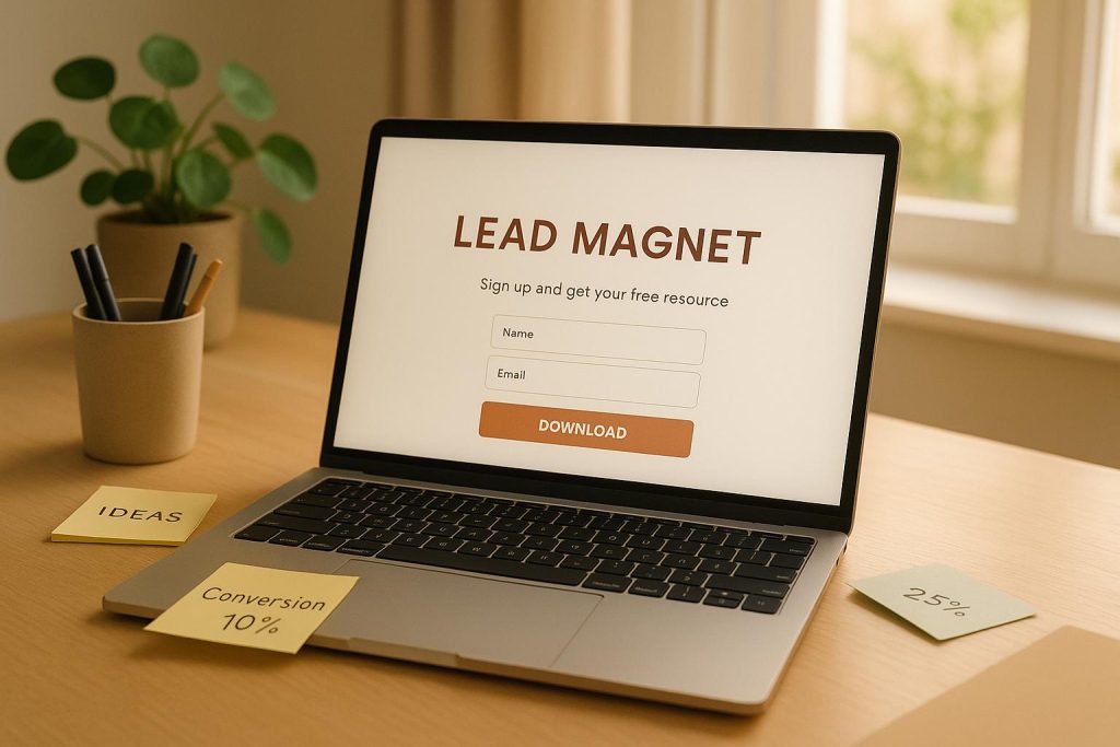
Struggling with low lead magnet conversions? You’re not alone – average landing pages convert at just 6.6%, but top performers exceed 30%. The difference? Strategy. If your lead magnets are underperforming, it’s likely not a traffic issue but a conversion problem. Here are five fixes to improve results:
- Target the right audience: Segment users by their needs and journey stage to create tailored offers.
- Strengthen your value proposition: Address specific pain points with clear, actionable benefits.
- Optimize placement and delivery: Make your lead magnets easy to find and access instantly.
- Improve design and user experience: Simplify layouts, shorten forms, and ensure mobile responsiveness.
- Track and refine: Use data to continuously test and improve your lead magnet performance.
Start implementing these strategies to turn casual visitors into engaged leads.
7 Lead Magnet Landing Page Mistakes That Are KILLING Your Conversions
Fix 1: Target the Right Audience
Getting your lead magnets to convert starts with one key step: reaching the right audience. And that means nailing your audience segmentation.
Why Generic Lead Magnets Miss the Mark
When lead magnets are too broad, they fail to connect with specific audience needs, pain points, or interests. Think about it: offering something like an "Ultimate Marketing Guide" to every visitor might sound appealing, but it’s not practical. A beginner might appreciate a basic educational guide, while someone closer to making a purchase would rather see case studies or pricing comparisons.
Signs you’re missing the mark include low opt-in rates, high bounce rates on landing pages, poor content engagement, and leads that stall out in your sales funnel. This mismatch not only wastes ad spend but also overwhelms your sales team with unqualified leads. The solution? Sharpening your audience segmentation.
How to Break Down Your Audience
Good segmentation turns one-size-fits-all offers into tailored solutions. Start by grouping your audience based on their buyer’s journey stage, demographics, behavior, or traffic source. For instance:
- Awareness Stage: Educational guides work well here.
- Consideration Stage: Comparison charts and product overviews are more relevant.
- Decision Stage: Case studies, product demos, or free trials seal the deal.
You can refine this even further. For example, IT professionals might appreciate technical guides, while executives might prefer tools like ROI calculators. Traffic sources also provide clues: someone who finds you through a Google search for "email marketing tips" likely has different needs than someone who clicks on a social media ad. Companies that focus on segmentation and personalized follow-up have seen conversion rates soar – up to 25–35% higher than industry norms.
Streamline Segmentation with Subpage.co
Subpage.co makes audience segmentation much easier. Its multi-tab AI and customizable templates allow you to design offers that speak directly to different segments. The platform’s analytics tools reveal which groups respond best to your content, while its built-in integrations automatically tag leads based on the specific lead magnet they download. This data feeds directly into your email marketing or CRM systems, giving you the insights needed to fine-tune your strategy.
Fix 2: Strengthen Your Value Proposition
Your value proposition is essentially the promise you make to visitors about what they’ll gain in exchange for their email. When this promise is unclear or lacks appeal, even the most targeted audience might pass on your offer.
Signs Your Value Proposition Needs Work
One of the biggest warning signs? Low opt-in rates. If your landing page is pulling in traffic but conversions are lagging behind, your value proposition might not be hitting the mark. High abandonment rates are another clue that visitors aren’t convinced your offer is worth it.
Other signs include underperforming conversion rates compared to industry benchmarks, feedback suggesting your offer misses the mark on addressing real needs, or analytics showing visitors exiting immediately. Research shows that lead magnets tailored to specific audience pain points outperform generic ones by 25–35%.
Often, the issue comes down to a disconnect between your offer and what your audience actually needs. Titles like "Ultimate Marketing Guide" or vague promises like "Boost Your Business" don’t clearly communicate the value or relevance of the offer.
How to Build a Stronger Offer
A solid value proposition is clear, specific, and focused on delivering results. It should solve a real problem your audience is facing and offer a benefit they can achieve without jumping through hoops.
Start by conducting voice-of-customer research to uncover the most pressing challenges your audience is dealing with. Use surveys, interviews, or other feedback tools to validate these pain points, and then craft a lead magnet that directly addresses them. Using your audience’s own words to describe these issues can make your offer feel even more relevant.
Keep it focused. Instead of trying to solve every problem, zero in on one specific issue and promise a quick, actionable result. For example, instead of offering something broad like "Complete Social Media Strategy", try something more targeted, such as "5-Minute Daily Routine That Doubles Instagram Engagement."
Adding elements like social proof or testimonials can also boost credibility. For instance, a quiz or assessment that helps busy professionals pinpoint their stress style and offers a personalized plan is far more appealing than a generic wellness ebook.
Once your offer is refined, it’s time to test and tweak for maximum impact.
Test and Optimize with Subpage.co
Subpage.co’s Notion-like editor makes it easy to experiment with headlines, descriptions, and calls-to-action through A/B testing. You can create and test multiple variations of your value proposition to find the one that resonates most with your audience.
With Subpage.co’s analytics tools, you can track essential metrics like opt-in rate, abandonment rate, and engagement rate, giving you the data you need to measure what’s working. By following a simple cycle – test, analyze, refine – you can continuously improve your lead magnets. Subpage.co’s templates make it easy to tweak your offer and test different approaches, ensuring your value proposition stays sharp and effective.
Fix 3: Improve Placement and Delivery
Once your value proposition is polished, the next step is making sure your lead magnet grabs attention and is delivered without delay. Even the most enticing offer won’t perform well if visitors struggle to find or access it. The placement of your lead magnet and the method of delivery can have a huge effect on your conversion rates.
Why Placement Matters
Think of placement like prime real estate – where you position your lead magnet can make or break its effectiveness. Well-timed pop-ups, exit-intent overlays, or inline calls-to-action (CTAs) can engage users at the right moment.
For example:
- Pop-ups and exit-intent overlays catch visitors who are about to leave your site, giving you one last chance to convert them.
- Inline CTAs blend seamlessly into your content, offering value exactly when users are engaged.
The trick is to match your placement strategy to user behavior. A visitor who’s spent time scrolling through your content might be ready for your offer, while someone who just landed on your page may need more time before being prompted.
Make Delivery Simple
Once someone opts in, the process of accessing your lead magnet should be as smooth as possible. Every extra step – like additional form fields – risks losing their interest.
Consider this: HubSpot found that reducing form fields from four to three increased conversions by 50%. Small changes like this can make a big difference.
Delivery speed is just as important. Whether it’s a direct download or an instant email, prospects expect immediate access after signing up. Any delay can cause them to lose interest.
And don’t forget mobile users! Your forms and content need to look and function perfectly on smartphones and tablets. Poor mobile design – like oversized forms or tiny buttons – can make your lead magnet practically invisible to mobile visitors.
Here’s a real-world example: In August 2025, a SaaS company saw its conversion rate jump from 5.02% to 8.05% after switching from static PDF downloads to interactive calculators delivered via pop-ups and exit-intent overlays. With instant email delivery and a three-step follow-up, the company boosted qualified leads by 34% and improved lead-to-sale conversions by 22%.
Using Subpage.co’s Delivery Features
If you’re looking for a simple way to put these strategies into action, Subpage.co has you covered. It offers tools like customizable pop-ups, inline widgets, and instant, mobile-friendly content delivery that works seamlessly on any device.
Subpage.co also provides analytics to track key metrics, such as opt-in conversion rates, bounce rates, and form completion rates. With this data, you can pinpoint what’s working and where you’re losing potential leads.
Plus, with its drag-and-drop editor and pre-made templates, testing new approaches is quick and easy. Whether you’re tweaking exit-intent overlays, refining inline CTAs, or optimizing forms for mobile, Subpage.co makes it simple to adjust your strategy based on real-time performance insights.
sbb-itb-b3a7196
Fix 4: Improve Design and User Experience
A poorly designed website or clunky user experience can completely derail your conversion efforts. Even if your targeting is flawless and your value proposition is spot-on, visitors will walk away if your page feels unprofessional or is hard to navigate. Design flaws create unnecessary friction, often driving away potential leads before they even have a chance to engage.
Common Design and UX Problems
Some design mistakes consistently undermine the performance of lead magnets. For instance, cluttered layouts can overwhelm and confuse visitors. When your page is overloaded with conflicting colors, fonts, images, and text blocks, users struggle to focus on what you want them to do.
Long forms are another common pitfall. While it’s tempting to gather as much information as possible, asking for too much upfront often backfires. Forms with 8-10 fields feel like a chore, and most visitors will abandon them rather than complete the process.
Mobile responsiveness – or the lack thereof – is especially critical in the U.S., where a large chunk of web traffic comes from mobile devices. If your page doesn’t load properly on a smartphone, you’re effectively shutting out a significant portion of your audience. Check out the table below for a quick summary of common design issues and their solutions:
| Issue | Impact on Conversion | Recommended Solution |
|---|---|---|
| Cluttered layout | Confuses users, lowers trust | Use clean, simple design |
| Long/complex forms | Increases abandonment | Minimize required fields |
| Poor mobile responsiveness | Excludes mobile users | Use responsive templates |
| Inconsistent branding | Reduces credibility | Apply custom branding |
| Slow load times | Causes drop-offs | Optimize images, streamline code |
Next, let’s dive into how you can create a polished, professional look that builds trust.
Creating a Professional Look
A clean, well-thought-out design does more than look good – it builds trust and credibility. For visitors who might be cautious about sharing their information, a professional design reassures them that your offer is legitimate and secure.
Start by incorporating plenty of white space into your layout. This makes your page easier to scan and helps users quickly grasp your message. Establish a clear visual hierarchy with larger headings, prominent buttons, and a logical flow that naturally guides visitors to your call-to-action.
Consistent branding is another key element. Use your brand’s colors, fonts, and logo to create a cohesive experience that feels polished and intentional. This not only enhances credibility but also helps differentiate your offer from competitors.
Keep your copy short and benefit-driven. Use concise, punchy statements that clearly communicate what the user will gain. Your call-to-action button should stand out visually and use action-oriented language like “Get My Free Guide” instead of generic phrases like “Submit.”
Copyblogger once showcased the power of clean design by increasing email signups by nearly 400%. They achieved this by offering a bundled resource package with a clean, visually appealing registration form. The simple, clear layout was a major factor in their success.
Using Subpage.co’s Design Tools
If you want to simplify the process of creating professional-looking designs, Subpage.co has you covered. Their platform provides pre-designed templates that are optimized for conversions. These templates follow best practices for layout, spacing, and mobile responsiveness, so you don’t need to be a design expert to create something that works.
The drag-and-drop editor makes customization a breeze. You can tweak colors, fonts, and layouts to align with your brand – all without touching a single line of code. Plus, every template is mobile-responsive by default, ensuring your lead magnets look great on smartphones and tablets.
When it comes to forms, Subpage.co allows you to customize the number and type of fields you collect. For example, you can start with just a name and email field, then test whether adding a company name improves lead quality without significantly lowering conversions.
The platform also offers real-time analytics, so you can measure how your design changes impact performance. Track metrics like opt-in conversion rates, form abandonment rates, and mobile versus desktop performance to see what’s working and what’s not.
In July 2024, a U.S.-based SaaS company used Subpage.co to overhaul its lead magnet landing page. They reduced the number of form fields from 8 to 3 and switched to a mobile-first template. Over 60 days, they saw a 42% increase in opt-in conversions, as reported by Subpage.co analytics. The initiative, led by Growth Marketing Manager Lisa Tran, also included A/B testing of layouts and CTA button colors.
Subpage.co’s custom branding features let you maintain a consistent visual identity across all your lead magnets. From branded templates to custom domains and the ability to remove platform branding, you can create a seamless user experience that reinforces your professionalism and trustworthiness.
Fix 5: Track Performance and Optimize
Once you’ve fine-tuned your offer, design, and delivery, the next logical step is to measure how it’s performing and make adjustments. Crafting an effective lead magnet is just the beginning. Without monitoring and tweaking, even the best campaigns lose momentum. Marketers who excel treat lead magnets as dynamic tools that evolve based on real-world data. This mindset is what separates campaigns that thrive from those that fizzle out after their initial launch.
Key Metrics to Track
Start by focusing on the numbers that matter most. The conversion rate is crucial – it shows the percentage of visitors who actually sign up for your lead magnet. This metric reveals how attractive your offer is and how well your landing page is doing its job.
The download rate tracks how many people who signed up actually access the lead magnet. If there’s a big gap between opt-ins and downloads, it could point to delivery issues or unmet expectations. Then there’s lead quality, which dives deeper. Are your leads engaging with follow-up emails, scheduling calls, or eventually becoming customers? This metric helps you understand the real value of the leads you’re generating.
Industry benchmarks help you see how you’re stacking up. For instance, in 2025, email marketing continues to shine: biotech companies hit a 12% channel-to-lead conversion rate, while SaaS companies average 8.05%. When it comes to lead-to-sale conversions, biotech leads at 1.60%, compared to SaaS at 0.67%.
Other metrics to keep an eye on include bounce rate, time on page, and cost per lead – especially if you’re running paid campaigns. Businesses that implement structured follow-up strategies report conversion rates 25–35% above industry averages, underscoring the importance of nurturing leads after the initial download.
| Metric | 2025 Industry Average | Top Performing Industry | Key Insight |
|---|---|---|---|
| Channel-to-Lead Conversion | 8.05% (Marketing) | 12% (Biotech, Email) | Email outperforms paid channels |
| Lead-to-Sale Conversion | 0.67% (SaaS) | 1.60% (Biotech) | Systematic follow-up boosts performance |
| Guide Conversion Rate | 67.2% | – | Highest among long-form content |
| Email Marketing ROI | $44 per $1 spent | – | Works best with strong lead magnets |
A Framework for Continuous Improvement
Optimization isn’t a one-and-done task – it’s an ongoing process. The formula? Audit, test, analyze, and refine. This cycle ensures your lead magnets keep improving instead of stagnating.
Start with an audit of your metrics and user feedback. Look for trends – are mobile users converting at the same rate as desktop users? Which traffic sources bring in the best leads? Use surveys or interviews to dig into why people are or aren’t converting.
Next, run A/B tests to experiment with specific variables like format, placement, or content bundling. Test one change at a time to clearly identify what’s working.
When it’s time to analyze, go beyond surface-level metrics. Sure, conversion rates matter, but also consider lead quality, engagement, and long-term value. Sometimes, a slightly lower conversion rate can result in higher-quality leads that are more likely to convert into sales.
Finally, iterate by applying what you’ve learned and repeating the process. Formats like interactive video guides and personalized quizzes are expected to dominate in 2025, outperforming traditional options like ebooks and webinars.
Using Subpage.co’s Analytics and Integrations
Subpage.co offers a powerful analytics dashboard that helps you keep tabs on everything from conversion rates to user engagement. You can export data in CSV format or use Zapier to integrate directly with your CRM, making it easy to track lead quality and sales conversions.
The platform also supports email marketing integrations, enabling automated follow-up sequences that can significantly boost your lead-to-sale conversion rates. Plus, Subpage.co’s custom branding options ensure your analytics maintain a professional and cohesive look, building trust with your audience.
With conversion-ready templates and a drag-and-drop editor, you can quickly test and tweak your lead magnets without technical headaches. Businesses that focus on clear messaging and a strong value proposition often see 15–25% higher conversion rates compared to industry norms. Subpage.co’s tools make it easy to identify what resonates with your audience and double down on those strategies.
"AI-powered lead generation tools are showing remarkable results, with some companies reporting 99% increases in inbound leads and 143% increases in website traffic after one year of implementation".
Not every business needs to dive into AI, but the principle holds true: data-driven decisions will always outperform guesswork.
Conclusion
Improving underperforming lead magnets comes down to focusing on five key areas that directly impact your conversion rates. First, targeting the right audience ensures your offer reaches the people who genuinely need it, rather than casting a wide net and hoping for the best. Second, a strong value proposition is essential – your offer should address a specific problem your audience is struggling with. Each improvement builds on the previous one, creating a smoother path to conversion.
Next, optimizing placement and delivery makes it easy for users to find and access your lead magnet. When people can quickly locate your offer and receive it immediately after signing up, they’re far more likely to convert. Additionally, a polished design and user-friendly experience keep users engaged while fostering trust through professional, mobile-responsive layouts that guide them through the process.
Tracking performance and making continuous adjustments is what separates successful campaigns from one-off attempts. Companies that implement consistent follow-up strategies often see conversion rates climb 25–35% above industry averages. Meanwhile, clear messaging paired with a compelling value proposition can boost conversions by another 15–25%.
The shift toward interactive content is already reshaping the landscape. Platforms like Subpage.co bring all these elements together, offering tools for audience segmentation, conversion-focused templates, and an intuitive drag-and-drop editor for testing different approaches. With delivery features that enhance user experience and an analytics dashboard to monitor key metrics, Subpage.co simplifies the entire process. Plus, integrations with Zapier and email marketing platforms make automating follow-ups a breeze, turning leads into loyal customers.
Interactive content, such as personalized quizzes and video guides, is set to take center stage by 2025, outperforming traditional formats like ebooks and whitepapers. Whether you’re starting fresh or revamping an underperforming campaign, these five fixes provide a clear path forward. The key is to treat lead magnets as flexible, evolving tools that adapt based on data, rather than static, one-time assets.
FAQs
How can I segment my audience to boost lead magnet conversions?
Segmenting your audience plays a crucial role in boosting the effectiveness of your lead magnets. The key is to craft lead magnets that directly address the unique needs and interests of specific audience groups. When content is too generic, it tends to miss the mark, but targeted solutions are much more likely to engage and connect with your audience.
One smart approach is to align your lead magnets with the different stages of the buyer’s journey: awareness, consideration, and decision. By doing this, your content stays relevant and valuable no matter where someone is in their decision-making process. On top of that, lead magnets can double as a tool for gathering insights about your audience’s preferences and behaviors. These insights can help you fine-tune your segmentation strategy, making your future efforts even more effective.
How can I make my lead magnets more compelling to my audience?
To create lead magnets that truly resonate, zero in on addressing a specific, pressing issue your audience faces. The key is to offer something that’s clear, actionable, and provides instant benefits – something they can put to use right away.
Invest in high-quality design and visuals to boost its appeal and credibility. At the same time, ensure the content lives up to its promise. Speak directly to your audience’s challenges, steering clear of generic messaging. A strong lead magnet should feel like an easy win, leaving your audience excited to explore more of what your brand has to offer.
How can I make sure my lead magnet looks great on both desktop and mobile devices?
To make sure your lead magnet works well on both desktop and mobile devices, prioritize a design that adapts effortlessly to various screen sizes. Use larger, readable text and keep your messaging clear and concise to avoid overwhelming mobile users. Make call-to-action buttons prominent and easy to tap, placing them in spots that are simple to reach. Compress images to speed up loading times while ensuring they look great on any device. Also, space out links to minimize accidental clicks on smaller screens. These tweaks can enhance the user experience and increase your chances of driving conversions.