

How to Simplify Gated Content for Higher Conversions

Most gated content loses leads because the process asks for too much, too soon. If 81% of people who start a form never finish it, the fix is usually simple: make the offer clear, cut form fields, remove page clutter, and track where people drop off.
Here’s the short version:
- Say what people get right away
- Use the fewest form fields possible
- Keep the page focused on one action
- Make mobile use easy
- Send the asset right after submission
- Track starts, submits, and device performance
- Test one change at a time
I’d sum it up like this: if the interactive lead magnets are easy to understand and the path feels short, more people will finish the form. Data in the article backs that up. For example, one-field forms can convert at 18.2%, while forms with nine or more fields can drop to 4.2%. And three-field forms often beat longer ones.
A few takeaways stand out:
- Clarity comes first. If the headline is vague, people won’t bother with the form.
- Form length has a direct effect on completion rate.
- Mobile friction costs leads fast, especially when pages load slowly or forms are hard to use.
- Small tests can lead to big gains, like trimming a form from 11 fields to 4.
If I were applying this today, September 14, 2026, I’d start with the offer, then the form, then the page layout, and only then move into testing. That order gives you the fastest path to more submissions without adding more work for the visitor.
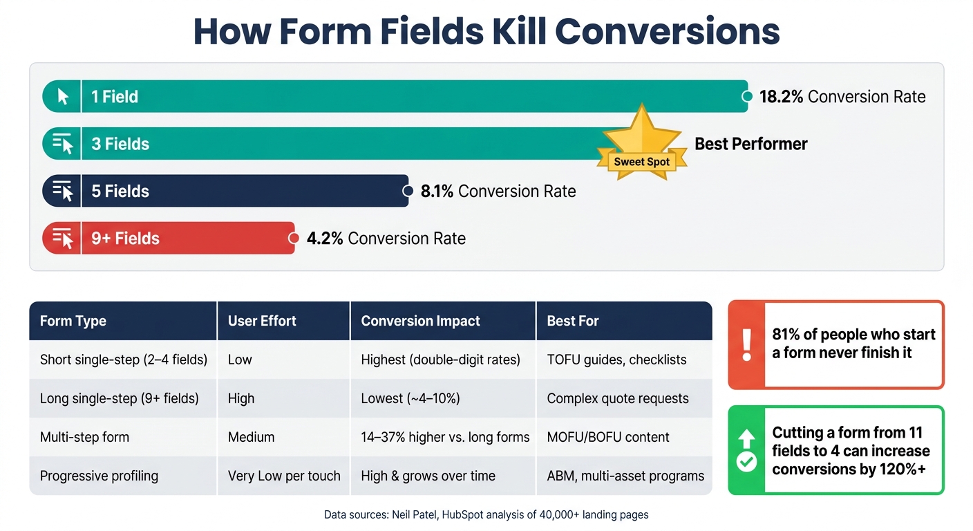
How Form Field Count Impacts Gated Content Conversion Rates
5 Step Formula to Get More Leads with Gated Content on WordPress
sbb-itb-b3a7196
1. Make the offer clear before asking for a form fill
Lead with the result the reader wants. A landing page gets only a few seconds to make its point. If the offer is easy to grasp, the form feels like the next step instead of a roadblock.
Write a headline that promises a clear outcome
A vague headline hurts conversions. “Download our guide” says almost nothing. There’s no result, no context, and no clear reason to care.
A stronger headline puts the payoff front and center, like "Reduce Onboarding Time With a 5-Step Employee Training Framework" or "Cut Proposal Turnaround Time With a Ready-to-Use Sales Template."
The wording should also match the ad or email that brought the person there. That way, the page feels like a smooth next step, not a bait-and-switch.
List what the reader gets in 3 short bullets
Use three short bullets to spell out:
- the deliverable
- what’s inside
- the payoff
Be specific. Skip fuzzy lines like “actionable insights” or “valuable tips.” Those don’t help someone make a decision. Instead, say exactly what they’ll get: “a 12-step audit checklist,” “a one-page competitor analysis template,” or “a fill-in-the-blank business case you can adapt in minutes.”
Three bullets are usually enough to keep the offer easy to scan. Add more, and it starts to feel like work. Use fewer, and the offer can seem too light.
Pick the right asset for the buyer’s intent
Not every asset fits every stage of the funnel. Checklists and templates tend to work well for early-stage visitors who want a quick win without much effort. Whitepapers and frameworks fit buyers who are still doing research and need more context. Business cases and ROI calculators make more sense for prospects who are close to a decision and need help making the case internally.
This match matters. The wrong format adds friction and can hurt completion rates. Someone looking for a fast reference tool probably doesn’t want to open a long report. Subpage.co lets marketers build and test these assets without code or design work.
Once the offer is clear, the next move is simple: cut any form fields that don’t help lead quality.
2. Reduce form friction to the minimum needed
Use the shortest form that still gets the data you need for the next step. Neil Patel’s compiled form-length data makes the tradeoff pretty clear: a one-field form converts at 18.2%, then drops to 8.1% at five fields and 4.2% at nine or more. That kind of slide can have a direct effect on campaign results.
Ask for fewer fields and only what you need
For top-of-funnel content like checklists, templates, or intro guides, start with first name and work email. In most cases, that’s enough to begin a nurture sequence and tailor follow-up. If you need light segmentation, add one more field, like company name or job title, and stop there.
Why the hard stop? Because extra fields may help qualify leads, but they also shrink volume. HubSpot‘s analysis of 40,000+ landing pages found that three-field forms performed best, and adding a fourth led to a clear drop in conversions.
A simple rule works well here: add a field only if the answer changes what happens next. That could mean sending the lead to sales, changing the nurture sequence, or shaping outreach. If the answer doesn’t affect the next action, it probably doesn’t belong on the first form.
Choose the right form format for the offer
Match the form format to the offer and to visitor intent. Put simply, the format should line up with how much effort someone is likely to accept at that stage.
| Form Format | User Effort | Expected Conversion Impact | Lead Quality | Best-Fit Use Cases |
|---|---|---|---|---|
| Short single-step form | Low | Highest; often double-digit rates with 2–4 fields | Moderate | TOFU guides, checklists, templates, paid social campaigns |
| Long single-step form | High | Lowest; 9+ fields can drop to ~4–10% | High per lead, but fewer leads | Detailed quote requests, complex assessments |
| Multi-step form | Medium (perceived low) | 14–37% higher vs. equivalent long forms | High, with better volume | MOFU/BOFU content, business cases, tailored whitepapers |
| Progressive profiling | Very low per touch | High initial, grows as trust builds | Improves over time with repeat visits | Multi-asset programs, ABM, recurring gated content |
Progressive profiling works especially well when you want to keep each form short but still build a richer lead profile over time. A common setup is to ask for 2–3 fields on the first download, then collect 1–2 new fields on later visits when the person comes back for another asset.
Add trust signals near the submit button
Right before someone clicks submit, hesitation can creep in. A short privacy note under the form can help, along with plain-language labels and clear follow-up expectations. B2B buyers tend to respond better when the next step is spelled out. If a sales rep may follow up, say that in simple terms.
You can also add a small lock icon or secure form label as a visual cue without making the page feel busy.
Once the form is lean and trusted, the page itself needs to stay just as simple.
3. Build a low-friction page experience on every device
A strong offer and a short form still won’t do much if the page feels messy or hard to follow. The goal is simple: give people one clear path to the download. Once the form is lean, the page should feel just as lean.
Use a single-purpose landing page layout
Treat the page like it has one job. Remove the main navigation and any secondary CTAs. Keep the headline and form above the fold.
It also helps to place a cover image or a short preview of what’s inside the asset next to the form. That gives people a fast sense of what they’re getting without making them hunt for it.
Once the page is easy to scan, mobile use usually becomes the next point of failure.
Optimize for mobile speed and readability
Mobile accounts for more than half of North American web traffic. So if the page feels clunky on a phone, you’re likely losing people before they even start.
Stick with a single-column layout. Use 16 px body text, 44×44 px controls, compressed images, and deferred scripts.
A few small details matter here too:
- Use the right keyboard type for each field
- Turn on autofill
- Show inline error messages
These choices cut down on friction in the moments where users tend to give up.
Give users immediate access after submission
When someone submits the form, don’t make them wait around. Give them the asset right away with an on-page unlock, a direct download, or an email that arrives within minutes.
You can use Subpage.co to build gated pages, capture leads, track performance, and automate delivery through your email tools.
After the page feels smooth, watch where users drop off and test one change at a time.
4. Measure results and keep simplifying
Once the page is live, measure each step before you change anything.
Track the numbers that show where users drop off
Track page visits, form starts, and submissions as separate events. That helps you spot the exact drop-off point instead of guessing. Look at each stage on its own: visit-to-start, start-to-submit, and total conversion rate.
If your visitor-to-submission rate is below 10%, the problem usually starts earlier in the journey. In many cases, the offer isn’t clear enough, or the form is getting in the way. High-intent assets like industry benchmark reports can reach as high as 34.8%.
Also, split your data by device. If mobile converts at less than half your desktop rate, that points to a clear problem you can fix.
Connect form submissions to your CRM and calculate revenue per lead. That number shows whether more optimization work is worth the time and money.
Run small A/B tests one variable at a time
Start with the biggest drop-off, then pick your next test from there.
Test one change at a time. On gated content pages, the biggest wins often come from headline clarity and form length. For example, cutting a form from 11 fields to 4 can increase conversions by 120% or more.
Run each test for two weeks or until it reaches 1,000+ sessions. Write down every result, even when a test loses. Over time, that gives your team a much clearer view of what your audience responds to.
Conclusion: Simpler pages convert better and attract better leads
The steps in this guide follow a simple logic: make the offer clearer (like creating a checklist lead magnet), cut extra form fields, remove distractions, fix mobile usability, and use data to find the next thing to simplify.
Each change builds on the last one. A cleaner page brings in more submissions, and better-qualified submissions can drive more revenue per lead.
Subpage.co is built for this kind of step-by-step work. Its no-code editor and pre-built templates help teams launch, measure, and refine gated pages without needing a developer.
FAQs
How many form fields should I use?
For most lead magnets, 2 to 3 fields tends to work best. In most cases, that means a name and email field. Add more than that, and the form starts to feel like work. And when that happens, more people leave before they finish.
Here’s a simple way to think about it:
- Newsletters: 1 to 2 fields
- Whitepapers: 2 to 4 fields
- Demo requests: 4 to 8 fields
If your form needs more than 5 or 6 fields, don’t cram everything into one screen. Use a multi-step form or progressive profiling instead.
When should I use a multi-step form?
Use a multi-step form when your gated form needs more than five or six fields. Splitting the form into smaller steps lowers friction and makes the whole thing feel easier to finish, especially for high-value offers like webinars or consultations.
Keep each step to 3–5 fields, and group related fields together so the flow feels natural. Add a progress indicator too. It gives people a clear sense of where they are and how much is left.
If you can cut the form down to four fields or fewer, keep it on a single page.
What should I track first?
Start with your form completion rate. That’s the clearest sign of whether your form is doing its job.
It also helps to track form views and form starts. Those numbers show whether people are paying attention and choosing to begin before they try to finish.
From there, look at field-level funnel analytics. This shows where users drop off, field by field, so you can spot friction points and improve performance with more confidence.
Related Blog Posts
