How to Create a Whitepaper Without Design Skills

You don’t need design experience to create a professional whitepaper. Focus on delivering clear, actionable content and use simple tools to handle the design. Whitepapers are detailed documents that establish authority and attract leads, but many people avoid creating them due to concerns about layout, visuals, or lack of resources. The truth is, quality content and a clean structure matter more than flashy designs.
Here’s how to do it:
- Plan your content: Choose a topic that solves a problem for your audience, research it thoroughly, and outline your key points.
- Use beginner-friendly tools: Platforms like Google Docs, Canva, or Subpage.co provide templates and layouts to simplify design.
- Keep it simple: Add basic visuals like charts or graphs to support your points, and use consistent fonts and colors.
- Tailor for your audience: For US readers, follow formatting norms (e.g., MM/DD/YYYY dates, $1,000 for currency) and use plain, accessible language.
- Review and refine: Proofread your content, check for readability on different devices, and ensure accessibility features like alt text for visuals.
How to Make a White Paper: Easy + Fast Tutorial
Step 1: Planning and Structuring Your Whitepaper
Before diving into writing, take the time to create a solid plan. This stage is where you’ll define your topic, gather research, and map out your outline. These early decisions set the foundation for a whitepaper that flows smoothly and resonates with your audience. The goal? To choose a topic that aligns with your audience’s interests, back it with credible research, and structure it in a way that keeps readers engaged from start to finish.
Picking the Right Topic
Choosing the right topic is all about finding the intersection between your audience’s needs and your business’s expertise. This balance ensures your whitepaper not only attracts the right readers but also positions your company as a go-to resource.
Start by identifying the challenges your audience faces. Dig into customer support emails, sales call notes, or social media interactions. What questions or concerns pop up repeatedly? These recurring pain points are goldmines for whitepaper ideas.
For instance, if you run a marketing agency and clients frequently ask about boosting email open rates, a whitepaper titled "The Complete Guide to Email Subject Lines That Convert" could address that need. Similarly, if you’re in cybersecurity and businesses are anxious about remote work security, a topic like "Securing Your Remote Workforce: A Step-by-Step Implementation Guide" could be highly relevant.
Avoid going too broad or too specific. A topic like “Digital Marketing” is too vague and overwhelming, while “How to Write Email Subject Lines for SaaS Companies in the Pacific Northwest” is too niche. Aim for something focused enough to provide real value, but broad enough to appeal to a significant portion of your audience.
Test your topic by asking these three questions: Does it solve a real problem for your audience? Can you offer unique insights or solutions? Will it naturally lead readers to consider your products or services? If you can confidently answer "yes" to all three, you’ve found a winner.
Collecting and Organizing Research
Once your topic is locked in, it’s time to gather reliable data. Strong research transforms your whitepaper into an authoritative resource rather than just another opinion piece. You’ll need credible statistics, expert insights, and practical examples to back up your points and provide real value.
Start with trusted sources like industry reports from McKinsey or Deloitte, government databases, academic studies, and surveys from established organizations. Don’t forget your own company’s data – case studies, customer success stories, and proprietary research can make your whitepaper stand out.
Organize your research by themes rather than sources. For example, if your whitepaper is about email marketing, you might create folders labeled “Industry Statistics,” “Best Practices,” “Common Mistakes,” and “Future Trends.” This approach makes it easier to identify gaps in your content and ensures each section is backed by solid evidence.
Keep a detailed log of your sources. A simple spreadsheet with columns for the source name, publication date, key statistics or quotes, and the URL can save you hours when it’s time to fact-check or add citations.
Stick to recent data whenever possible. Information from 2019 might feel outdated by 2025, especially in fast-evolving fields like technology or digital marketing. If you must use older data, acknowledge its age and explain why it’s still relevant.
Lastly, check out what your competitors have already published. You’re not looking to copy their work, but understanding the existing landscape can help you identify opportunities to offer a fresh perspective or fill gaps in the conversation.
Creating Your Outline
A clear, well-thought-out outline is the backbone of a successful whitepaper. It ensures your content flows logically and helps readers follow your argument from the problem to the solution.
A strong structure typically includes:
- A concise introduction
- A clear problem statement
- A detailed analysis with 3-5 key points
- Actionable recommendations
- A brief conclusion
Start with an introduction that hooks readers and outlines the key takeaways. Follow this with the problem statement, which digs into the challenges your audience faces. Use data and research to explain why this issue matters – this section often takes up 20-30% of the whitepaper because it sets the stage for the solution.
The analysis or solution section is where you present your insights, strategies, or recommendations. Break this into 3-5 main points, each supported by research and examples. Then, in the recommendations section, offer specific, actionable steps readers can take. Wrap up with a conclusion that summarizes the key takeaways and provides a clear next step.
Plan for visual breaks throughout your whitepaper. Charts, graphs, or infographics can make complex information easier to digest and keep readers engaged. Even simple visuals, like a bar chart showing industry growth or a diagram outlining your process, can enhance readability.
Keep your page count in mind. Most effective whitepapers are between 6-12 pages. If your outline suggests a much longer document, consider narrowing your focus or splitting the content into multiple whitepapers. Conversely, if it feels too short, dig deeper into your research or expand your scope slightly.
Finally, review your headers to ensure they tell a coherent story. Do they flow naturally from one section to the next? If something feels out of place, refine your structure before moving on to the writing phase.
With your outline in hand, you’re ready to move on to Step 2 and start crafting your whitepaper.
Step 2: Building a Professional Whitepaper Without Design Skills
Now that your outline is ready, it’s time to transform your research into a polished whitepaper. The best part? You don’t need to be a design expert or invest in expensive tools to create something that looks professional and delivers results.
Tools That Simplify Whitepaper Creation
Creating a professional-looking whitepaper is all about using the right tools. Here are a few options that can help even if you’re not a designer:
- Subpage.co: This tool offers pre-designed whitepaper templates and built-in lead capture forms. What sets it apart is its ability to collect contact information directly from readers by gating your whitepaper behind a form. This saves you from juggling multiple platforms or dealing with technical setups.
- Google Docs: A reliable choice for straightforward whitepapers, especially for team collaborations. Its real-time editing features make it easy to gather feedback, while built-in templates help with basic formatting. You can also add charts from Google Sheets or images to enhance your content.
- Canva: If you want more design flexibility, Canva’s drag-and-drop interface and extensive templates are a great choice. Their whitepaper designs include professionally paired fonts and color schemes that make your content pop.
- PowerPoint: This tool allows you to design each page as a slide and then export the final document as a PDF. It’s a simple way to create visually appealing whitepapers without needing advanced skills.
Pick the tool that aligns with your workflow and comfort level. Once you’ve chosen, you can focus on using templates and visuals to make your whitepaper as engaging as possible.
Leveraging Templates and Visuals
Templates are a game-changer when it comes to whitepapers. They offer pre-set layouts, font combinations, and color schemes that ensure your document looks polished without much effort. Choose a template that reflects your industry and brand identity to save time and avoid starting from scratch.
Pay attention to key design elements like white space and text hierarchy. A well-designed template will naturally guide readers through the content with clear headers, varying font sizes, and enough space around text blocks to keep the layout uncluttered.
Visuals play a significant role in making your whitepaper engaging. Instead of burying your data in paragraphs, turn it into charts and graphs. For instance, a bar chart highlighting industry trends or a pie chart summarizing survey results can make your content both easier to digest and more memorable.
Consistency is crucial. Stick to a unified color scheme for all your visuals – if your first chart uses blue, keep that same shade for the rest. This creates a cohesive look that feels professionally designed, even with basic tools.
Adding icons and illustrations can also break up dense text and simplify complex ideas. Many platforms like Canva or Flaticon offer free icon libraries, while Unsplash provides high-quality images. Use these sparingly – just a couple of visuals per page can make a big difference without overwhelming the reader.
To emphasize key points, consider using callout boxes or sidebars. These elements highlight important insights or actionable tips without interrupting the main flow of your content. Most templates include these features, making them easy to customize.
Finally, use bold text for standout statistics, italics for meaningful quotes, and bullet points for lists. But don’t overdo it – too much emphasis can make your whitepaper appear cluttered.
Reviewing and Final Touches
Before publishing, take the time to review your whitepaper for both content and design. This step ensures that your document meets professional standards and delivers a seamless experience to readers.
Start by reviewing the content for clarity and flow. Read through the whitepaper as if you’re encountering the topic for the first time. Does the argument progress logically? Are there any gaps or confusing sections? Pay close attention to transitions between sections to maintain a smooth narrative.
Double-check all data and citations to ensure accuracy and proper attribution. Verifying these details not only boosts your credibility but also safeguards against potential issues later.
Next, focus on visual consistency. Are your headers uniform in size and style? Do your charts and graphics use the same fonts and colors? Are images aligned and properly sized? These small details can significantly elevate the overall presentation.
Test your whitepaper’s readability by viewing it on different devices or printing a copy. Formatting issues that might not be obvious on your screen can stand out in other formats. Check that text is legible, colors contrast well, and any interactive elements function as intended.
Finally, ask someone else to review your work. A fresh perspective can catch errors or unclear sections that you might have missed. Encourage your reviewer to focus on both content and flow to ensure the document resonates with potential readers.
Once everything is finalized, export your whitepaper as a PDF. This format preserves your design and ensures the document looks the same across all devices and software.
sbb-itb-b3a7196
Step 3: Tailoring for US Audiences and Best Practices
If you want your whitepaper to connect with American readers, paying attention to formatting and cultural preferences is a must. These small details can make a big difference in how professional and credible your document feels to a US business audience.
US Localization Basics
Start by using US-specific formats for dates, currency, and numbers. For example, dates should follow the MM/DD/YYYY format, like 09/09/2025.
When it comes to currency, the dollar sign goes before the number (e.g., $1,000.00), with commas separating thousands and a period for decimals. Numbers use the same pattern – commas for thousands and periods for decimals – so a figure like 15,250.5 makes sense to US readers, while 15.250,5 (common in Europe) could cause confusion.
Measurements should use imperial units. For instance, describe office space as "5,000 square feet" instead of using square meters. Similarly, reference miles, pounds, and feet, and use Fahrenheit for temperature discussions.
Stick to American English spelling. Words like “color,” “organize,” and “analyze” are standard in the US and help establish credibility.
Cultural relevance is another key factor. Whenever possible, reference US-based companies, regulations, and market data. For example, instead of highlighting European privacy laws, focus on US frameworks like HIPAA for healthcare or SEC regulations for financial services. Including case studies from American companies or examples from US markets will also resonate better with your audience.
Finally, consider American business practices. Discuss familiar concepts like quarterly earnings reports, Black Friday sales cycles, or fiscal year planning. For B2B topics, mention enterprise software procurement or annual budget cycles – things that US professionals deal with regularly.
Making Your Whitepaper Accessible
Once your document is tailored for US readers, make sure it’s accessible to everyone. Accessibility isn’t just about compliance – it’s about ensuring your insights reach as many people as possible. According to 2023 US Census Bureau data, over 61 million Americans live with a disability, so designing with accessibility in mind is essential.
Choose clean, easy-to-read fonts like Arial or Calibri in sizes 10-11 points. Stick to high-contrast colors, like black text on a white background, to improve readability. Avoid decorative fonts – they might look appealing but can be hard to read, especially for those with visual impairments or dyslexia.
Structure your content with clear headings and plenty of white space. Dense blocks of text can be overwhelming and make navigation harder for readers using screen readers. Break up long paragraphs, use bullet points for lists, and add descriptive headings to guide readers through each section of your whitepaper.
Include alt text for images and charts so visually impaired readers using screen readers can understand your visuals. Be specific – don’t just say “chart showing data.” Instead, write something like, “Bar chart illustrating a 40% increase in email marketing ROI from 2023 to 2024.”
Keep your language straightforward and easy to follow. Aim for an 8th-grade reading level for general business audiences. This doesn’t mean simplifying the content too much – it means explaining complex ideas in a clear and concise way. Define technical terms the first time they appear, and consider adding a glossary if your whitepaper dives into specialized topics.
A logical structure benefits all readers but is especially important for those using assistive technologies. Use proper heading levels (H1, H2, H3) consistently, and ensure your document flows naturally from introduction to conclusion. Number the pages and include a table of contents for longer documents.
Before publishing, test your whitepaper’s accessibility. Many word processors and PDF tools have built-in accessibility checkers to help you spot potential issues. Better yet, have colleagues test the document on different devices and with various accessibility settings to ensure it works well for everyone.
When exporting your whitepaper as a PDF, make sure the text remains selectable rather than converting it into a flat image. Selectable text allows screen readers to process the content and lets readers adjust the text size if needed. Most modern PDF tools preserve text selectability by default, but it’s worth double-checking before distribution.
Step 4: Tool Comparison for Whitepaper Creation
Once your whitepaper is polished and ready for an audience, the next step is selecting the right platform to maximize its potential for lead generation. With various tools available, it’s crucial to choose one that aligns with your goals and workflow.
Main Features of Subpage.co
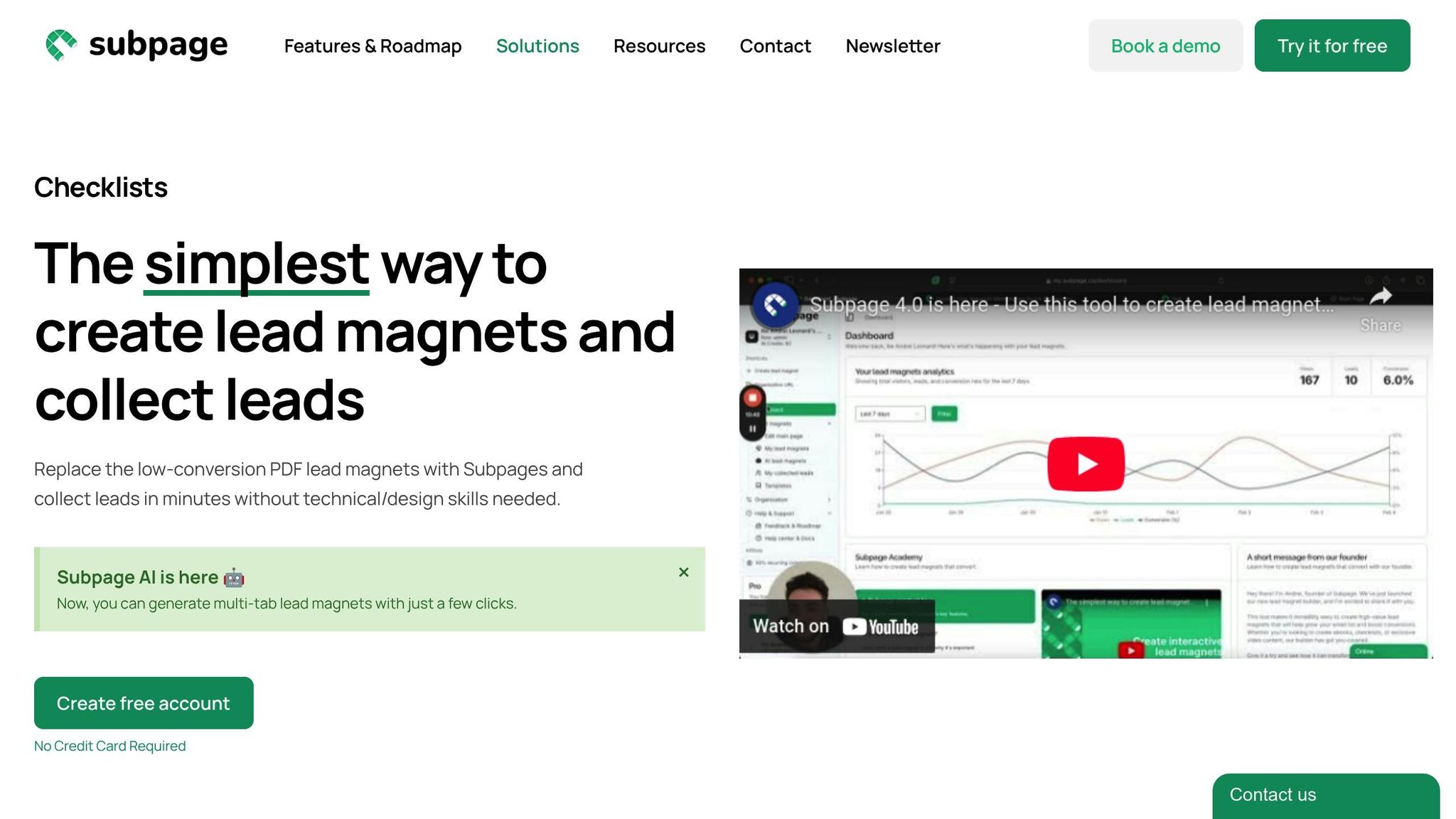
Subpage.co is designed specifically to create lead magnets like whitepapers, and it does so without requiring any design expertise. Its editor, which feels similar to Notion, simplifies the process, allowing you to focus on content rather than wrestling with complex design tools.
The platform’s clean interface is built for clarity. It supports multi-tab whitepapers, which make it easier to organize detailed information into manageable sections. Plus, its AI-powered features can help structure these sections, saving you time and effort.
What sets Subpage.co apart is its built-in lead capture functionality. You can add forms, pop-ups, top bars, and widgets directly to your whitepaper, eliminating the need for external tools. This seamless integration ensures a smoother process for collecting leads.
Custom branding options allow you to incorporate your logo, colors, and even a custom domain, ensuring your whitepapers match your brand identity. This polished presentation can make a strong impression on potential leads and enhance conversion rates.
Subpage.co also provides built-in analytics to track how your whitepaper performs. You can export lead data to a CSV file or connect it to your CRM or email marketing tools via Zapier, making it easy to integrate with your existing systems.
Here’s how Subpage.co stacks up against other popular tools:
Subpage.co vs. Other Tools Comparison
| Feature | Subpage.co | Google Docs | Canva |
|---|---|---|---|
| Ease of Use | Notion-like editor, minimal learning curve | Familiar word processor interface | Drag-and-drop design; moderate learning curve |
| Templates | Pre-designed whitepaper templates | Basic document templates | Extensive design templates |
| Custom Branding | Full branding control with custom domain linking | Limited formatting options | Good design customization |
| Lead Generation | Built-in forms, pop-ups, top bars, and widgets | No lead capture features | No lead capture features |
| Analytics | Detailed tracking, CSV export, Zapier integration | Basic sharing analytics | Limited analytics |
| Collaboration | Single-user on free plan | Excellent real-time collaboration | Team collaboration available |
| Export Options | PDF, web publishing, and lead export options | PDF, Word, web publishing | PDF, PNG, JPG |
| Pricing | Free plan available; $19/organization/month for premium | Free with a Google account | Free plan available; $15/month Pro |
Google Docs is a great choice for teams that need real-time collaboration. Its straightforward interface and shared editing capabilities are hard to beat for content development. However, it lacks features for professional design and lead generation, meaning you’ll need additional tools to gate and collect leads.
Canva, on the other hand, shines when it comes to visual design. With thousands of templates, it’s perfect for creating visually appealing whitepapers – if you have design skills. However, Canva treats whitepapers as static projects, so you’ll need another solution to handle lead capture and analytics.
Subpage.co bridges these gaps by combining ease of use with features tailored for lead generation. While it doesn’t offer the real-time collaboration of Google Docs or the design flexibility of Canva, it excels at creating whitepapers that not only look professional but also drive conversions. From content creation to lead capture and analytics, it’s an all-in-one solution.
For businesses prioritizing lead generation and performance tracking, Subpage.co simplifies the process. Its free plan allows you to create up to five lead magnets with 7-day analytics, giving you a chance to explore its features before upgrading to the $19/month premium plan.
Conclusion: Helping Non-Designers Create Professional Whitepapers
You don’t need to be a design expert to create a polished, professional whitepaper. With the right tools and a clear approach, anyone can do it. The secret? Focus on the essentials: a well-organized structure, meaningful content, and smart use of resources already at your disposal.
Breaking it down into steps makes the process much easier. Begin by identifying your audience and selecting a topic that directly addresses their needs or challenges. Gather your research in an organized way, and then bring it all together using tools you’re comfortable with. Templates can be a game-changer here – they simplify the design process and provide a polished starting point.
This method isn’t just theory; it’s been proven in practice. For example, a marketing manager with no design background used a Canva template to craft a whitepaper on digital marketing trends. By focusing on a clear structure, built-in visuals, and accessibility guidelines, their whitepaper generated over 500 qualified leads in the first month. This shows that professional results don’t require professional design skills.
Keep in mind that readability and accessibility are just as important as the visuals. Use clear headings, bullet points, and concise language to make your whitepaper easier to digest. Following established US formatting guidelines helps ensure your document looks professional and is easy to navigate.
Modern tools take care of the technicalities so you can focus on what really matters: delivering valuable insights and actionable advice. Support your points with credible research, offer practical recommendations, and make sure your content speaks directly to your audience’s challenges. When paired with professional templates, this content-first strategy can produce whitepapers that not only look great but also deliver results.
Now, it’s time to put this plan into action. Pick a tool – whether it’s Google Docs for collaboration, Canva for design flexibility, or Subpage.co for lead generation. Choose a template, outline your topic, and start creating. With this framework, you’re equipped to craft whitepapers that build your authority and drive meaningful results.
Thanks to user-friendly tools and templates, creating professional whitepapers has never been easier. By keeping your focus on delivering valuable content, you’ll be able to connect with your audience and grow your business effectively.
FAQs
How can I create a professional whitepaper without any design experience?
Creating a polished whitepaper, even without a background in design, is more manageable than you might expect. The key is to focus on creating content that’s well-organized, clear, and to the point. Tools like Canva or Google Docs are great starting points. They offer pre-designed templates that are easy to customize, helping you add a professional touch with minimal effort.
To ensure your whitepaper stands out, stick to a straightforward structure: conduct thorough research, arrange your ideas in a logical flow, and use headings, bullet points, or charts to break up dense text. Adding simple visuals can boost readability and give your whitepaper a professional edge – no advanced design skills required.
How do I choose the best topic for my whitepaper to meet my audience’s needs and showcase my expertise?
To create impactful content, begin by identifying your audience’s most pressing challenges, interests, and questions. Dive into social media conversations, conduct surveys, or analyze industry reports to uncover their needs. Choose a topic that solves a specific problem, aligns with your expertise, and offers practical advice. Tackling the right topic not only grabs attention but also earns trust and establishes you as a trusted voice in your field.
How can I make my whitepaper more accessible to people with disabilities?
To ensure your whitepaper reaches a wider audience, including individuals with disabilities, focus on making it easier to read and navigate. Use clear, straightforward language to improve understanding. Choose large, legible fonts and maintain ample spacing between lines and paragraphs to reduce visual strain. Organize your content with well-defined headings and sections that follow a logical order, which also helps screen readers process the document effectively. Don’t forget to add alternative text for images and graphics so users relying on assistive tools can grasp the visual elements. These thoughtful tweaks can go a long way in making your whitepaper more inclusive and accessible to all.