

Lead Magnet Conversion Benchmarks 2026

Most lead magnet benchmarks are only useful if you match the exact metric. A 6.6% landing page conversion rate, a 40.1% quiz start-to-lead rate, and a 57% webinar attendance rate can all be normal at the same time, because each one measures a different step.
If I had to boil this article down to the main point, it would be this: I should compare like-for-like numbers only. Traffic source, offer type, and audience warmth change results fast. For example, email traffic converts at 19.3%, paid search at 11.3%, organic at 6.4%, and paid social at 3.1%.
Here’s the short version:
- Low-friction offers like checklists, templates, and tools tend to convert better than interactive lead magnets vs PDF ebooks
- Quiz benchmarks often use engaged users as the denominator, not all visitors
- Webinar registration rate and attendance rate are not the same thing
- Warm traffic usually beats cold traffic by a big margin
- Shorter forms and clearer copy tend to improve opt-ins
- A page can look weak or strong depending on the channel behind it
A few benchmark ranges from the article:
- Checklist / cheatsheet: 24%–42% opt-in rate
- Free tool / calculator: 28%–42%
- Interactive quiz: 40.1%–47.3% start-to-lead
- Ebook / whitepaper: 4%–8% landing page conversion rate
- Live webinar: 6%–22% registration rate
Quick Comparison
| Lead magnet type | Typical range | What it measures |
|---|---|---|
| Checklist / cheatsheet | 24%–42% | Opt-in rate |
| Free tool / calculator | 28%–42% | Opt-in rate |
| Interactive quiz | 40.1%–47.3% | Start-to-lead |
| Ebook / whitepaper | 4%–8% | Landing page conversion rate |
| Live webinar | 6%–22% | Registration rate |
Bottom line: I’d use these numbers as starting points, then set goals by traffic source, offer format, and funnel step instead of chasing one average.
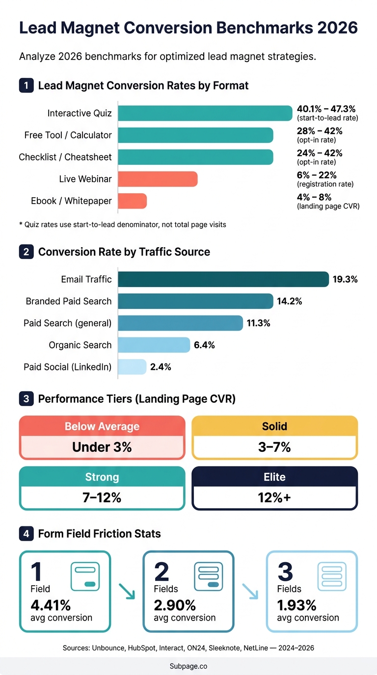
Lead Magnet Conversion Benchmarks 2026: Rates by Format & Traffic Source
Lead Magnet Conversion Benchmarks in 2026
Typical Landing Page and Opt-In Rate Ranges
Benchmark ranges in 2026 swing a lot based on traffic source and offer format. Email traffic converts at 19.3%, paid search at 11.3%, organic search at 6.4%, and paid social at 3.1%.
Format changes the picture too. Checklists and cheatsheets often convert in the 24–42% range (see how to create a checklist lead magnet), while ebooks and whitepapers usually sit between 4–8% on a landing page basis. In plain English: lower-friction lead magnet ideas tend to convert more.
Use the ranges below as a starting point, not a one-size-fits-all target.
| Lead Magnet Type | Typical Range | Metric Type |
|---|---|---|
| Checklist / Cheatsheet | 24–42% | Opt-in rate |
| Free Tool / Calculator | 28–42% | Opt-in rate |
| Interactive Quiz | 40.1–47.3% | Start-to-lead (engaged denominator) |
| Ebook / Whitepaper | 4–8% | Landing page CVR |
| Webinar (Live) | 6–22% | Registration rate |
Quiz rates use a start-to-lead denominator, not total-page visits.
That detail matters more than it may seem. If two teams both say a quiz converted at 45%, but one means starts and the other means all visitors, they are not talking about the same thing.
These ranges only mean anything once the metric definition is clear.
Below Average, Solid, and Strong: What the Numbers Mean
After you have a benchmark range, the next step is figuring out what your own number says. For most lead-gen pages, performance usually falls into four tiers:
- Below average: Under 3% – often points to message mismatch or form friction.
- Solid: 3–7% – healthy for most lead-gen pages.
- Strong: 7–12% – often points to a good match between offer and audience.
- Elite: 12%+ – usually tied to warm traffic or very high intent.
The catch is context. A 3% rate can look weak on warm email traffic and perfectly fine on cold paid social. Same number, very different story.
Next, the measurement definitions show why these ranges shift.
sbb-itb-b3a7196
12 Genius Lead Magnets That Actually Convert…
How the Benchmarks Were Measured
The numbers in this article come from major marketing platforms, including Unbounce, HubSpot, ON24, NetLine, Interact, WordStream, GetResponse, and Sleeknote. But there’s a catch: each source uses a different denominator. That means these ranges do not line up cleanly side by side. In plain English, the sample size matters less than what each platform is counting.
| Source | Sample Size | Metric Definition | Date Range |
|---|---|---|---|
| Unbounce | 41,000 landing pages / 464 million visitors | Visitor-to-lead (landing page CVR) | Q4 2024 |
| HubSpot | 150,000 landing pages | AI-personalized vs. static CVR | Feb. 2026 |
| Interact | 80M+ leads | Quiz start-to-lead (engaged denominator) | 2026 |
| NetLine | 6.2M B2B registrations | Gated content demand and consumption | 2024 |
| Sleeknote | 26,270 campaigns | Popup and form field mechanics | 2025 |
| ON24 | Millions of global events | Webinar registration-to-attendance | 2024 |
Metric Definitions That Change the Numbers
The biggest issue here isn’t bad data. It’s mixed definitions.
Three metrics get lumped together all the time: landing page conversion rate, start-to-lead rate, and webinar attendance rate. The problem is simple. Each one tracks a different step in the funnel, so comparing them like they mean the same thing can send you in the wrong direction.
- Landing page CVR counts unique visitors who turn into leads. Unbounce puts the median at 6.6% across 41,000 landing pages.
- Start-to-lead rate counts only people who already started an interaction, not total visitors. Interact reports 40.1% with that method.
- Webinar attendance rate measures how many registrants actually attended, not how many people viewed the registration page. The median is 57%.
So yes, a 40.1% start-to-lead rate can sit next to a 6.6% landing page CVR in the same article. But they’re measuring different starting points, which makes them a poor one-to-one comparison.
How Traffic Source and Audience Temperature Affect Results
Traffic source is the biggest variable in conversion rate data. Where the visitor comes from changes almost everything.
Email traffic converts at a median of 19.3% because those people already opted in. Branded paid search – people searching for a company name on purpose – hits 14.2%, and top-quartile results reach 28.6%. Organic search lands at 6.4%, while LinkedIn paid ads come in at 2.4%.
That’s why a rate that looks average in one channel can be strong in another. Audience warmth shifts the numbers. Once those measurement rules are clear, the next section looks at results by lead magnet type.
Conversion Rates by Lead Magnet Type
With the metrics defined, the table below compares common lead magnet formats using the same frame where possible.
| Lead Magnet Format | Typical Range | Traffic Context | Funnel Stage |
|---|---|---|---|
| Interactive Quiz | 30% – 40.1% | Best on social and email traffic | TOFU |
| ROI Calculator | 15% – 30% | Search and direct traffic | MOFU / BOFU |
| Template / Swipe File | 8% – 14.8% | Intent-based traffic | MOFU |
| Checklist / Cheat Sheet | 5% – 11.4% | Organic / email | TOFU |
| Webinar (Registration) | 4% – 15% | Warm email / social | MOFU |
| Ebook / Whitepaper | 1.9% – 5% | Mixed traffic | TOFU / MOFU |
Quiz benchmarks use a start-to-lead denominator, not total page visits.
Checklists, Templates, and Short Practical Downloads
For short, practical downloads, speed and clarity tend to drive the best opt-in rates. Not all lead magnets perform the same, and interactive formats usually beat static downloads. Checklists and templates often do better than longer formats at the top of the funnel because the payoff is plain and immediate. People can see what they’ll get and put it to work in under 3 minutes.
Placement matters just as much as format. Targeted lead magnets placed inline inside relevant blog posts can hit 15% to 25% opt-in rates, and inline placements can beat sidebar placements by 2–3x. That makes sense. If the offer shows up right when the reader is thinking about the problem, the next step feels natural.
Ebooks, Whitepapers, Webinars, Quizzes, and Calculators
Longer or interactive offers shift the tradeoff. You may get lower friction, higher intent, or sometimes both. Even so, consumption can be a weak spot. Only 12% of ebook and whitepaper downloaders finish reading them, and that gap can hurt later engagement.
For quizzes, the denominator is a big deal: the benchmark is based on engaged users who already started the quiz, not all page visitors. Calculators work in a similar way. They give users a personalized result, which can lift perceived value before the form appears. Webinars need a bit more scrutiny too. Registration rate tells only part of the story: 57% of B2B registrants convert to attendees, so attendance rate deserves its own tracking right alongside registrations.
What Drives Higher or Lower Conversion Rates
Now that the ranges are clear, the next step is figuring out what moves a page toward the top or bottom end. In most cases, three things shape the spread: offer relevance, page friction, and traffic temperature.
Offer Relevance, Page Clarity, and Form Length
Your headline needs to match the promise made in the ad or email. If that match is off, conversions drop. And broad, generic free guides usually lag behind more specific, content-focused lead magnets. A narrow, problem-focused asset – like an industry-specific audit or a tight checklist – can convert at 8–20%.
Forms matter too. Every extra field adds friction. One field averages 4.41%, two fields 2.90%, and three fields 1.93%. If you need more than an email address, multi-step forms often work better. Why? Because 76% of people who finish step one go on to complete the rest.
Copy also has a big effect. Simple writing tends to win. Pages written at a 5th- to 7th-grade reading level average 11.1%, which is more than double the rate for professional-level copy.
How to Set a Realistic Target for Your Campaign
Targets should match the traffic source. Otherwise, you’re judging a page by the wrong standard. Email traffic converts at 19.3% on average, Google paid search comes in at 11.3%, and display ads usually land around 1%–2%. So yes, the same offer can perform very differently depending on where the visitor came from.
A simple way to set expectations:
- Start with the average for the traffic source
- Adjust up if the audience is warmer and already knows you
- Adjust down if the traffic is cold or lightly qualified
For example, a checklist shown to cold paid traffic should not be judged the same way as an interactive tool sent to a warm email list.
Conclusion
Benchmarks are a starting point, not a verdict. A 6.6% median landing page conversion rate gives you context, but it isn’t a goal on its own. What matters next is matching the benchmark to the exact metric behind it.
Use like-for-like comparisons ONLY. A 40.1% quiz rate is start-to-lead, not visitor-to-lead. And 19.3% email traffic doesn’t behave like cold paid traffic. Those numbers may sit in the same article, but they don’t mean the same thing. Once the metric is clear, the next step is simple: figure out which outcome matters most.
Focus on downstream revenue, not just opt-in rate. Set targets by traffic source, funnel stage, and offer type. Then push for 25% to 30% above baseline instead of chasing top-quartile results on day one.
If you’re ready to put these benchmarks to work, the page builder you choose matters too. Subpage.co helps you build lead magnets and gated pages with built-in lead collection and analytics.
FAQs
Which benchmark should I use for my campaign?
Use a benchmark that matches your funnel stage, traffic source, and asset format. Conversion rates can swing a lot, so don’t lean on one industry-wide number.
For example, quizzes may convert at 25%–40%, while broad landing pages often land in the 2%–7% range. Your channel and industry matter too. Email traffic often beats social, SaaS may lean toward calculators, and ecommerce may get better results from quizzes or discounts.
Why do quiz conversion rates seem so high?
Quiz conversion rates often look high because they’re measured on a different basis.
A standard landing page usually tracks conversion rate against all unique visitors. Quiz conversion rates, on the other hand, often track the share of people who started the quiz and then submitted an email.
That changes the math in a big way. The denominator isn’t cold traffic. It’s a self-selected, high-intent group that has already chosen to engage.
Quizzes also tend to work well because they offer personalized, diagnostic value. People aren’t just browsing. They want an answer, a result, or some kind of tailored feedback.
So while quiz conversion rates can look strong, they aren’t always a fair comparison to cold-traffic landing page conversion rates.
What conversion rate is realistic for cold traffic?
For cold traffic, a realistic lead magnet conversion rate is usually 3% to 10%. That makes sense. People in a cold audience don’t know you yet, so their intent is lower than warm traffic.
That said, there are cases where highly optimized, very specific gated content from ads or organic search can hit 10% to 20%.
Related Blog Posts
