Top Bar Design Tips for Better Conversions
A top bar can help more people click and sign up – but only if I keep it short, clear, easy to tap, and tied to one offer. In this article, I’d boil the whole playbook down to a few rules: use one message, keep copy around 60 characters or less, make the bar easy to read on mobile, use colors with strong contrast, and test changes against clicks, signups, and revenue.
Here’s the short version:
- Say one thing. One offer and one CTA work better than a crowded bar. This is especially true when promoting content-led lead magnets that provide immediate value.
- Keep it brief. Long messages lose clicks. Mobile space runs out fast.
- Make it stand out. Contrast, readable type, and enough height help people notice it fast.
- Pick the right behavior. Static bars fit short pages; sticky bars fit long pages.
- Match the page. A blog reader and a cart visitor do not want the same message.
- Design for thumbs. Full-bar taps, bigger targets, and a close button matter on phones.
- Track what happens after the click. A 3%–8% CTR is useful, but signups, checkout starts, and revenue matter more.
A few numbers stand out: notification bars can lift conversions by up to 35%, targeted bars can do 40%–60% better than generic ones, and one sticky mobile CTA test showed a 20.4% lift. So if I want a top bar to pull its weight, I need to treat it like a small CTA system – not just a strip at the top of the page.
| Area | What I’d focus on |
|---|---|
| Offer | One message, one CTA |
| Copy | Under 60 characters when possible |
| Design | Strong contrast, plain background, readable text |
| Size | About 30–50px tall |
| Behavior | Static for short pages, sticky for long pages |
| Mobile | Full-width tap area, 48px targets, one-line copy |
| UX | Clear dismiss button and saved close state |
| Testing | A/B test one change at a time |
Below, I’d walk through the design choices that help a top bar get attention without getting in the way.
Why Top Bar Design Affects Conversion Performance
How Top Bars Compete With Navigation and Hero Content
Top bars are often the first thing visitors notice on a page, and they get about 1.4 seconds of attention when the page first loads. That’s not much time. So the message has to do the heavy lifting right away.
In plain English: the top bar’s copy is your first shot at getting action.
If the bar blends into the header, people gloss over it. If it uses strong contrast that still fits the brand, it has a much better chance of getting noticed and clicked.
Why Clear Value Communication Gets Better Response
People don’t read top bars line by line. They scan them. That means the message needs to land fast.
Lead with the reward instead of the rule. For example, "Free Shipping on Orders Over $75" beats "All orders over $75 qualify for free shipping". Same offer, better phrasing.
CTA wording matters too. Personalized CTAs tend to beat generic ones because they line up more closely with what the visitor wants. The same idea applies when the bar promotes a lead magnet ideas or gated asset: if the value is clear at a glance, more people are likely to act.
Where Top Bars Fit in Lead Generation Funnels
Top bars work well as small conversion steps. They’re not there to do everything. They’re there to move visitors toward one clear next action, like a signup, download, or gated page.
Sticky bars stay in view during the session, which makes them a good fit for always-on offers and page-specific messages.
With that context, the next tips focus on the design choices that make a top bar noticeable, usable, and clickable.
sbb-itb-b3a7196
1. Lead With One Clear Offer
The fastest way to improve a top bar’s conversion rate is simple: cut decision friction. A top bar gets about 2 seconds to land one offer before people move on. So the job here isn’t to say more. It’s to make one choice easy to spot and easy to act on.
This is where Hick’s Law comes in. When people see more choices, decisions slow down, and clicks tend to drop. That’s why a top bar should stick to one message and one CTA. Pick the highest-value offer for that page, then commit to it.
If you need to show more than one offer, don’t cram them into the same bar. Rotate offers on a timer instead of stacking them side by side. That matters even more on smaller screens, where every character has to earn its place.
On mobile, keep offer-first copy under 40–60 characters.
2. Keep Copy Under 60 Characters
Keep top bar copy under 60 characters so the full offer stays visible on mobile. In other words, this isn’t just a writing choice. It’s a design choice too.
Start with the smallest screen. "Free shipping on orders over $75" puts the payoff up front. "All orders over $75 qualify for complimentary standard shipping" hides the point behind extra words. Same offer. Less punch.
A simple way to write these bars is [Benefit] + [Specificity] + [Action]. Then trim anything that doesn’t help. Filler like "Please enjoy" or "We are glad you are here" takes up space without adding value.
Once the message is short, make it easy to scan in a split second.
3. Use High-Contrast, Brand-Aligned Colors
Once you’ve trimmed the offer, color does the heavy lifting. It’s the fastest way to make the bar stand out.
Pick a brand color that contrasts sharply with the header. A simple rule works well here: light headers pair with dark bars, while dark headers need a brighter accent.
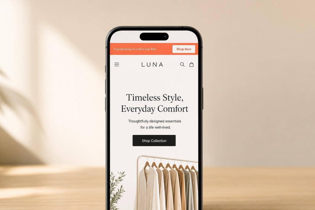
Haven’s Kitchen used a bright yellow announcement bar for its Aioli Intro Pack launch, choosing a color that broke from the site’s muted palette and made the new product harder to miss.
Keep the CTA button as the most distinct part of the bar. And stick with a flat background. Gradients and textures can make text harder to read. A flat color also helps you meet the 4.5:1 contrast ratio required by WCAG AA standards.
So: use a flat background, skip gradients and textures, and make sure the CTA button stands out first.
Once color grabs attention, typography needs to keep the message easy to read.
4. Choose Readable Typography
Color may win the first glance. Typography decides if people stick around long enough to read the offer.
A promo bar that’s only 35–45px tall has very little room, so it can only handle short copy. That’s why the text needs to be easy to scan right away, not something people have to stop and decode.
Keep text between 16px and 24px. On smaller screens, lean toward the lower end of that range so the line doesn’t wrap. If the message breaks into multiple lines, the bar starts to feel cramped fast.
Keep it tight:
- Use one message and one CTA
- Move secondary details to a lead generation landing page
- Pick a simple typeface that stays clear in a narrow bar
- Skip decorative fonts that slow scanning
Short copy matters here. Messages over 80 characters get a 22% lower click-through rate. That’s a pretty clear sign that promo bars work best when they say one thing, fast.
Readable type also depends on bar height. Even good text becomes hard to scan if the bar isn’t tall enough to hold it without wrapping.
5. Size the Bar for Visibility Without Taking Up Too Much Space
Once the copy is easy to read, the next job is getting the height right. This is what decides whether the bar stays visible without eating too much of the page. Put simply, bar height affects both visibility and how much space the bar takes up. A range of 30px to 50px is the usual sweet spot, and 35px to 45px tends to work best. Once you go past 50px, the bar often takes more space than it gives back.
On mobile, this matters even more. Oversized sticky bars can take up as much as 20% of the viewport. That’s a lot. A better target is 10% to 15% of the screen height.
Inline bars need a bit of planning too. If you don’t reserve space before the bar loads, it can trigger CLS and hurt SEO.
A little padding also goes a long way. It keeps the bar from feeling cramped and helps it stay clear of mobile UI elements like the hamburger menu and cart icon.
Once the height is locked in, the next step is deciding whether the bar should stay fixed or show up only when needed.
6. Choose Between Static and Sticky Behavior
Once you’ve set the copy, color, type, and size, the next step is behavior. You’re choosing between two simple options: static or sticky.
A static bar scrolls away with the page. A sticky bar stays fixed while visitors keep scrolling. The right pick depends on page length and whether people can still see the CTA as they move down the page.
If the page is short and the CTA stays in view without much scrolling, a static bar is usually enough. It does the job without adding extra weight to the screen.
Sticky bars make more sense on longer pages, where the CTA can disappear for a while. If someone has to scroll a lot before they see the next chance to click, a fixed bar can help keep that action in sight.
That isn’t just theory. On a long-scroll mobile homepage, a sticky CTA bar increased conversions by 20.4%.
Use sticky bars when you want the CTA to stay visible, but not get in the way of the page content.
7. Match Bar Content to Audience and Page Intent
Once you’ve set how the bar behaves, the next step is simple: make the message fit the page and the traffic source.
This matters more than a lot of teams expect. Targeted announcement bars convert 40% to 60% better than generic sitewide bars.
The reason is pretty straightforward. Different pages signal different goals. A person reading a blog post usually isn’t ready to buy on the spot. They’re learning, comparing, and trying to get their bearings. So a softer CTA like "Get the free checklist" feels like a natural next step.
A person on a cart or pricing page is in a different headspace. They’re close to making a choice, but something may still be in the way. That’s where messages like "Secure checkout" or "Free returns" do their job. They speak to the friction standing between interest and purchase.
You can take this a step further with source-based targeting. If someone arrives from an Instagram ad that promoted a specific discount code, the top bar should repeat that same code instead of swapping in a generic welcome message. When the message lines up, the experience feels smooth. When it doesn’t, it can feel off in a split second.
Use page type as the first targeting rule.
| Page Type | Visitor Intent | Recommended Bar Message |
|---|---|---|
| Homepage | Browsing | Broad value (welcome offer, brand trust signals) |
| Blog / Content | Researching | Soft CTA (email signup, free guide/checklist) |
| Product Page | Evaluating | Purchase trigger (free shipping threshold, stock urgency) |
| Cart / Pricing | Deciding | Reassurance (guarantees, secure checkout) |
| Landing Page | Specific action | Urgency or offer reinforcement |
One more thing: set fallback text for every dynamic field so missing data never leaves a blank or broken bar.
8. Design for Mobile Tap Targets and Small Screens First
Mobile isn’t a side case for top bars. It’s the main limit you need to design around. About 40% of storefront traffic comes from mobile devices, which means a bar that looks fine on desktop can break down fast on a small screen. And on mobile, each extra tap can hurt conversion. So once your bar is short and easy to read, the next step is simple: make it easy to tap.
On mobile, make the entire bar tappable instead of depending on a tiny "Click Here" button. The top of the screen is harder to reach with a thumb, so a full-width tap target cuts down friction. Focus on tap area more than extra height, and make controls big enough to hit without pinching or zooming.
A few sizing rules matter here:
- Any CTA button should be at least 48px tall, with 24px of horizontal padding on each side
- Leave at least 8px of space between tappable elements
- Stick to one CTA, one tap, one action
That last point matters more than it seems. If people can tap fast and move on, they’re more likely to reach the signup or gated page.
Text size matters too. Use at least 16px for text and fields so iOS doesn’t auto-zoom when someone taps. For the bar copy itself, use 14–16px semi-bold sans-serif text. And because users scan a bar in under 1.5 seconds, keep the message to one line on mobile.
After touch targets, give users a fast way to close the bar.
9. Include a Clear Dismiss or Minimize Option
A top bar without a close button can feel pushy. And when something feels pushy, people trust it less. That can hurt the same offer the bar is trying to support.
There’s data behind that too: dismissible bars with an "X" button get 12% higher engagement because users feel more in control. But that only helps when the close action is easy to spot and easy to tap.
Put a clear X in the top-right corner, and make the tap target 48×48 pixels on mobile. For critical alerts, use a minimize option instead, so users can collapse the bar without removing it fully.
If someone closes the bar, save that choice so it doesn’t interrupt the same session again. The right dismissal rule depends on what the bar is for:
- Dismiss (standard): Shows again on a set schedule. Best for alerts like downtime or shipping delays
- Dismiss & never show again: Stops appearing for that user. Best for one-time promos or feature intros
- Suppress after conversion: Hide the bar once the goal is done, like after a signup, download, or registration, so it doesn’t compete with the next step
Track dismissal rate and reactivation next, since close behavior can shift engagement.
10. Test Variants and Track Conversion Metrics
Once the bar is live, find out which choices lead to more clicks and more revenue. A/B testing helps you check whether a change in the top bar is doing its job. Even small tweaks can move the needle. Kiss My Keto saw a 19.32% lift in conversions after adding one coupon reminder announcement bar, with no change to paid traffic or the main offer.
Keep the test clean. Change one variable at a time. If you adjust the copy, color, and CTA all at once, you won’t know which change made the difference. A simple way to work through it is:
- Start with the bar copy
- Then test CTA presence
- Then try discount framing, like percentage vs. dollar amount
- After that, compare sticky vs. static behavior on the page
For results you can trust, run each variant for at least 2 weeks and wait until it reaches 1,000 sessions and 100 conversions.
Don’t stop at clicks. CTR for top bars often lands between 3% and 8%, but clicks alone don’t pay the bills. Watch the numbers tied to sales, such as add-to-cart rate, checkout starts, and revenue per visitor. Add UTM parameters to CTA links so you can track bar traffic in Google Analytics with more precision.
It also helps to watch a couple of guardrail metrics. Bounce rate and scroll depth can show whether the bar is helping the page or stealing too much attention from it.
Swap out the bar message every 2–4 weeks to reduce banner blindness. Then use what the data shows to pick the version that stays live.
Static vs. Sticky Top Bars at a Glance
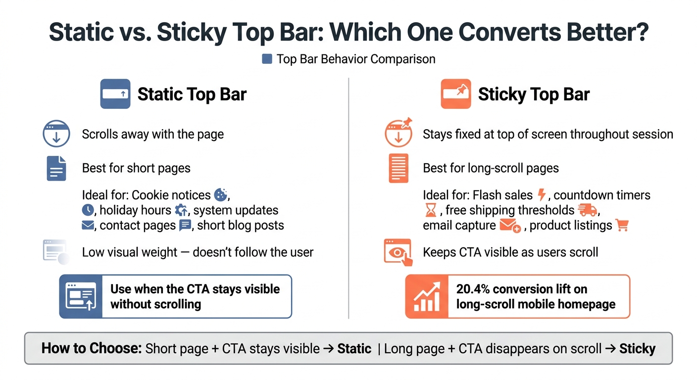
Static vs. Sticky Top Bar: Which One Converts Better?
Use this quick comparison to choose the behavior that fits the page.
| Feature | Static Top Bar | Sticky Top Bar |
|---|---|---|
| Visibility | Loads at the top and scrolls away | Stays fixed at the top or bottom of the screen throughout the session |
| Ideal Page Types | Homepages, short blog posts, contact pages | Long-scroll pages, blog posts, product listings |
| Best Use Cases | Cookie notices, holiday hours, system updates | Flash sales, countdown timers, free shipping thresholds, email capture |
When a Static Bar Is Enough
Use static bars for short pages and one-time notices. If the message only needs a quick glance, there’s no need to have it follow the visitor down the page. In that case, a sticky bar can feel like extra noise instead of help.
When a Sticky Bar Supports Better Results
Sticky bars make the most sense on long pages where the main CTA can disappear before someone is ready to click. A fixed bar keeps that action in view while people scroll, which makes it easier to act when the timing feels right.
Use sticky bars when the offer needs to stay visible on long pages.
Once the behavior is set, build the lead-capture flow around it.
Using Subpage.co to Turn Top Bars Into Lead Capture Tools
Once your top bar has one clear offer, the next step is simple: send that click to a dedicated gated page.
That matters more than it might seem. A top bar can get attention, but the page behind it does the heavy lifting. If the page feels messy, slow, or off-topic, people drop off. Subpage.co helps teams build gated lead magnets and content pages without needing design or coding help. If you want to set up that path fast, it’s one option worth looking at.
Build Lead Magnets Without Design or Development Work
Subpage.co’s editor gives marketers and founders a simple way to create whitepapers, checklists, and business cases in minutes. You can paste content straight from Google Docs, start with a pre-designed template, and publish a gated page without waiting on a developer.
It also includes Subpage AI, which can generate multi-tab lead magnets.
Link Top Bars to Gated Content Pages
Subpage.co also makes it easy to promote a whitepaper or checklist in a top bar across your site, then send visitors straight to the gated content page.
That setup gives you a clean path: the bar gets the click, and the gated page turns interest into signups.
From there, you can track which offers get clicks and which ones bring in leads.
Use Analytics and Exports to Track Results
Subpage.co includes built-in analytics so you can see which lead magnets are driving results. On the Free plan, analytics and leads stay available for 7 days. Premium gives you unlimited access.
When it’s time to use that data, you can export leads as a CSV file. On the Premium plan, you can also connect leads through Zapier or webhooks.
What to Measure When Testing Top Bars
Once a bar is live, the job isn’t done. You need to see whether it moves people through the funnel or just picks up clicks. CTR tells you if the bar gets noticed. Downstream conversions tell you if it’s doing useful work.
Core Metrics to Watch First
Click-through rate (CTR) shows whether the offer connects and whether the bar is easy to spot. But CTR is a diagnostic metric, not the main success metric. The metric that matters most is what happens after the click: signups, form completions, add-to-cart actions, checkout starts, or revenue per visitor.
Use bounce rate and scroll depth as guardrails. If clicks go up but bounce rate climbs or scroll depth drops, the bar may be pulling attention away from the page instead of helping it.
Test Variables That Often Change Results
Each test variable should tie back to a metric that shows business impact.
| Test Variable | Primary Metric | Guardrail Metric |
|---|---|---|
| Color contrast | CTR | Scroll depth |
| Timing/urgency | Conversion rate | Cart abandonment rate |
| Segmented traffic | Revenue per visitor | Bounce rate |
How to Run Useful A/B Tests
Change one variable at a time. If you tweak copy, color, and timing all in one test, you won’t know what made the difference.
Start with the commercial question. For example: "Does trust-led framing beat offer-led framing?" Then isolate the copy or design element tied to that question.
Also, tag every top bar link with UTM parameters so you can follow clicks all the way to downstream conversions in your analytics platform. After you have enough traffic for statistical significance, pick the winner based on bottom-of-funnel results, not just clicks. Then use that winning version as the new baseline for the next test.
Conclusion
A top bar works best when it stays simple.
The bars that get clicks tend to share the same traits: one clear offer, easy-to-read copy, strong contrast, and a layout that still looks good on mobile. When those pieces are in place, the bar feels useful instead of fading into the background.
That matters because a top bar has only a few seconds to win attention. Short copy and mobile-first clarity cut friction and keep the message in view where it matters most.
The bigger edge comes from matching the message to the visitor. Targeting and testing are what separate bars that convert from bars people ignore. Keep iterating, and refresh the message on a regular basis.
That’s when a top bar stops being decoration and starts doing real work.
FAQs
What makes a top bar convert better?
High-converting top bars work best when they say one thing clearly and make that message feel relevant right away. Keep the copy short and punchy, pair it with one clear call to action, and use high-contrast colors that stand out without making the text hard to read.
It also helps to update the messaging every two to four weeks so the bar doesn’t go stale. Keep the bar sticky so it stays in view, and use page-specific or geo-targeted rules when they make sense. On top of that, add a dismiss button – especially on mobile – so the bar feels helpful instead of annoying.
Should my top bar be static or sticky?
A sticky bar is usually the better pick for most websites because it keeps your message in front of people without getting in their way.
A static bar can slip out of sight once someone starts scrolling. A sticky bar, on the other hand, stays fixed at the top or bottom of the browser window. That means your offer, announcement, or call to action remains visible while visitors keep browsing.
How do I know if my top bar is working?
Don’t judge your top bar by click-through rate alone.
A healthy click-through rate often falls between 3% and 8%. But clicks don’t tell the whole story. A top bar can get attention and still pull people away from your main conversion path.
Look first at your primary goals, such as add-to-cart rate, checkout starts, and revenue per visitor. Then check secondary signals like banner interaction, bounce rate, and scroll depth to see how the bar affects the rest of the page.
If click-through rate drops below 1%, the offer may not be strong enough, or the visual contrast may need work.