

How to Simplify Lead Collection Forms
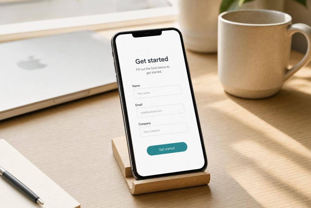
Short forms get more leads. In the data shared here, one-field forms convert at 18.2%, while forms with 9+ fields drop to 4.2%.
If I want more people to finish a lead form, I do three things first:
- Cut fields hard
- Keep the layout simple
- Fix copy, errors, and mobile friction
The core idea is simple: ask for less upfront. I keep only the fields needed for delivery, routing, or first follow-up. Then I move other questions, like budget, phone, or timeline, to later steps.
Here’s the whole process in plain English:
- Audit every field and label it as needed now, ask later, or remove
- Match form length to content-focused lead magnets
- Newsletter: 1–2 fields
- Whitepaper: 2–4 fields
- Demo request: 4–8 fields
- Use one column
- Order fields from easy to hard
- Use multi-step forms only when a short form isn’t possible
- Write clear labels and button text
- Show inline errors after a user leaves a field
- Add a short privacy note and explain what happens next
- Track completion rate, field drop-off, and mobile vs. desktop results
A few numbers stand out. Mobile users can take about 30% longer to finish forms. And cutting a form from 11 fields to 4 has been tied to a 120% lift in conversions. So if a form feels long, that’s often the first problem to fix.
This article shows a simple rule: keep the first ask small. Get the lead first. Ask the extra questions later.
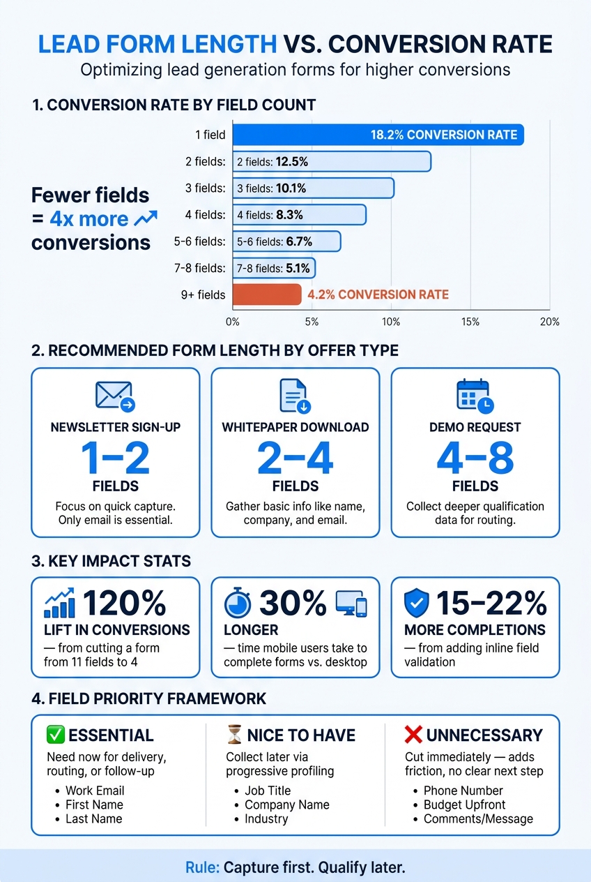
Lead Form Length vs. Conversion Rate: How Fewer Fields Drive More Leads
My Top Form Tips to Improve Your Lead Gen
sbb-itb-b3a7196
1. Audit your current form before making changes
Start by listing every field in a spreadsheet. Then get clear on the form’s main job. That goal becomes your filter for every field on the page. Once you do that, it gets much easier to see what should stay and what should go.
Sort every field by conversion value
Put each field into one of three buckets: essential, nice to have, or unnecessary.
- A field is essential if you need it right away for delivery, routing, or follow-up.
- A field is nice to have if you can collect it later.
- A field is unnecessary if it doesn’t support a clear next step or if it adds friction and leads to drop-off.
| Field | Newsletter Sign-Up | Whitepaper Download | Demo Request |
|---|---|---|---|
| Work email | Essential | Essential | Essential |
| First name | Nice to have | Nice to have | Essential |
| Company | Unnecessary | Nice to have | Essential |
| Job title | Unnecessary | Nice to have | Nice to have |
| Phone number | Unnecessary | Unnecessary | Nice to have |
| Budget / Timeline | Unnecessary | Unnecessary | Nice to have |
High-friction fields like phone number and budget often slow people down. If you don’t need them right now, cut them.
After that, remove every field that doesn’t clearly earn its spot.
Match form length to the offer
The value of the offer should set the ceiling for how many fields you ask people to fill out. A newsletter sign-up usually supports 1–2 fields. A whitepaper download can support 2–4 fields. A demo request can support 4–8 fields, but only if each field has a clear reason to be there.
If your current form is longer than these ranges for that offer type, that’s the first place to look in your audit.
Once the audit is done, the next move is simple: cut the form down.
2. Remove fields and clean up the structure
Cut required fields to the minimum
Delete every field your audit flagged as unnecessary. A field should stay only if it directly helps with delivery, routing, or follow-up in the first interaction.
The numbers make the case. Reducing a form from 11 fields to 4 has been shown to increase conversions by 120%. That kind of lift matters fast, especially with cold traffic.
For most lead magnet ideas, the smallest workable set is usually just 2–3 fields. In many cases, that means email and first name. For some B2B forms, company name also makes sense if you need it for routing.
Anything beyond that can come later through progressive profiling. Instead of asking for everything at once, ask one or two extra questions in later interactions. Once you cut the list down, the next job is making the remaining fields easier to finish.
Use a simple layout and logical field order
Layout matters just as much as field count. In most cases, a single-column form is the best choice. It gives people a clear path from top to bottom, cuts visual clutter, and works well on mobile, where multi-column forms often feel cramped or fall apart.
Field order matters too. Start with easy, familiar inputs like first name and work email. Then move to medium-effort fields like company name or role. Save the hardest questions – phone number, budget, or project details – for the end.
That sequence works for a simple reason: once people get started, they’re more likely to keep going. In U.S. B2B forms, phone number is often the field people resist most. Putting it last – and being clear about how you’ll use it – can improve completion.
Use multi-step forms only when the form cannot be short
If the form still needs more than a handful of inputs, split it into steps. But multi-step forms are not a trick for dodging the work of cutting fields.
They make sense in a few cases:
- High-value offers, like demo requests or custom quotes
- Qualification flows where sales needs to sort leads before spending time on them
If you can cut the form to 4 fields or fewer, keep it on one page.
When a multi-step form does make sense, keep each step to 3–5 inputs and group them by theme. For example:
- Step one: contact info
- Step two: company details
- Step three: project specifics
Add a progress bar and short step labels so each screen feels limited and clear. On Subpage.co, you can split lead magnet questions across screens and unlock content-led lead magnets on the final step.
3. Fix labels, microcopy, and validation
Once you’ve trimmed the field list, the next step is simple: remove friction from the fields that are left.
Write labels and button text that remove hesitation
When a form asks for only what it needs, each field should feel easy to complete. Start with labels. Put them above each field as visible labels, not inside the field as placeholder text. Use placeholders only for format hints, like [email protected] or +1 555-123-4567.
That split matters. The label tells people what to enter. The placeholder shows them how to enter it.
Your submit button needs the same level of care. Words like “Submit” and “Send” are flat and vague. They don’t tell people what happens next. Instead, use button text that names the outcome:
- Download the guide
- Get the checklist
- Access the case study
Match the button text to the asset name used on the page. That consistency helps confirm the next step.
Add inline validation and clear error messages
Field-by-field validation, shown after a user leaves each field, catches mistakes early. That means people don’t hit submit, get blocked, and then have to scan the whole form to figure out what went wrong.
Research shows this can increase form completion rates by 15–22% and cut errors by about 22%.
Timing matters here. Trigger validation after the user leaves a field. If a form marks an email as invalid while someone is still typing, it feels jumpy and annoying. That kind of friction can lead people to abandon the form.
When an error message does appear, make it specific. Put it directly below the field and explain exactly what needs to change.
| Instead of this | Write this |
|---|---|
| Invalid input | Looks like this email is missing ‘@’. Please check and try again. |
| Field error | This field is required to send your download link. |
| Wrong number | Please enter a U.S. phone number, e.g., 555-123-4567. |
Vague errors don’t just irritate people. They can stop completions altogether.
Reassure visitors about privacy and next steps
A short privacy note near the submit button can help build trust, especially on gated content pages where someone is sharing a work email. Keep this copy to one or two sentences. Tell people what they’ll get, how often you’ll contact them, and that they can opt out without hassle.
For example: We respect your inbox. You’ll receive the requested checklist and no more than two follow-up emails per month. Unsubscribe anytime.
It also helps to spell out what happens right after submission. A single line under the button, such as After you submit, you’ll see a download link and get a PDF copy by email, removes doubt about the next step.
On Subpage.co, you can pair this kind of microcopy directly with your gated content form, so visitors know exactly what they’ll get before and after they click.
Use this version as the baseline for testing and measurement.
4. Launch, measure, and refine the form
With your labels cleaned up and your privacy note in place, the form is ready to go live. At that point, the job shifts from writing to measurement. You want to see if those updates actually cut friction.
Track completion rate, drop-off, and mobile performance
Form completion rate is your main signal. Also track field-level drop-off, time to complete, and mobile vs. desktop performance. Those numbers show you where people still get stuck.
Any field with more than 10–15% drop-off needs a closer look, especially more sensitive inputs like phone number or company size. If mobile performance lags behind desktop, check tap targets, input types, and how clearly errors show up.
A weekly review helps you catch issues early, before they snowball.
Test one change at a time
Change one variable at a time so you can tell what moved the result. Write down the hypothesis, the change, the test dates, and the outcome. That becomes your optimization log.
It’s a simple habit, but it pays off. You can use the same test-and-learn loop on any lead magnet page.
Apply the same process to gated lead magnet pages
This same review process works for gated content pages too. Track scroll depth and time on page to see whether visitors are reading your value proposition before they reach the form. Watch form start rate separately from completion rate. If start rate is low, the issue usually sits with the headline or value proposition, not the form itself.
On Subpage.co, you can build and test gated content pages without code. Built-in analytics show which fields or steps lead to drop-off, and integrations with third-party apps like Zapier send leads into your CRM or email tools. That makes it easier to test one change, check the result, and keep iterating.
Conclusion: Keep forms short, clear, and easy to finish
Better lead forms ask fewer questions – and make each one count. Every extra field adds a bit of friction, and those little slowdowns pile up fast.
The playbook is pretty simple: audit every field, cut anything that doesn’t earn its spot, keep the layout single-column, write clear copy, and test one change at a time.
Once the form is lean, move the rest of the qualification out of that first step. Capture first, qualify later. Ask only for name and email upfront. Save budget ranges, timelines, or company size for a follow-up email or a short post-signup survey. People are often more willing to share extra details after they’ve already gotten something useful from you.
The same idea works for interactive lead magnets vs PDF lead magnets too. Checklists, whitepapers, and ROI calculators follow the same pattern: less friction at the gate usually means more leads getting through.
The goal is simple: remove friction. Short, clear forms tend to convert more leads.
FAQs
What fields should I ask for first?
Start with the basics: name and work email for B2B. In most cases, that means just 2 fields.
If you need a third field to gauge fit, add company name.
Don’t lead with touchy or intrusive fields like phone number or budget. Those can feel like too much, too soon.
If you need more detail, use progressive profiling in later steps.
When should I use a multi-step form?
Use a multi-step form when you need more than five or six fields. Splitting the process into smaller steps lowers friction and makes the form feel easier to finish.
This setup works especially well for high-value offers, like webinars or consultations. It also tends to be easier to use on mobile, where long forms can feel like a slog. Adding a progress indicator can help too. Once people start and see how far they’ve come, they’re more likely to keep going.
How do I know which field causes drop-off?
Use field-level funnel or drop-off analytics to compare form_start and form_submit. That makes it much easier to see where people quit the form.
Pay close attention to drop-off spikes around specific inputs. If one field causes a sharp falloff, that’s often the friction point.
It also helps to compare drop-off rates before and after you make sensitive fields optional. Phone numbers are a common sticking point.
Subpage’s analytics dashboard, along with GA4 integration, can help you pinpoint the exact step or field causing the problem.
Related Blog Posts
