Ultimate Guide to Lead Form Optimization

Lead form optimization is about making web forms easy to use and effective at converting visitors into leads. Here’s what you need to know:
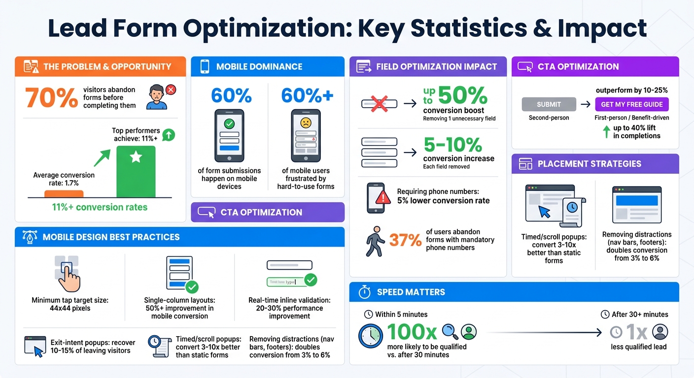
- 70% of visitors abandon forms before completing them.
- Top-performing companies achieve conversion rates over 11%, compared to the average of 1.7%.
- A good form balances simplicity (fewer fields) with the value of the offer.
- Mobile optimization is critical, as 60% of submissions happen on mobile devices.
- Placement matters: forms above the fold or triggered by user behavior (like exit-intent popups) perform best.
Key tips:
- Use only essential fields to boost conversions.
- Write clear, action-oriented CTA buttons.
- Design forms for mobile with single-column layouts and real-time validation.
- Place forms strategically on high-intent pages or use behavioral triggers.
Lead Form Optimization Statistics and Best Practices
🚀 Lead Form Best Practices to Maximize Your Conversions | Lead Generation 101 Part 3
sbb-itb-b3a7196
Core Components of High-Converting Lead Forms
Creating a lead form that drives conversions and attracts quality leads boils down to three key factors: the number of fields you include, the wording of your call-to-action (CTA) button, and how well the form functions on mobile devices. Nail these, and you’ll watch your completion rates soar. Miss the mark, and you’ll lose potential leads.
Choosing the Right Number of Form Fields
When it comes to form fields, less is often more. Stick to the "minimum viable form" approach – only ask for the essentials needed for the next step. For most B2B forms, this usually means requesting a name, work email, and company name – nothing extra.
Data backs this up. Removing just one unnecessary field can boost conversions by up to 50%, with each field you cut typically increasing conversion rates by 5–10%. However, there’s a tradeoff: while shorter forms lead to more submissions, longer forms can help filter out unqualified leads. Growth marketer Liam Dunne points out that fewer fields might increase quantity but could reduce lead quality.
The number of fields you include should align with the value of your offer, such as interactive lead magnets vs PDF lead magnets. For instance:
- A simple newsletter signup might only need 1–3 fields. For more complex offers, you can follow steps to create effective lead magnets to ensure your forms remain high-converting.
- A high-value offer, like an enterprise software demo, can justify 7–10 fields.
Be cautious with phone numbers – they tend to be a sticking point. Requiring one can lower conversion rates by up to 5%, and 37% of users may abandon the form altogether if it’s mandatory. A smart move? Make the phone number optional.
To strike the right balance, consider using progressive profiling. This technique allows you to collect additional details from returning users over time, rather than asking for everything upfront. Tools like Clearbit or ZoomInfo can also enrich your data by pulling company details from just a work email, letting you keep your form concise without compromising on lead qualification.
Once your fields are optimized, it’s time to focus on crafting an effective call-to-action.
Writing Clear Call-to-Action Buttons
Your CTA button is where the magic happens – or doesn’t. Replace dull, generic phrases like "Submit" or "Learn More" with action-oriented, benefit-driven text. Think “Get My Guide” or “Start My Trial” instead.
The team at OrbitForms offers a simple but powerful guideline:
"The button copy should complete the sentence ‘I want to…’ from the user’s perspective. ‘I want to download the template’ makes sense. ‘I want to submit’ doesn’t." – OrbitForms
First-person CTAs tend to outperform second-person ones by 10–25%. Why? They feel more personal and engaging. Adding microcopy near the button – like "No credit card required" or "We respond within 2 hours" – can also ease any last-minute doubts and encourage clicks.
With a compelling CTA in place, make sure your form is ready for the mobile-first world.
Designing for Mobile Devices
With over 60% of form submissions now happening on mobile devices, mobile optimization is a must. As the FormHug Team explains:
"A form that looks clean in a browser window can be genuinely broken on a phone – fields too small to tap accurately, the submit button below the fold, labels that overlap on a narrow screen." – FormHug Team
Start with a single-column layout, as multi-column forms can lead to messy horizontal scrolling on smaller screens. Make sure all tap targets – like fields, checkboxes, and buttons – are at least 44×44 pixels, so they’re easy to use with thumbs.
Use appropriate HTML input types to trigger the right mobile keyboards. For example:
- Use
type="email"for email fields to display the "@" symbol. - Use
type="tel"for phone numbers to bring up the numeric keypad.
Place labels above the fields rather than inside them as placeholders. This ensures they remain visible while users are typing. Also, enable autofill by using standard field names like ‘name’ and ’email’ to speed up the process.
Inline validation is another game-changer. By catching errors in real-time, you can improve form performance by 20–30%. And don’t just resize your desktop browser to test mobile functionality – test your forms on actual devices to catch any quirks with scrolling or keyboard behavior.
Where to Place Lead Forms on Your Website
Once you’ve fine-tuned your form fields, call-to-action (CTA), and mobile design, the next step is deciding where to place your lead forms for maximum impact. Placement plays a huge role in boosting your conversion rates.
The average conversion rate for lead capture pages across industries is 6.6%. However, where you position your form can significantly exceed this benchmark. As LeadOps.io puts it:
"The lead form isn’t a box you bolt onto the bottom of a landing page. It’s the trigger for your entire funnel."
Your placement strategy should align with how users interact with your site. High-intent pages like demo requests or resource downloads and lead magnets need instant visibility, while educational pages thrive with forms that appear after delivering value. Let’s explore the two most effective strategies.
Above-the-Fold Positioning
For high-intent pages – like product pages or demo requests – placing your form above the fold is essential. This ensures visitors see it immediately without scrolling, reducing friction and capturing their interest when it’s at its peak.
Katie Woon, Head of Marketing at PlatoForms, underscores this point:
"If users have to scroll to find your form, many of them won’t bother. Place your form prominently on the page, ideally above the fold."
Data supports this. Forms hidden below the fold often cause lead volume to plateau. Positioning your form in the hero section, next to your headline or offer, creates a seamless connection between value and action.
That said, context is key. For longer content like blog posts or guides, embedding forms at intervals – about every 350 words – keeps your offer visible as readers scroll. This strategy ensures your form stays top-of-mind without relying on users to remember it by the end of the page.
Pro tip: Simplify your lead capture pages. Removing distractions like navigation bars, footers, and extra links can double your conversion rate, jumping from 3% to 6% by keeping the focus solely on the form.
For visitors who don’t convert right away, consider alternative triggers to capture their attention.
Using Exit-Intent Popups and Timed Forms
When visitors hesitate, behavioral triggers can step in – these forms appear based on user behavior rather than static placement.
Exit-intent popups are particularly effective. They activate when a user’s cursor moves toward the back button or address bar, offering one last chance to collect their information. These popups can recover 10–15% of visitors who would otherwise leave. Keep these forms simple – stick to a single field to reduce friction for someone already planning to exit.
Timed and scroll-triggered forms take a different approach. Instead of interrupting users immediately, these forms appear after a visitor has engaged – typically after 30 seconds on the page or once they’ve scrolled 50–60% down. Bohdan Khodakivskyi, Founder of Fomr, explains why this method works:
"When they’re done well, [popup forms] convert 3-10x better than static inline forms."
The secret? These forms show up at the right moment, making the request feel natural rather than pushy.
Here’s a quick comparison of placement strategies:
| Placement Type | Primary Advantage | Typical Conversion Rate | Best Use Case |
|---|---|---|---|
| Above-the-Fold | Immediate visibility; captures high-intent users | ~1–3% (Static/Inline) | Product pages, demo requests, landing pages |
| Timed/Scroll Popups | Matches engagement; appears when interest peaks | 3–10x higher than static | Blog posts, resource guides, newsletter signups |
| Exit-Intent Popups | Recovers lost traffic without disrupting flow | 10–15% recovery rate | Pricing pages, checkout abandonment, general exits |
For mobile users, ensure popups don’t cover more than 60–70% of the screen. This avoids Google’s interstitial penalties and keeps the experience user-friendly.
Building Lead Forms with Subpage.co
Creating effective lead forms doesn’t have to be a hassle, especially when you use a platform like Subpage.co. Subpage streamlines everything – from setting up gated content to monitoring results. Forget the need for multiple plugins or complex landing page builders. With Subpage, you can simply create a page, activate lead collection, and share a direct link. Plus, Subpage AI makes it even easier by generating multi-tab lead magnets in just a few clicks, saving you time and effort.
Setting Up Gated Content for Lead Capture
Offering something valuable in exchange for contact details is one of the best ways to capture leads. Subpage’s gated content feature is perfect for resources like whitepapers, checklists, or business cases. Instead of letting visitors download a static PDF without leaving any information, Subpage creates an interactive page. Visitors can preview the content, but they’ll need to provide their email to unlock the full resource. This method not only helps you collect leads but also keeps users engaged on your page.
Subpage offers multiple ways to gate content, including pop-ups, top bars, and lead generation widgets. You can choose the method that fits your content best. For example, Subpage users collectively generated over 1,000 leads in just two weeks during April and May 2026. Once your gated content is live, you can further fine-tune it by adjusting its design and integrating it with other tools.
Customizing Forms and Connecting Integrations
Consistency is key when it comes to branding. Subpage allows you to customize your forms by applying your brand colors and hosting them on a custom subdomain (e.g., yourname.subpage.co). If you want a fully white-labeled experience without Subpage branding, the Premium plan ($19/month) has you covered.
Beyond aesthetics, Subpage integrates seamlessly with your existing marketing tools. Using Zapier and Webhooks (available with the Premium plan), you can automatically send leads to your CRM or email marketing platform. Even the Free plan provides a solid starting point, offering basic functionality with up to 5 lead magnets and 7 days of analytics access.
Here’s a quick look at the plan features:
| Feature | Free Plan | Premium Plan ($19/mo) |
|---|---|---|
| Lead Magnets | Up to 5 | Unlimited |
| Analytics & Lead History | 7 days | Unlimited |
| Branding | Subpage Branding | Whitelabel (No Branding) |
| Domain | subpage.co subdomain | Custom Subdomain |
| Integrations | Not included | Zapier & Webhooks included |
Tracking Form Performance with Analytics
Optimizing your forms starts with understanding how they perform. Subpage includes an analytics dashboard that shows form submissions and allows you to export lead data via CSV. For deeper insights, you can integrate with Google Analytics 4 (GA4) to track actions like form_start and form_submit. This helps identify problem areas – whether visitors abandon the form halfway through or fail to click on the call-to-action.
The Premium plan provides unlimited access to analytics and lead history, while the Free plan limits you to the past 7 days. By tracking trends over time, you can make ongoing improvements. GA4’s funnel explorations feature can also help you map the entire journey, from the initial page view to form submission. This way, you’ll know which gated resources generate the highest-quality leads.
Armed with these insights, you can keep refining your lead forms to ensure they align with your goals and deliver the results you need.
Common Lead Form Mistakes and How to Fix Them
When it comes to capturing leads, even the best-designed forms can fall short if they include common mistakes. Here’s a sobering statistic: nearly 70% of visitors who start filling out a form abandon it before completing it. The good news? Most of these issues are easy to fix, and even small changes can have a big impact on your conversion rates.
One major issue is asking for too much information upfront. Forms that demand sensitive details like phone numbers or budget estimates before trust is established can feel intrusive. The fix? Keep it simple. Start with just the basics – name and email. If more details are necessary, use progressive profiling to gather information gradually over time.
Another common problem is a poor mobile experience. With over 60% of mobile users frustrated by forms that are hard to navigate, optimizing for mobile is non-negotiable. Ensure all buttons and input fields are at least 44 pixels tall for easy tapping, and stick to a single-column layout that loads quickly on smaller screens.
Unclear or generic language is another conversion killer. Headlines like "Contact Us" or buttons labeled "Submit" don’t convey value or next steps. As Bohdan Khodakivskyi, Founder of Fomr, explains:
"Submit is the most wasted word in form design. It tells the visitor nothing about what happens next".
Swap out these generic labels for action-oriented, benefit-driven phrases like "Get My Free Audit" or "Download Template" to make your forms more engaging.
Trust issues and validation problems also drive users away. Forms without privacy policies or security badges can feel risky – 29% of users abandon forms due to privacy concerns. Similarly, delayed error messages frustrate users. Instead, include real-time inline validation to guide users as they fill out each field. This small adjustment can improve form performance by 20–30%.
Here’s a quick overview of common lead form mistakes and how to address them:
Comparison Table: Mistakes vs. Solutions
| Mistake | Solution | Expected Impact |
|---|---|---|
| Too many fields | Limit to 3–4 essential fields (e.g., Name, Email, Company) | Up to 120% increase in conversions |
| Generic "Submit" button | Use benefit-driven text (e.g., "Get My Free Guide") | Up to 40% lift in completions |
| Poor mobile formatting | Opt for single-column layouts and 44px tap targets | 50%+ improvement in mobile conversion |
| Asking for phone numbers | Make phone fields optional or remove them entirely | 37% reduction in abandonment |
| Post-submit validation only | Add real-time inline validation | 20–30% better performance |
| Missing trust signals | Include privacy statements and security badges | 17% boost in mobile completion |
| Vague value proposition | Add a clear, benefit-focused headline | Up to 40% lift in completions |
Conclusion
Optimizing lead forms can completely reshape how you turn visitors into subscribers. Katie Woon, Head of Marketing at PlatoForms, sums it up perfectly:
"A lead capture form isn’t just a set of fields. It’s a psychological journey. It’s a value exchange".
Here’s the reality: while the average form conversion rate sits at just 1.7%, the best performers see rates soar above 11%. That difference is massive. Even small improvements in your conversion rate can add up to millions in potential revenue.
The formula for improvement is simple but powerful. Focus on these essentials: reduce friction by replacing low-conversion lead magnets and only asking for what’s absolutely necessary, design forms with mobile users in mind (since over 70% of submissions now happen on smartphones), and make sure the value you’re offering aligns with the information you’re requesting.
But capturing leads is only half the battle. What happens next is just as crucial. Did you know that leads contacted within five minutes are 100 times more likely to be qualified than those reached after 30 minutes? That’s why it’s vital to integrate forms with your CRM, set up automated welcome sequences, and use inline validation to smooth out the user experience. Keep an eye on where users drop off, test different headlines and calls to action, and treat each form as the starting point for your sales funnel.
Start small: focus on high-traffic forms, establish a baseline, and tweak one element at a time. Consistent, data-backed adjustments can drive exponential growth. When you approach lead forms with this mindset, they become more than just tools – they turn into powerful engines for sustained lead generation.
FAQs
How do I choose between fewer fields and better lead quality?
Balancing the number of fields in your form with lead quality can be tricky. Simplifying your form by reducing the number of fields often leads to higher conversion rates, but it might also bring in leads that aren’t a great fit. The key is to ask only the most important questions – this minimizes friction and keeps prospects engaged.
To gather more information without overwhelming users upfront, consider tools like progressive profiling or data enrichment. These methods allow you to collect additional details over time, ensuring you maintain strong lead quality without compromising your conversion rates.
What’s the best way to test and improve form conversion rates?
To boost your form conversion rates, begin by taking a close look at how your current forms are performing. Are there too many fields? Are the labels unclear? These could be barriers for users.
Next, try A/B testing. Experiment with different elements like where you place your call-to-action (CTA), how long the form is, or even its overall design. Small tweaks can make a big difference.
Keep an eye on the data – track metrics like abandonment rates and overall performance. Use those insights to make informed adjustments. With a consistent, data-driven approach, you can see a noticeable increase in form submissions over time.
How can I follow up fast after a form submission?
When someone submits a form, timing is everything. Set up automated workflows to send a quick acknowledgment or thank-you message right away. This simple step reassures your lead that their submission was received and keeps the conversation going.
Take it a step further by linking your forms to your sales or marketing tools. This ensures leads are instantly routed to the right team or workflow, making follow-ups faster and more tailored to their needs.