How To Analyze Funnel Performance

Want to improve your marketing funnel? Start by analyzing where users drop off and how to fix it. Here’s what you need to know:
- A funnel maps the customer journey, from discovering your brand to taking action (like making a purchase or signing up).
- Common funnel types include lead generation funnels (focused on capturing contact info) and sales funnels (focused on converting leads into customers).
- Tools like Google Analytics 4 (GA4), Mixpanel, and Subpage.co help track user behavior and identify bottlenecks.
- Key metrics to measure include conversion rates, drop-off rates, and funnel velocity (how fast users move through stages).
- Fix issues by addressing friction points like unclear messaging, complicated forms, or technical bugs. Use A/B testing to validate changes.
Pro Tip: Even small improvements at each stage can lead to big gains – like a 10% boost per stage translating into a 46% overall increase in conversions.
Keep reading to learn how to map, track, and optimize your funnel for better performance!
Mapping and Tracking Your Funnel
How to Map the Customer Journey
When mapping the customer journey, focus on how users actually interact with your site, not on an idealized version of their behavior. Real users often take unexpected paths – skipping steps, backtracking, or finding shortcuts. A common mistake is designing a funnel based on how you want users to behave rather than how they actually behave.
"Funnel analysis only works when it reflects real behavior, not ideal behavior. Most teams build their funnel around how they want users to move through the site… if your funnel is built on assumptions, you are essentially measuring fiction." – AnalyticSafe
Start by pinpointing the final action you want users to take, such as completing a purchase, requesting a demo, or submitting a form. Then, work backward to outline the real steps users take to get there. For example: Blog Post → Landing Page → Gated Content → Form Submission → Thank You Page. Keep your funnel to 4–6 stages to avoid cluttering your analysis with unnecessary data.
Once you’ve mapped the journey, figure out which data points and tools you’ll need to track each stage effectively.
Data and Tools You Need for Tracking
Accurate funnel tracking depends on collecting data like page views, event triggers (e.g., clicks, downloads, or form submissions), and identity stitching to connect anonymous users with known ones.
Here’s a breakdown of tools that can help you track and analyze your funnel:
| Tool Category | Purpose | Examples |
|---|---|---|
| Web Analytics | Understand traffic sources and early-stage behavior | GA4, Plausible, Fathom |
| Event & Product Analytics | Analyze stage-to-stage conversions and time between steps | Mixpanel, Amplitude, VWO |
| CRM & Sales Tools | Track leads and deals (especially for B2B) | HubSpot, Salesforce |
| Behavioral Tools | Discover why users drop off | VWO Insights, Hotjar |
It’s worth noting that browser-based tracking often misses 20–40% of conversions due to ad blockers and privacy settings. Combining client-side tracking with server-side tracking can help close this gap. For those prioritizing privacy, tools like Plausible or Matomo provide GDPR-compliant tracking without sacrificing data quality.
Platforms like Subpage.co can also enhance your funnel visibility, especially for gated content. Every lead magnet – whether it’s a checklist, whitepaper, or resource page – generates actionable analytics. You can export leads as a CSV file or integrate them with email platforms via Zapier, ensuring that conversions at this stage feed seamlessly into your overall tracking system. This level of detail is critical for identifying and addressing bottlenecks in your funnel.
Once your data collection tools are in place, the next step is defining each funnel stage clearly and assigning measurable metrics.
Defining Funnel Stages and Metrics
Clear definitions for each funnel stage make your data actionable. Every step should correspond to a specific, measurable event or URL – for instance, form_submit_success instead of a vague label like "showed interest." This level of precision makes it easier to identify where users drop off and address the causes.
Two critical factors often overlooked are time windows and monetary values. A time window defines how long users have to complete an action for it to count as a conversion. For example, you might track users who sign up within seven days of landing on your page. Without this boundary, it’s impossible to distinguish a truly engaged user from someone who returns months later by coincidence.
Assigning a dollar value to each stage based on historical conversion rates helps you prioritize fixes. For instance, a 10% drop-off in a stage that represents $50,000 in potential revenue is far more urgent than the same drop-off in a stage worth $500.
sbb-itb-b3a7196
What is funnel analysis? (And how to fix conversion bottlenecks)
Key Funnel Metrics to Measure
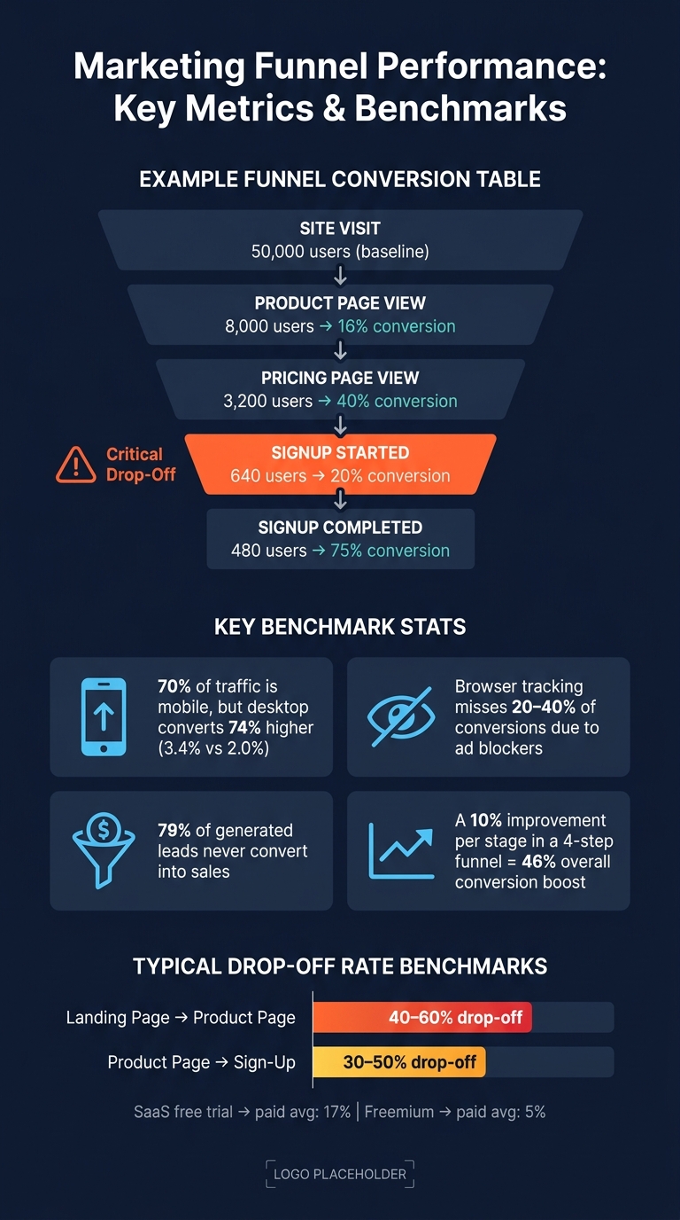
Marketing Funnel Performance: Key Metrics & Benchmarks
Stage-to-Stage Conversion Rates
After defining your funnel stages, tracking your stage-to-stage conversion rate becomes essential. This metric shows the percentage of unique users who move from one step to the next.
The formula is straightforward:
Conversion Rate = (Users at Step N+1 ÷ Users at Step N) × 100
It’s critical to count unique users rather than total events. For example, if a user clicks "Sign Up" three times, it still counts as just one conversion.
Here’s an example to illustrate:
| Funnel Step | Users | Stage-to-Stage Conversion Rate |
|---|---|---|
| Site Visit | 50,000 | – (baseline) |
| Product Page View | 8,000 | 16% |
| Pricing Page View | 3,200 | 40% |
| Signup Started | 640 | 20% |
| Signup Completed | 480 | 75% |
(Source: OSCOM Funnel Analysis Example)
In this example, notice the steep drop between "Pricing Page View" and "Signup Started" (20%). While it might be tempting to focus on the stage with the lowest number of users, this drop-off highlights a critical area for improvement. Addressing this stage could significantly boost overall funnel performance, often by optimizing lead magnet conversion rates.
Drop-Off Rates and Funnel Friction
Drop-off rate measures the percentage of users who leave the funnel at a specific stage. It’s essentially the inverse of the conversion rate. For reference, drop-offs of 40–60% from a landing page to a product page and 30–50% from a product page to sign-up are fairly typical.
If you notice an unusually high drop-off rate at any stage, start by confirming that your tracking is accurate. A broken event trigger might create the illusion of a drop-off. Once you rule out technical issues, identify the root cause by categorizing the friction into one of these four areas:
- Awareness gap: Users don’t know what action to take next.
- Motivation gap: Users aren’t convinced to proceed.
- Friction problem: The process feels too complicated or time-consuming.
- Technical issue: Bugs or slow loading times are causing frustration.
Each type of friction requires a tailored solution, whether it’s clearer instructions, stronger messaging, a smoother user experience, or technical fixes.
Advanced Metrics for Funnel Efficiency
Once you’ve nailed down conversion and drop-off rates, advanced metrics can help connect funnel performance to broader business goals. Two key metrics to monitor are:
- Customer Acquisition Cost (CAC): How much it costs to acquire a single customer.
- Average Order Value (AOV): The revenue generated per customer.
These metrics help you decide where to focus your efforts. For example, use the formula:
Revenue at Risk = (Visitors × Drop-off rate × AOV)
This approach shifts the focus to stages with the highest financial impact. A 20% drop-off at a stage worth $80,000 in potential revenue deserves more attention than a 40% drop-off at a stage worth only $2,000.
Another valuable metric is funnel velocity, which measures how quickly users move from the first step to the final conversion. For instance, a SaaS free trial converting to paid status at an average rate of 17% differs significantly from a freemium model averaging just 5%. Tracking these rates over time can reveal whether changes in performance are tied to product updates, new campaigns, or seasonal trends.
Finding and Fixing Funnel Bottlenecks
Using Funnel Visualizations
A funnel visualization chart is your go-to tool for spotting bottlenecks fast. Tools like GA4 Funnel Exploration (free) and VWO display each funnel stage as a bar, highlighting where the biggest drop-offs occur. These visualizations make it easier to pinpoint issues without combing through endless spreadsheets.
Here’s a tip: Keep your funnel between 4–8 steps. Any more, and the chart gets cluttered, making it harder to focus on what’s important. Also, decide upfront whether your funnel should be closed (users must follow steps in sequence, ideal for checkouts) or open (users can enter at any stage, better for browsing content). Using the wrong setting could give you misleading results. Once you’ve identified the major drop-offs, segmenting the data will uncover more specific insights.
Segmenting Data for Deeper Insights
After visualizing your funnel, take the next step by segmenting the data. Looking at overall funnel performance can hide important details. For example, in 2026, desktop conversion rates are 74% higher than mobile (3.4% vs. 2.0%), even though mobile drives nearly 70% of traffic. If you only analyze combined data, you might miss gaps like this.
Start by breaking down your funnel by device type, traffic source, and user type (new vs. returning). If drop-offs happen across all segments, the issue likely lies with your content or messaging. But if the drop-off is specific to one segment – like new mobile users from paid ads – you’ve got a more targeted problem to address.
Diagnosing Bottlenecks and Finding Solutions
Once you’ve identified problem areas through visualization and segmentation, it’s time to figure out what’s causing them. Quantitative tools help you locate the issue, while qualitative tools explain why it’s happening.
"Many teams already know which pages need improvement, but the real challenge is knowing what to change. Our process starts with reviewing design, UX, and performance data to spot where the biggest leaks and opportunities exist." – Talia Wolf, CEO, Getuplift
Session pairing is one effective method: compare 10 recordings of users who dropped off with 10 recordings of those who converted. This can reveal patterns like rage clicks, hesitation loops, or ignored CTAs. Microsoft Clarity offers this feature for free, along with heatmaps.
If you notice a sudden drop, first confirm your tracking is accurate. Once the data checks out, categorize the root cause and match it to a solution using this table:
| Issue | Indicators | Fixes |
|---|---|---|
| Awareness | High exit rate, low scroll depth | Add clearer CTAs, make next steps obvious |
| Motivation | High bounce on pricing pages | Strengthen value proposition, add social proof |
| Friction | Form abandonment, long time on step | Simplify forms, reduce required fields |
| Technical | Device-specific drops, error pages | Test across browsers, optimize page speed |
For lead magnet pages – like gated whitepapers or checklists – one common issue is mismatched expectations. If the landing page feels overly sales-focused compared to the ad or link that drove the user there, visitors may hit the back button immediately. Tools like Subpage.co’s built-in analytics can help you pinpoint where users lose interest, allowing you to align the page content with their expectations.
Testing and Improving Funnel Performance
Data-Driven Optimization Strategies
Once you’ve identified where your funnel is leaking, the next step is to tackle the issues step by step. Start by forming a clear hypothesis: pinpoint the friction point, outline the change you plan to make, predict how user behavior might shift, and decide on the metric you’ll use to measure success.
To ensure accuracy, establish a baseline using 30–90 days of data. This helps you work with reliable averages. Then, use an Impact vs. Effort matrix to prioritize your fixes. Focus on high-impact, low-effort changes first – like rewriting a confusing call-to-action (CTA) or removing unnecessary form fields. Larger redesigns should wait until your tests confirm the direction you’re heading.
Here’s an interesting stat to keep in mind: a 10% improvement at each stage of a four-step funnel can result in a 46% overall boost in conversions. Small, consistent improvements often deliver better results than attempting a massive overhaul. With your hypotheses and priorities in place, move forward by validating your changes through structured A/B testing.
A/B Testing for Funnels
As PulseCRO explains:
"Funnel analysis is the map. A/B testing is the route. You need the map first."
One common mistake? Research shows that 68% of companies optimize the wrong funnel stage first. This often happens because they focus on percentage drop-offs instead of absolute user volume. To avoid this, prioritize the step where you’re losing the most users, not just the step with the largest percentage drop.
When running A/B tests, stick to one variable at a time to pinpoint its exact impact. For example, if you’re testing a landing page for a gated resource like a whitepaper, change either the headline or the form length, but not both. Tools like Subpage.co make it easy to create test variations with built-in analytics, helping you track actions like downloads with precision.
Run your tests for 14–30 days to account for traffic fluctuations and ensure statistical significance. Measure success based on the final conversion – such as a completed signup or download – rather than intermediate metrics like click-through rates. This iterative approach helps refine your funnel over time, building on the insights gained from each test.
Once your tests are complete, focus on understanding the broader effects of your changes.
Measuring the Impact of Changes
When a test wraps up, don’t just look at surface-level metrics to declare a winner. For instance, a change that increases checkout completions by 8% might also lead to more refund requests or higher customer support volume, which could negate the benefits. That’s why tracking guardrail metrics – secondary indicators like payment error rates, average order value, or customer support inquiries – is just as important as monitoring your primary key performance indicator (KPI).
Take Bunzl’s experience as an example. In April 2026, they used VWO to pinpoint a major drop-off just before the final checkout stage. By focusing their testing efforts on this specific bottleneck, they achieved a 9% increase in total sales and a 9.5% rise in click-throughs to checkout. This success came from addressing a single pain point with a targeted test, rather than overhauling their entire site.
To further sharpen your insights, compare results across different segments, like desktop vs. mobile users, to ensure consistent performance across platforms.
Conclusion
Effective funnel analysis means understanding how users interact with your brand, pinpointing where they drop off, and making ongoing adjustments. Since both markets and user behavior are always evolving, this isn’t a one-time task – it’s a process that requires constant attention.
As Alisha Conlin-Hurd, CEO & Co-Founder of Persuasion Experience, explains:
"A funnel isn’t something you choose to have. It already exists through every interaction someone has with your brand. Each touchpoint can either move people forward or create hidden revenue leaks that add up over time."
The process starts at the top of the funnel. Focus on your entry points, especially lead magnets. Why? Because nearly 79% of generated leads never convert into sales. High-quality, well-targeted gated content – like whitepapers or checklists – can make a big difference. Platforms like Subpage.co make it easier to create and track these materials, giving you the insights you need to improve performance right where it matters most.
FAQs
How do I choose the right funnel stages?
Instead of sticking to a rigid framework, focus on mapping the actual steps users take on your site. Start by identifying the key actions they perform, beginning with the very first interaction and leading up to your primary conversion goal.
Keep the process manageable by aiming for 3–8 stages. This strikes a balance between providing enough detail and maintaining clarity. Define each stage by a specific action – like moving from a landing page visit to booking a consultation.
To make this approach effective, ensure that these stages align closely with your business objectives. Use consistent definitions across your mapping process to avoid confusion and keep everything on track.
What should I do if my tracking is missing conversions?
If you’re noticing missing conversions, start by comparing backend data – like CRM leads or order records – with reports from GA4 and your ad platforms for the same time frame. If the backend data appears consistent, it’s time to investigate potential tracking issues.
First, check for any delays in reporting. GA4 can sometimes take 24–48 hours to update. Next, review any recent changes, such as updates to Google Tag Manager (GTM) or the implementation of new consent banners, which could disrupt tracking. Running test conversions can help pinpoint the problem.
Use debugging tools to ensure events are firing as they should. Once you’ve confirmed and resolved any tracking issues, you can confidently make adjustments to your budgets.
How do I prioritize which drop-off to fix first?
When analyzing user drop-offs, it’s crucial to focus on the stage where the largest absolute number of users is lost – not just the stage with the highest percentage drop-off. Why? Because fixing leaks with a higher volume of users can deliver a much greater impact on your business outcomes.
To address this effectively, use a prioritization framework that evaluates impact, reach, effort, and confidence. This helps you zero in on the areas that truly matter and ensures you’re investing resources where they can make the biggest difference.
Once you’ve identified the key friction points, dig deeper to uncover the root cause. It could be anything from awareness gaps (users don’t know what to do next), motivation issues (users aren’t convinced to take action), or technical barriers (users encounter bugs or slow load times). From there, develop a testable hypothesis to address the issue and validate your solution.