

Checklist for Branding Lead Magnets with Colors
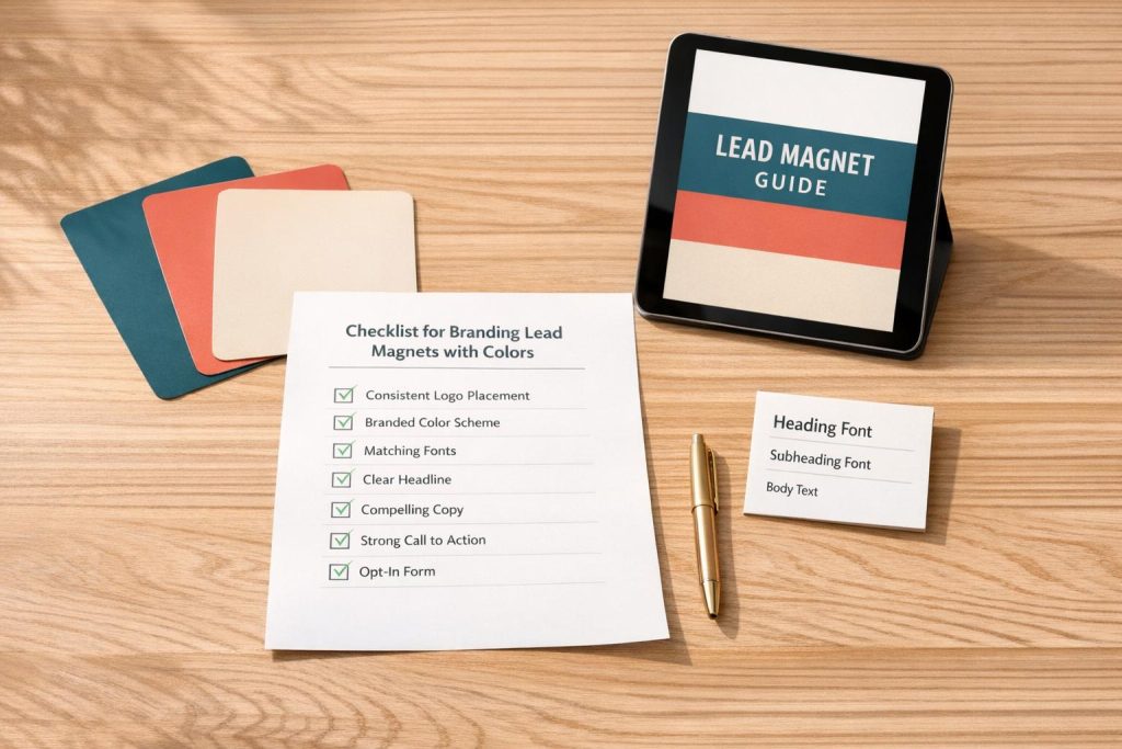
Your lead magnet is often the first interaction someone has with your brand. Its design can either build trust or make people question your professionalism in seconds. Consistent branding – through colors, typography, and layout – helps create a polished, trustworthy impression. Here’s how to ensure your lead magnets reflect your brand effectively:
- Define Brand Colors: Use a clear palette with primary, secondary, neutral, and accent colors. Document HEX, RGB, and CMYK values for consistency.
- Set Typography Rules: Limit to 2-3 fonts with defined roles (headings, body text, captions). Ensure readability with proper sizes and spacing.
- Check Accessibility: Use contrast tools to meet WCAG standards for text and background readability.
- Create a Branding Guide: Compile all brand elements into a simple reference for consistent use across all materials.
- Apply Colors and Fonts: Use your brand colors and typography on the lead magnet’s cover and interior pages for a cohesive look.
- Review Consistency: Audit all your lead magnets to ensure alignment with your branding. If you’re looking to expand your library, consider these lead magnet ideas to drive more signups. Use checklist lead magnet templates to simplify future designs.
- Final Checks: Test readability on mobile, verify link functionality, and ensure file size is manageable for easy downloads.
Consistency in branding builds recognition and trust, making your lead magnets more effective at engaging and converting your audience.
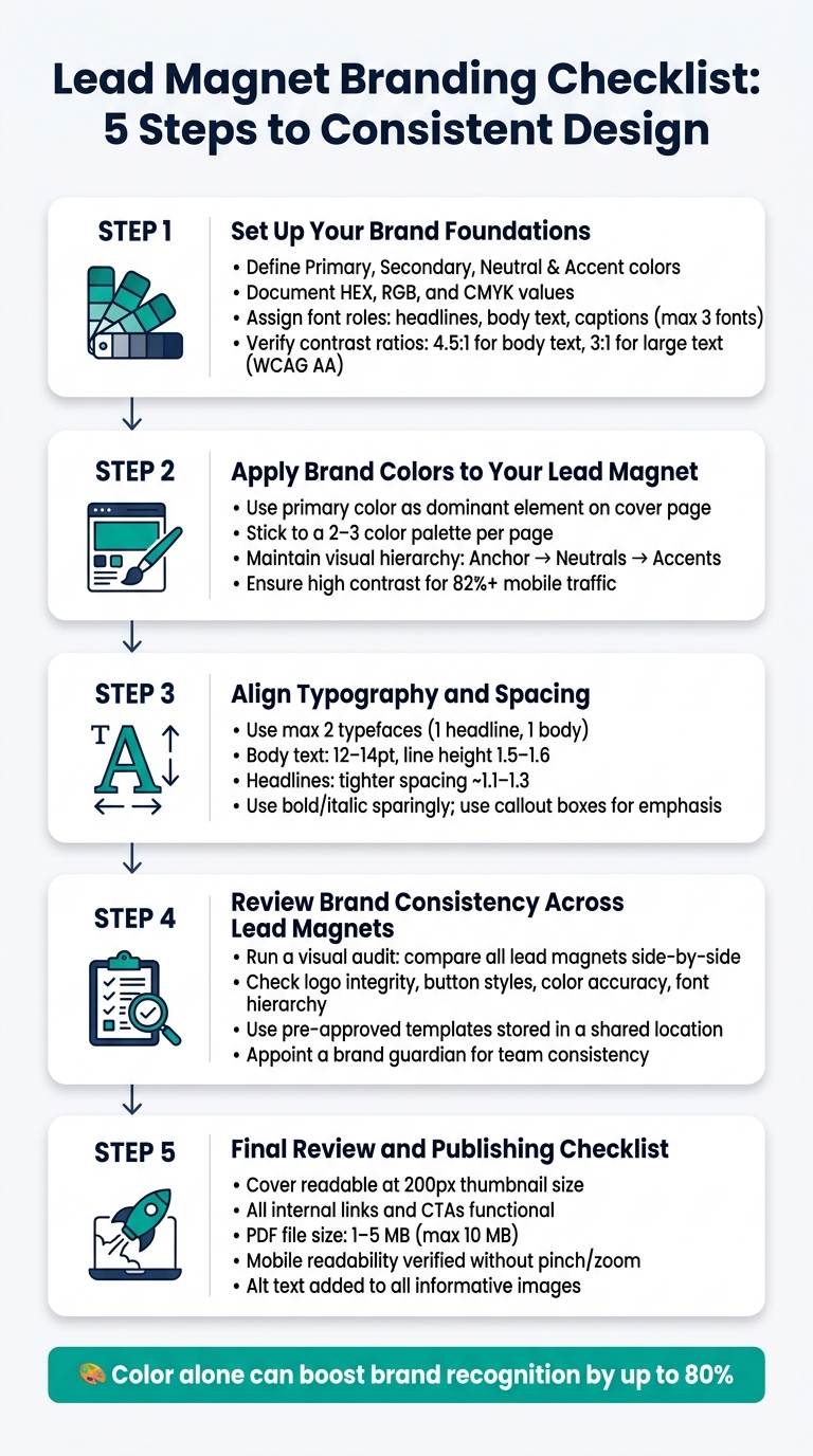
Lead Magnet Branding Checklist: 5 Steps to Consistent Design
Designing A Lead Magnet In Canva – 2024 Process + Tutorial
sbb-itb-b3a7196
Step 1: Set Up Your Brand Foundations
Before diving into design, it’s crucial to lock down your brand’s visual guidelines. Without this, every new lead magnet risks inconsistency, which can dilute your identity over time. Did you know that color alone can boost brand recognition by up to 80%? Getting this right from the start ensures every piece of content aligns with your brand.
Document Your Brand Colors
Your color palette should have clear roles to maintain consistency and clarity. Break your colors into four categories:
- Primary: Your main brand color, used for logos and headers.
- Secondary: Adds variety and helps with visual hierarchy, like in section dividers or graphics.
- Neutral: Supports readability, used for backgrounds, body text, and borders.
- Accent: Reserved for calls to action (CTAs), highlights, and alerts.
For each color, document its HEX, RGB, and – for print purposes – CMYK or Pantone values. Also, note approved text-on-background combinations to maintain readability.
| Color Role | Purpose | Typical Usage |
|---|---|---|
| Primary | Core brand identity | Logos, main headers |
| Secondary | Variety & hierarchy | Section dividers, graphics |
| Neutral | Readability & structure | Backgrounds, body text, borders |
| Accent | Conversion focus | CTA buttons, highlights, alerts |
Define Your Typography System
Typography plays a big role in how your brand feels. Assign specific roles to your fonts – headlines, body text, and optional captions – and stick to two font families (three at most). Too many fonts create visual chaos.
For digital screens, use 16px as the standard base size for body text, paired with a line height of 1.5 to 1.7 for easy reading. Headlines can have a tighter line height (around 1.2–1.3) to make them stand out. Always include a fallback web-safe font, like Arial or Georgia, to ensure compatibility. And don’t forget accessibility – your typography choices should be easy to read for everyone.
Check Contrast and Accessibility
Low contrast is a dealbreaker for users.
"Brand color accessibility is a revenue and trust issue disguised as a design detail. When people can’t read a headline, distinguish a button state, or parse a chart quickly, they don’t ‘try harder.’ They leave, hesitate, or make mistakes." – Brand Vision
Use tools like the WebAIM Contrast Checker (webaim.org/resources/contrastchecker) to ensure your color combinations meet accessibility standards. For body text, aim for a 4.5:1 contrast ratio, and for larger text or UI elements, a 3:1 ratio is acceptable. Test your colors, document the approved pairings, and stick to them.
Branding Reference Guide
Once you’ve nailed down your colors and typography, compile everything into a one-page reference guide. It doesn’t need to be elaborate – a simple PDF or shared Google Doc works perfectly.
"Color is the fastest way your brain processes brand identity." – Spellbrand
This guide ensures that anyone creating content for your brand can do so without second-guessing. If you’re working solo, it’ll save you time and keep your materials consistent. For teams, consider appointing a brand guardian – someone responsible for reviewing assets to ensure they align with the guide.
Step 2: Apply Brand Colors to Your Lead Magnet Design
Now that you’ve nailed down your brand colors and typography, it’s time to bring them to life in your lead magnet. Using consistent colors across your design not only builds trust but also signals to your audience that your content is worth their attention. Let’s dive into how to start with the cover page and carry that consistency throughout.
Design the Cover Page
Your lead magnet’s cover is its first impression, so make it count. Use your primary brand color as the star of the show – whether for the background or a dominant design element. From there, stick to a simple palette of 2-3 colors:
- Primary: Background or main element.
- Secondary: Headings or subtext.
- Accent: Highlights or small details.
To ensure everything aligns with your brand, use the HEX codes from your style guide. This guarantees your lead magnet feels like an extension of your website and other materials.
Here’s a quick tip: shrink your cover down to 200px wide and check if the title is still readable. This mimics how it’ll appear as a thumbnail on landing pages or social media. If the text gets lost, tweak the contrast before publishing.
Once your cover is polished, carry that same cohesive look into the rest of your lead magnet.
Keep Colors Consistent on Interior Pages
The design inside should mirror the cover’s style. Use your brand colors for key elements like headers, callout boxes, and pull quotes. Stick to dark gray or black for body text to keep it readable. As Inkfluence AI explains:
"The goal is recognition – when a subscriber opens two of your lead magnets, the colour palette should feel familiar."
And don’t forget about mobile users – over 82% of landing page traffic comes from mobile devices. High-contrast color choices are a must for readability across screens.
Maintain Visual Hierarchy
Colors should guide your reader, not overwhelm them. Assign a specific role to each color:
- Anchor color: Calls-to-action and key brand moments.
- Neutrals: Backgrounds and body text.
- Accent colors: Elements that need to pop.
As Brainy Papers puts it:
"The more restrained the anchor, the more recognizable the brand. Loose anchors read as noise."
Your goal is to direct attention smoothly from the most important elements to the less critical ones. If everything on the page is screaming for attention, it’s time to scale back your color usage. Less is often more when it comes to creating a polished and professional design.
Step 3: Align Typography and Spacing
Your brand colors might set the tone, but typography and spacing are what make your lead magnet look polished and professional. With your brand colors in place, it’s time to ensure the text layout reinforces your credibility.
Stick to Your Approved Fonts
Always use the fonts outlined in your brand kit. Avoid default system fonts like Arial or Times New Roman – they can make your content feel generic. Instead, go for thoughtfully selected typefaces like Inter or Source Serif, which instantly give your document a more refined appearance. As TextBuilder.ai explains:
"Two typefaces maximum. One for headlines, one for body text. Professionals know this rule. Less-experienced designers often overlook this rule."
Keep it consistent – don’t switch fonts mid-document. Sticking to your approved fonts ensures a cohesive and polished look.
Set Readable Font Sizes and Spacing
For body text, aim for a font size between 12–14 pt with a line height of 1.5–1.6. Headings should have slightly tighter spacing, around 1.1–1.3, to maintain clarity and hierarchy. Make sure there’s a noticeable size difference between headings and body text to avoid overwhelming readers with dense blocks of text. Always test your PDF on a smartphone to confirm it’s easy to read, especially since mobile usage is so common.
Use Emphasis Sparingly
With your fonts and spacing in place, limit the use of bold, italic, or colored text to highlight only the most important points. Overusing these elements can dilute their impact. Instead, consider using styled callout boxes to draw attention to tips or key frameworks.
"A reader scanning a dense wall of text on a PDF makes a subconscious calculation: this will cost me effort." – TextBuilder.ai
This snap judgment – made in less than 50 milliseconds – shows why clean, well-structured typography is crucial. A cluttered, overly emphasized layout can make your content feel unprofessional and discourage readers from engaging with it. Focus on simplicity to signal authority and keep readers hooked.
Step 4: Review Brand Consistency Across Lead Magnets
Now that your typography and spacing are in place, it’s time to take a step back and assess brand consistency across all your lead magnets. A single well-designed lead magnet can make a strong impression, but if the rest of your materials feel disconnected, it can chip away at your credibility.
Run a Visual Audit
Lay out your existing lead magnets side-by-side and compare them to your current design standards. Use your brand guide as a reference and look for common issues like stretched logos, mismatched colors for call-to-action buttons, or headings that don’t follow your font hierarchy. Vik Chadha, Founder & CEO of Magnt, emphasizes:
"Consistency breaks differently on each channel. Use this checklist to keep website, social, email, ads, and sales materials aligned."
Pay close attention to four key areas: logo integrity, typography hierarchy, button styles, and color accuracy. Any deviations you find should be documented, as this process ensures every asset aligns with your brand’s visual identity.
Use Approved Templates
Start every new lead magnet with pre-approved templates. These templates lock in your brand’s colors, fonts, and layout structure right from the beginning, making it easier to maintain consistency. Store these templates, along with your brand kit, in a shared location so your team always has access to the same resources. This approach eliminates guesswork and ensures no one strays from the established guidelines.
Use Subpage.co to Keep Branding Consistent
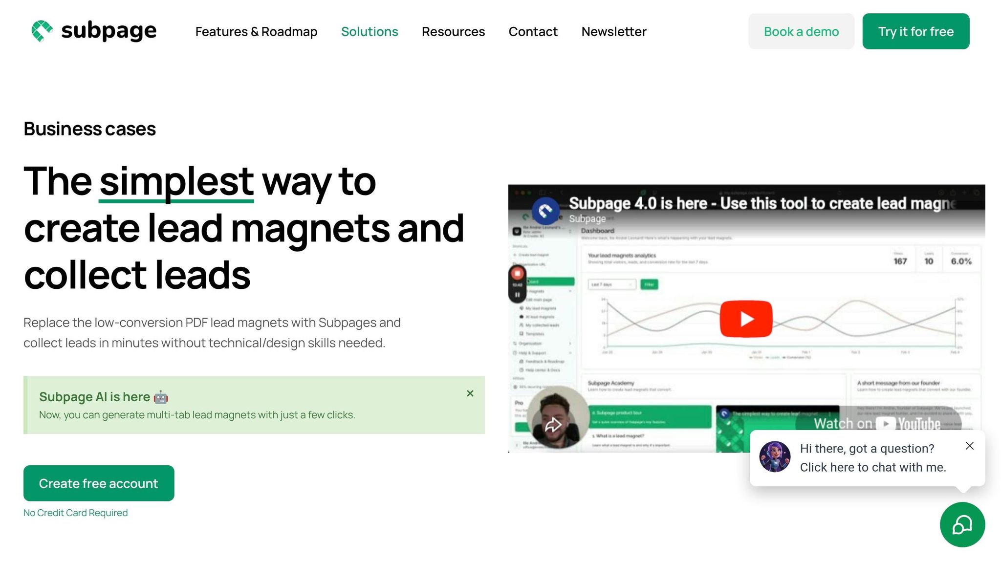
If your lead magnets are hosted on Subpage.co, you can manage branding settings directly from the Styles & Branding section at my.subpage.co/profile/styles. This feature allows you to define your colors, fonts, and logo just once, and they’ll automatically apply across all published lead magnets – no manual tweaking required.
Subpage also offers a Brand Guide editor that simplifies the process for non-designers. It provides tools to display HEX codes and guide logo or icon placement. On the free plan, you’ll have access to up to three brand categories and 50 MB of storage, which is plenty to get started. For larger teams or those needing unlimited categories and collaborators, the Growth plan is available for $11 per month.
Step 5: Final Review and Publishing Checklist
Before hitting "publish", take a moment to thoroughly review your lead magnet. This step helps catch any lingering issues, like mismatched colors, broken links, or blurry visuals. Building on earlier checks for color, typography, and consistency, this is your chance to fine-tune every detail so that your final product aligns perfectly with your brand guidelines.
Check Visual Quality
Start by ensuring the cover design is clear and readable, even at a thumbnail size of around 200px wide. Compare your exported file with your website using exact hex codes to confirm your colors match your brand guide. Also, double-check that all internal links – like those in the Table of Contents and CTAs – are functional and lead to the right destinations.
Verify Accessibility
Did you know that over 82% of landing page traffic comes from mobile devices? That makes mobile accessibility critical. Open your lead magnet on a smartphone to ensure it’s easy to read without needing to pinch or zoom. If adjustments are necessary, tweak the font size or layout.
For text readability, make sure body text has a contrast ratio of at least 4.5:1 against the background, and large text (18pt or larger, or 14pt bold) meets a 3:1 ratio, as required by WCAG AA standards. Additionally, confirm that any informative images include descriptive alt text for screen readers, while decorative images should have null alt text (alt="") to avoid unnecessary interruptions.
Once these accessibility checks are complete, you can finalize your file and hosting setup.
Confirm Export and Hosting Settings
PDF remains the go-to format for lead magnets because it preserves your design across all devices without requiring special software. Keep the file size manageable – ideally between 1–5 MB and no larger than 10 MB – to avoid delivery issues via email and ensure quick downloads.
If you’re hosting your lead magnet on Subpage.co, preview the live page to verify that your colors, fonts, and logo display correctly. Don’t stop there – run a full test signup to ensure the entire process works smoothly. Submit the form, check the delivery email, and open the file to confirm everything is functioning as expected.
| Checkpoint | What to Verify |
|---|---|
| Cover readability | Title is legible at ~200px thumbnail size |
| Color accuracy | Hex codes match your website and brand kit |
| Internal links | Table of Contents and CTA links are functional |
| Contrast ratio | Text meets WCAG AA contrast standards |
| File size | Exported PDF is under 10 MB (ideally 1–5 MB) |
| Mobile display | Text is readable without zooming on smartphones |
| Hosted page | Published page matches the designed lead magnet |
Conclusion: How Consistent Branding Strengthens Your Lead Magnets
Every step in this checklist – whether it’s documenting your hex codes or performing a final accessibility check – has one clear goal: ensuring your lead magnet stays unmistakably aligned with your brand. When your colors, fonts, and layouts match the rest of your branding, you’re not just creating a professional-looking document. You’re building a foundation that supports every future conversion strategy.
"Visual coherence acts as a subconscious trust signal, especially on creator websites where brand identity is often the product itself." – Marcus Hale, Senior SEO Content Strategist
This visual trust makes it easier for prospects to opt in, as every element feels cohesive and intentional. On the flip side, when branding is inconsistent, even the best offer can feel out of place, causing potential leads to drop off. Consistent branding eliminates that disconnect.
As your collection of lead magnets grows, tools like Subpage.co can help you maintain brand consistency effortlessly. With features that let you apply your brand colors, fonts, and even custom domains across all your lead magnets, you can keep everything on-brand without needing design expertise. In fact, users of the platform have reported generating over 1,000 leads in just two weeks using interactive lead magnets vs PDF lead magnets. For $9.99 per organization per month, the Premium Plan adds features like whitelabeling, unlimited lead magnets, and custom subdomain linking to ensure every lead magnet you create reflects your brand perfectly.
Regularly revisit your branding checklist with each new lead magnet. While the initial steps ensure a polished design, consistent updates and reviews solidify your brand’s long-term impact. Over time, this consistency builds momentum, making it easier to perfect every new asset. Consistency in branding pays off – it’s a long-term investment in trust and conversions.
FAQs
How do I choose my primary, secondary, neutral, and accent colors?
Choosing the right primary color is key to showcasing your brand’s personality. This color will dominate your logo, key call-to-actions (CTAs), and headers, making it a central element of your visual identity.
From there, pick secondary colors that work well with your primary choice. These will add variety and depth to your designs. Use neutral colors like grays or off-whites for backgrounds and text to keep things clean and readable. Finally, select accent colors to draw attention to highlights or alerts.
Once you’ve finalized your palette, make sure to document everything in a style guide. This ensures your branding stays consistent across all platforms and materials.
What’s the easiest way to make my brand colors WCAG-accessible?
Ensuring your brand colors meet WCAG accessibility standards can be simplified by using tools designed to create contrast-safe color palettes. These tools help calculate luminance and check contrast ratios to align with WCAG 2.1 or 2.2 guidelines. To make your color system more accessible, consider incorporating semantic tokens and pairing colors with additional visual elements like icons or labels. It’s also important to regularly test your palette using contrast checkers and simulate color blindness to confirm its usability for a diverse audience.
How can I keep every new lead magnet on-brand without redesigning from scratch?
To keep every lead magnet aligned with your brand without reinventing the wheel, consider building a centralized brand kit. This should include your brand’s colors, fonts, logos, and tone guidelines. Many tools allow you to set these elements up once and apply them automatically across all your materials. For example, platforms like Subpage offer user-friendly editors that help ensure consistency in branding. This approach not only saves time but also ensures your materials always look polished and cohesive.
Related Blog Posts
